Create a launcher pop-up
A launcher is a small pop-up that triggers a certain action, for example, another pop-up opening or user redirection to your specified website page. With its help, you can build pop-ups for lead generation and sales that respect users' experience and time on your page.
In this article, we will talk about how to create and configure a launcher.
Create a launcher pop-up
Go to your website, and click Add pop-up.
Read more: How to create a smart pop-up.
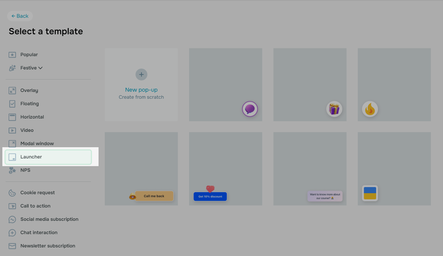
Click the Launcher pop-up type, and select a template that suits your design needs best, or create a launcher from scratch.
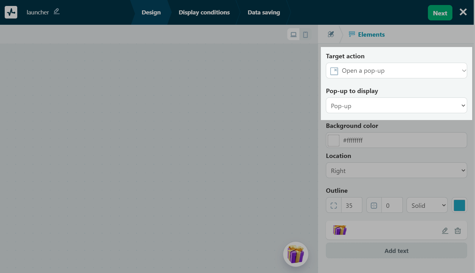
Select a target action
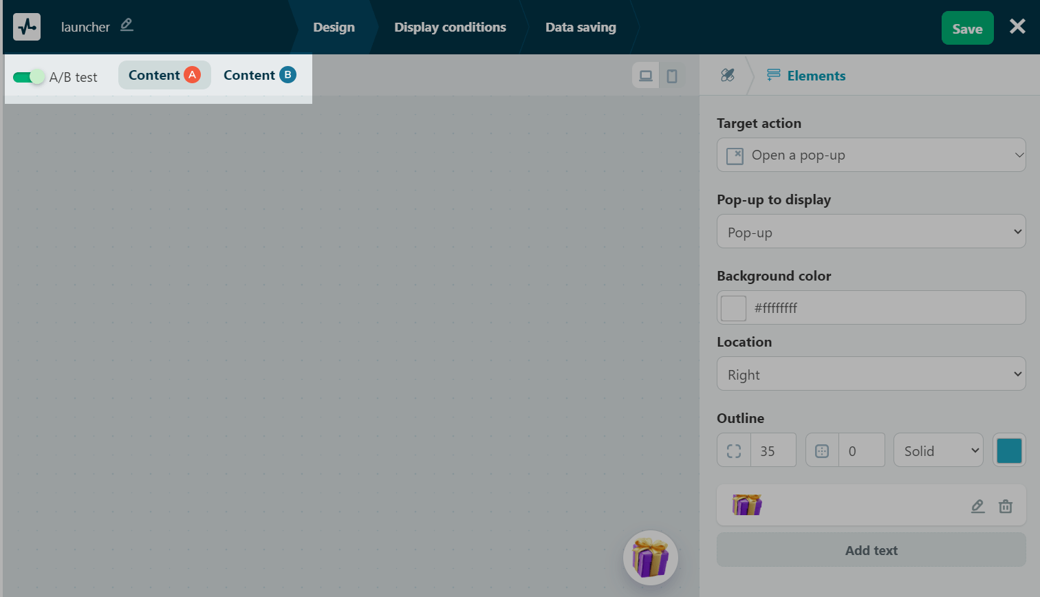
For this type of pop-up, you can select two actions: opening another pop-up and redirecting users to another site page.
Opening another pop-up
You can link your previously created main pop-up in the launcher settings. Alternatively, you can link your launcher while creating your main pop-up. This means that if you have already linked them up in the launcher settings, you do not need to repeat this action when creating your main pop-up, and vice versa.
In the Target action field, select Open a pop-up, and in the Pop-up to display field, select a pop-up from the drop-down list. This pop-up will be opened after a user clicks your launcher.
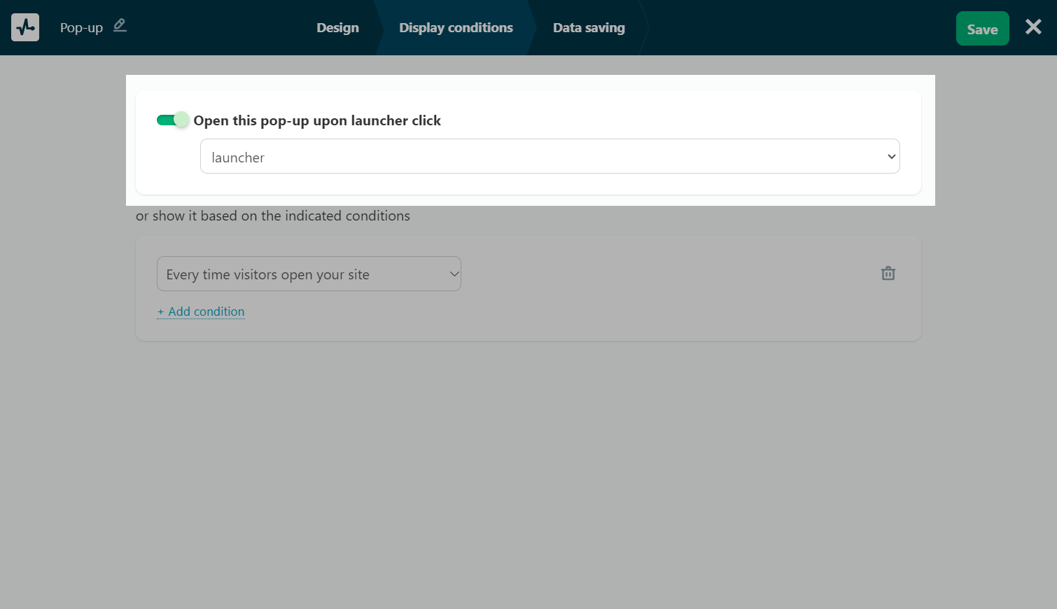
You can also link your launcher via your main pop-up. To do this, open a pop-up of a different type, or create a new one in your project, customize it, and turn on the Open this pop-up upon launcher click toggle in the Display conditions tab.
You can select a launcher only if there is one in your project.
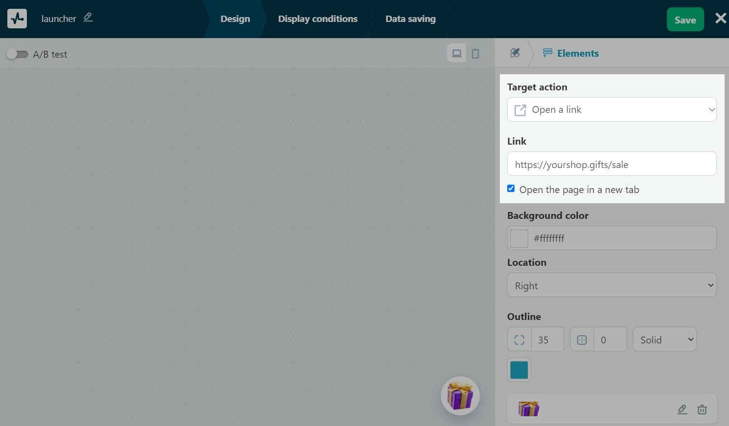
Redirecting users to another website page
In the Target action field, select Open a link. In the Link field, add a link to the page where users will be directed once they click your launcher.
If you want the page to be opened in another window, select the Open the page in a new window checkbox.
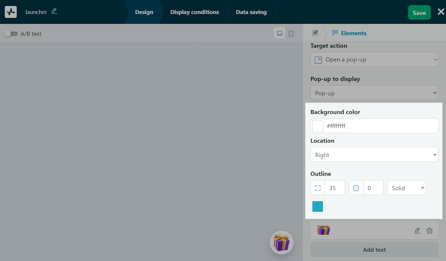
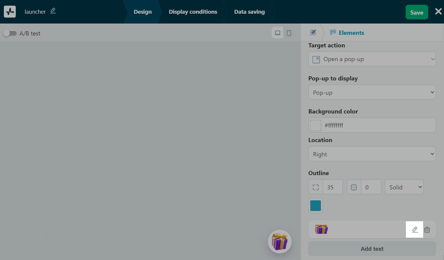
Customize your pop-up appearance
You can add text and upload an image, adjust the alignment and background color, and add effects.
Pop-up design
You can also customize your pop-up design using the following options:
| Background color | This option allows you to set your text background color. |
| Image position | This option allows you to position your text relative to your image. |
| Location | This option allows you to align your launcher relative to your website page. |
| Outline | This option allows you to set your outline rounding and thickness in pixels and select a line type (solid, dashed, or dotted). |
With the help of rounding, you can adjust your launcher shape. If you remove the text and set your rounding to 30, you will get a round launcher; if you set your rounding to 0, you will get a square launcher.
To add an image, click the pencil icon, and upload or select an image from the file manager. You can add a file of up to 5 MB in size in the GIF, JPG, JPEG, or PNG format. Once you upload your image, it will be automatically adjusted to your selected pop-up size.
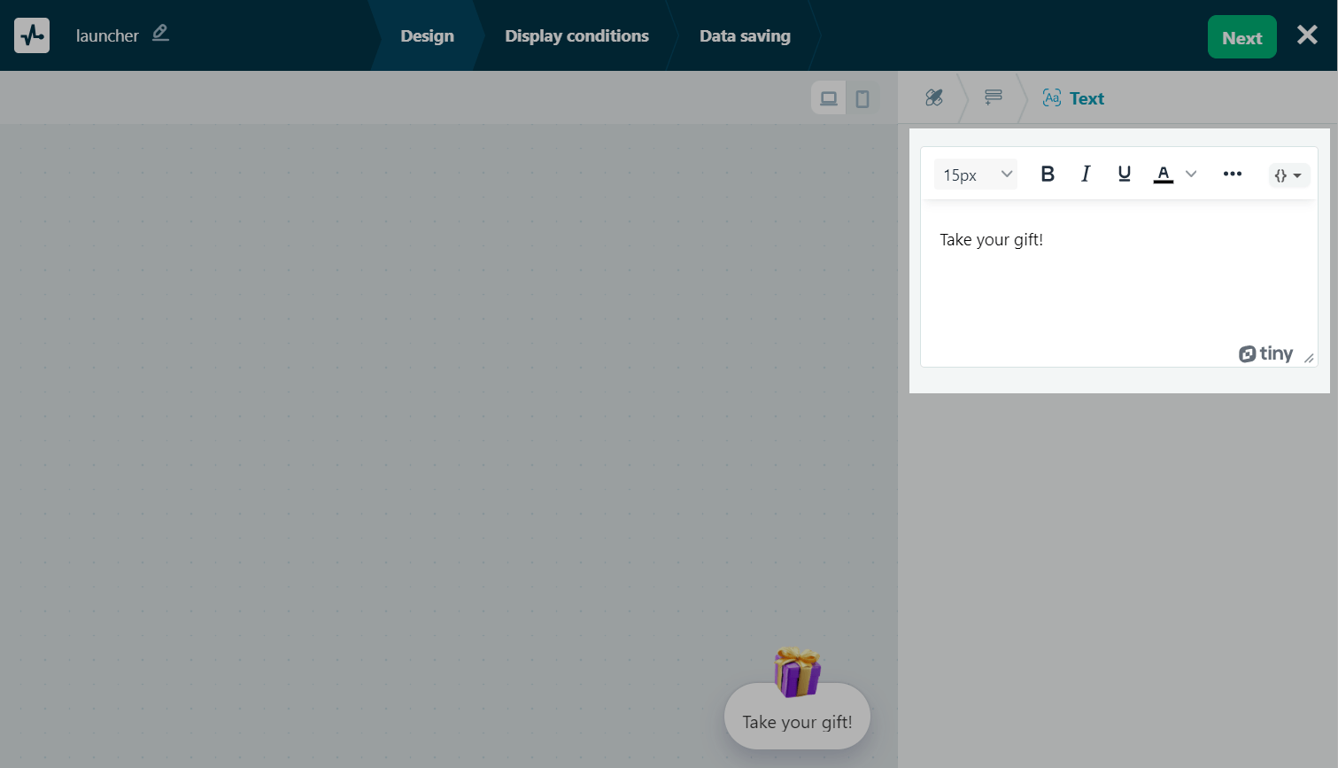
To add text, click Text, enter up to 120 characters, and format your text. You can add links, variables, and emoji.
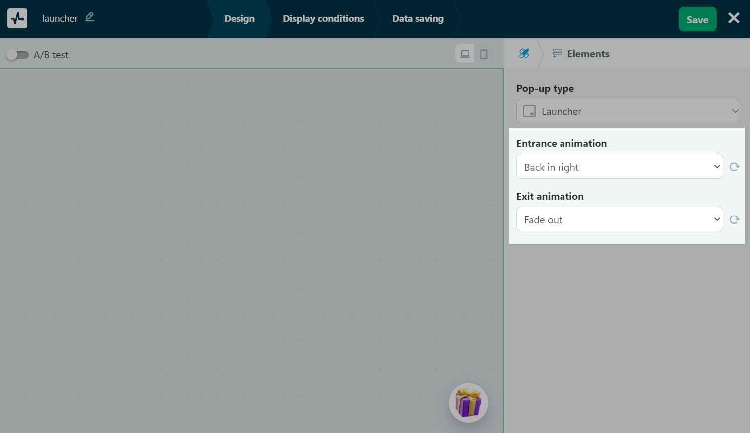
Effects
You can add entrance and exit effects to your launcher. To do this, go to the launcher styles.
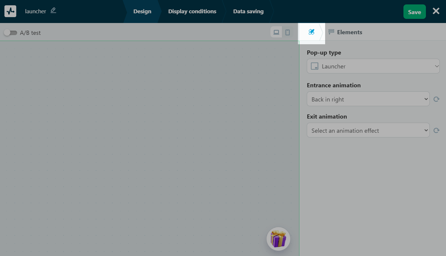
Select entrance and exit effects in the Entrance animation and Exit animation fields, respectively. You can select the following effects:
| Back | Pop-up goes across the screen from the bottom, top, left, or right sides and then falls into place. |
| Bouncing | Pop-up goes across the screen, settles into place, and sways slightly from side to side. It can appear from the bottom, top, left, or right sides or from its place. |
| Fade | Pop-up gradually comes into view. It can appear from the bottom, top, left, or right sides or from its place. |
| Flip | Pop-up rotates 360 degrees around its axis. It can flip vertically or horizontally. |
| Light speed | Pop-up appears in its place and shakes. It can appear from the bottom, top, left, or right sides. |
| Rotate | Pop-up is twisted around the perimeter. It can appear from the bottom, top, left, or right sides. |
| Specials | Pop-up rolls out or enlarges. |
| Zooming | Pop-up enlarges to its regular size. It can appear from the bottom, top, left, or right sides. |
| Slide | Pop-up slides into place. It can appear from the bottom, top, left, or right sides. |
You can also use pop-ups for A/B testing.
Read also: How to conduct pop-up A/B testing.
Click Save.
Continue setup
After customizing your pop-up design, click Next.
In the Display conditions tab, choose when and how the widget will appear.
In the Data saving tab, select where to store subscriber data in other services.
Once you're done, click Save and publish or Save and close.
Once you finish creating, go to the Pop-ups section to preview the pop-up, track stats, and edit any settings.
There are two metrics available in your launcher statistics: the number of views and clicks.
To monitor the statistics of your launcher and the pop-up it triggers, you need to view the number of launcher clicks and views and pop-up actions individually. To do this, switch between the linked pop-ups in your project, and go to the Statistics tab.
Last Updated: 06.05.2025
or