Email design best practices
Email design is the process of creating attractive and captivating emails by tweaking images, calls-to-action, fonts, colors, among other essential elements. Design plays a vital role in the success of an email marketing campaign, so it is imperative to follow industry email design best practices.
According to Statista, people send and receive over 260 billion emails each day with the number projected to increase to over 347 billion emails every day in 2022. As such, marketers need to stand out from their competitors by sending emails with optimized designs to maximize open rates.
With all that said, how exactly can businesses optimize email design? Here are some important things each email marketer should do to ensure the creation of perfect emails.
Make use of ready-made email templates
Using templates remains one of the most effective email design best practices. There is a variety of pre-made templates at marketers’ disposal offered by email services.
When using an email service provider such as SendPulse, marketers will have access to over 130 pre-designed and responsive templates. They can quickly select one based on their activity or event and then proceed to create effective emails within 10 minutes. Alternatively, marketing departments can choose to use the drag and drop feature to create stunning email templates. This option is ideal, given the fact that one does not need to have any coding skills to add text, images, and video to their emails.
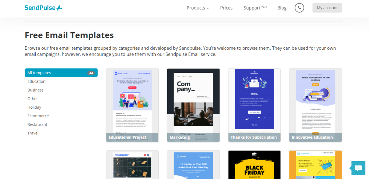
Watch this video to learn how to create a template in SendPulse.
Master mobile-friendly email design
In 2018, 46% of all email opens were made on mobile devices. Marketers should take that fact seriously while designing email campaigns. Pay special attention to email template size, it’s layout and CTA. In particular, make your email width 600px, use the shorter subject line, stick to single-column layout for your email to be easy to read. For images to load fast, optimize their size. Use large font size so that a user could easily tap the buttons — 13-14px would be the best choice. Leave some white space around the CTA to make it more eye-catching. Avoid placing links and menu bars as they are too difficult to tap on a smartphone. And test, test, test your emails on different devices!
To make the process of creating a mobile-friendly email stressless, try SendPulse. All the email templates crafted in the service are responsive by default.
Check out how SendPulse email template looks on desktops.
The way the same email template renders on mobile. The text is easy to read and the buttons are easy to click.
Write the subject line properly
The subject line should be personal, engaging, and relevant. Do not use CAPS excessively, incorrect punctuation, or contentious words. Regarding length, longer is not necessarily the best way forward. Marketers should know that subscribers use different devices and email clients so the length varies. Thirty-fifty characters is a great length for email subject lines. Subject lines that are about 61-70 characters won’t display the same way on each device. So, to be on the safe side, stick to less than 50 characters.
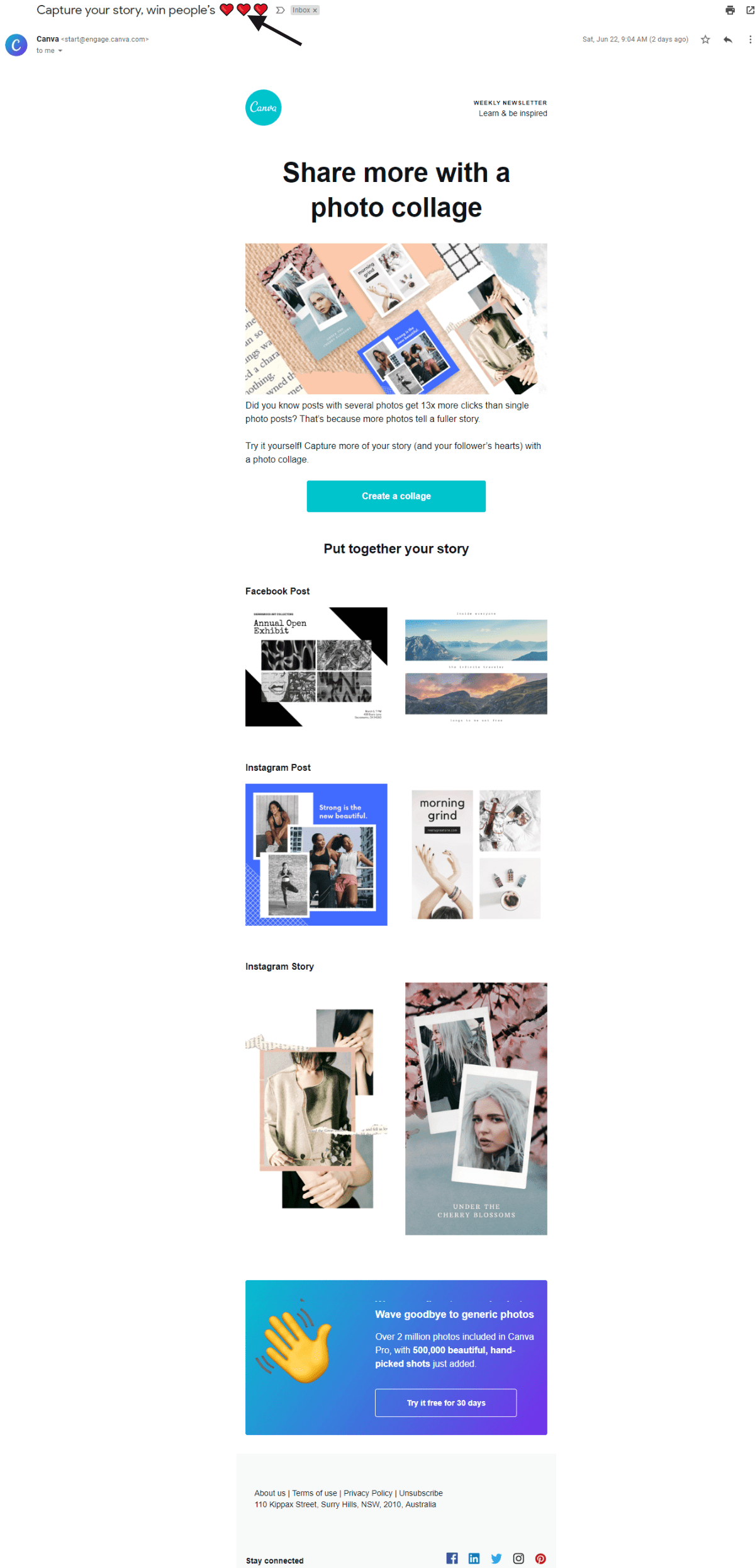
Brands can also consider using emojis in their emails. They can take the place of words, charm the reader, grab the attention of the recipient, and boost open rates. It’s important to realize if emojis correlate with your type of business and how the audience will perceive them. In addition, it is essential to note that if an email client does not support a specific emoji, then the reader will see this character- ☐.
Below is an example of how a brand uses emojis in the email subject line to the point.
Ensure brand optimization
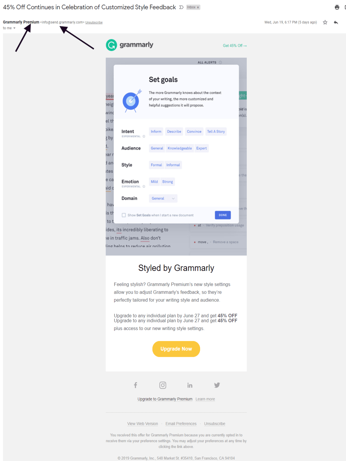
Brand optimization, is by far, one of the most important email design best practices. Email marketers should ensure that their emails speak the brand’s language. Firstly, add the name of your brand to the “From” field. Then, be sure to include your brand logo. That will increase brand recognition and give your email more chances to be opened. Make your email template design consistent for all email campaigns: stick to several colors, fonts, layout, customize an email footer. To simplify the process, create an email template once and modify it for all the campaigns.
SendPulse offers free ready-made emails templates for any occasion and drag-and-drop editor which requires no coding skills for using.
Basically, each section of the email should be on-brand. This way, better brand reputation, and email marketing success will be achieved.
Below is an email from Grammarly, that shows the brand name, “From” name, and “from address.” The emails from this brand are always easy to recognize due to well-thought and branded design.
Add the perfect preheader
They provide useful context to the subject line and assist in increasing the open rates. Preheader is visible in the inbox preview, in the email’s body, and in the preview pane. It should be short and to the point. Stick to 40-70 characters. Email marketers need to use the preheader to help the recipient understand why the email is useful to them. On a side note, the preheader text and the subject line should complement each other for better performance.
SendPulse allows its users to customize email preheader to increase email open rates.

Adopt an excellent email layout
600px email template width is ideal for marketing emails. A vertical layout remains the better option over a horizontal one, as it makes an email easy to scan. Stick to inverted pyramid design while crafting an email template as it makes a reader slightly move to the desired action.
Keep in mind a balanced ratio for text to images. Marketers should aim for 60:40 text-to-image ratio. It means that the emails should have 60% of text and 40% of pictures. If there is the need to change this a bit, then be sure to use more text. Increasing the image ratio is sure to slow down the load duration, which may make the reader click out of the email and stop reading it altogether.
Write messages that load fast. Image heavy emails tend to be flagged as spam by subscriber email providers. Away from that, headers, bold, occasional italics, headers, and bullet points make the text stand out.
Use short sentences as well as paragraphs while also using dividing lines and spacing to separate sections of your content. Increase legibility by adding line breaks every 60 characters in the plain text emails. Use standard fonts for web such as Arial, Times New Roman, Arial Black, Courier New, Tahoma, Verdana, etc. The body text should have a font of 14px, and the title should be 22px.
Make your call-to-action size is at least 44x44px so that users could easily tap it on their mobile devices. Make sure that it is eye-grabbing and contrasts against the background color.
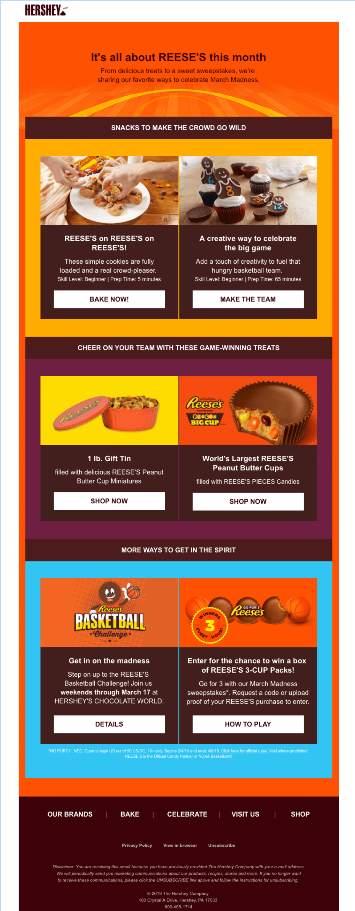
Below is an email from Hershey which has a balanced text to images ratio and inverted pyramid design that makes it easy to read.
Provide images of 1200px and be sure to use CSS. Apart from that, it is essential to optimize the file size and use alt text. It comes into play when an image doesn’t render or get blocked by email service providers. In this case, subscribers see a piece of text which overlays the image and describes it. Optimize the weight of the image, otherwise, it may lead to extremely slow loading or even blocking.
Craft the ideal footer
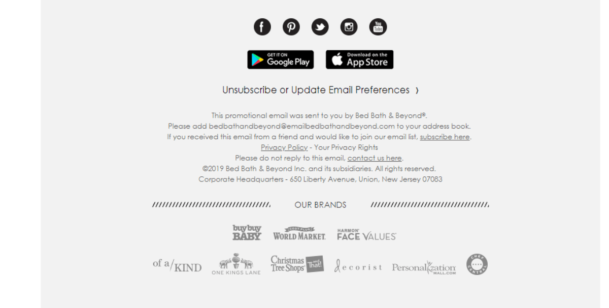
An excellent footer should contain the brand’s contact details, links to key parts of the website, social sharing buttons, the unsubscribe link. Mind that the last one should be visible and easy to tap on a smartphone. Also, it is important to include “Why are you receiving this email” to reduce chances of spam.
Here is an excellent example of a footer from an email sent by Bed Bath and Beyond.
Last Updated: 25.09.2024
or