The Gallery widget in website builder
With SendPulse’s website builder, you can add a gallery to display several images as a carousel, grid, or collage. For example, you can use a gallery as your portfolio or show your products and their reviews.
Let’s talk about how to add a gallery to your website and set up its display.
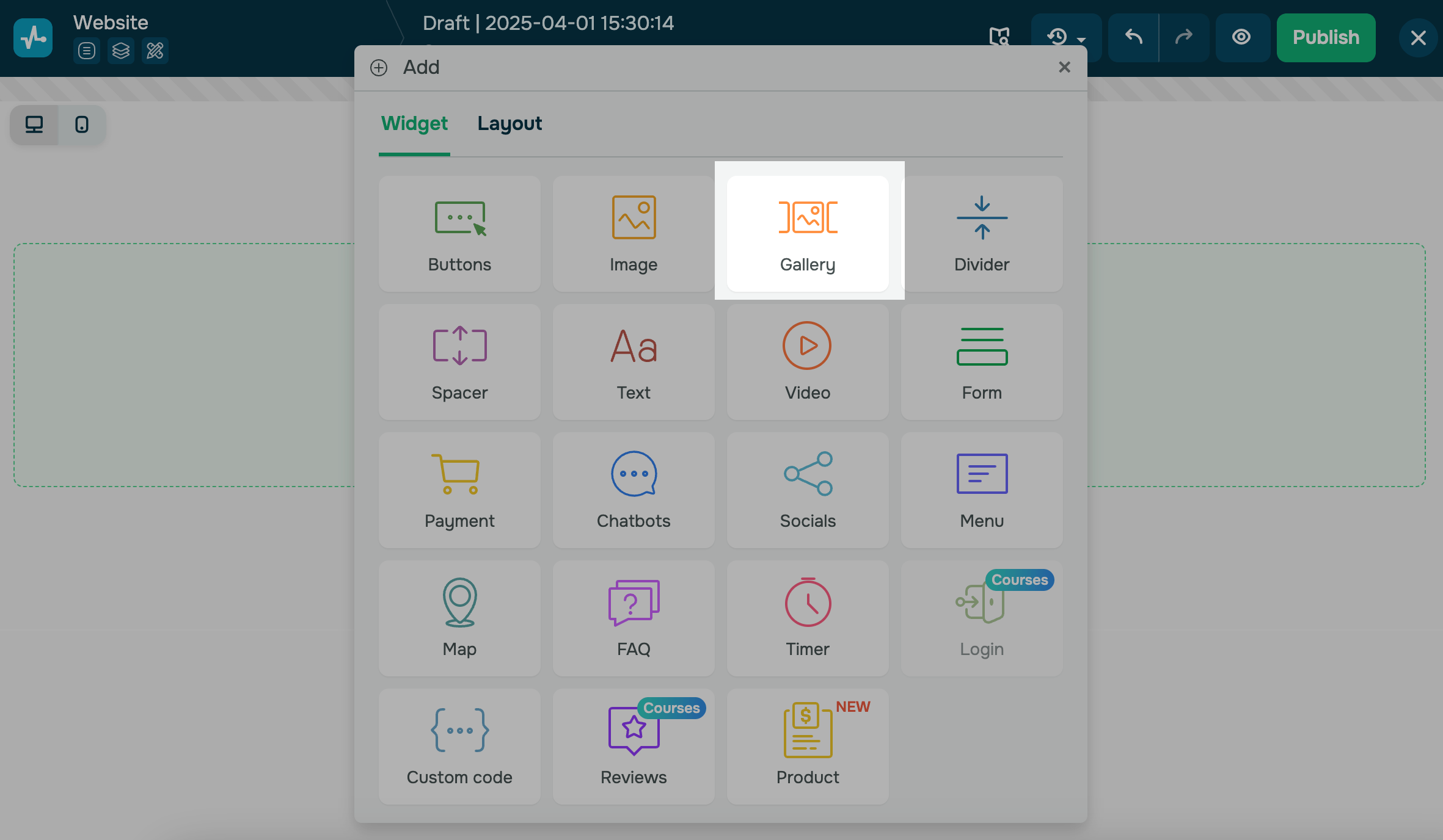
Add an element
Add the Gallery widget to a part of your website.
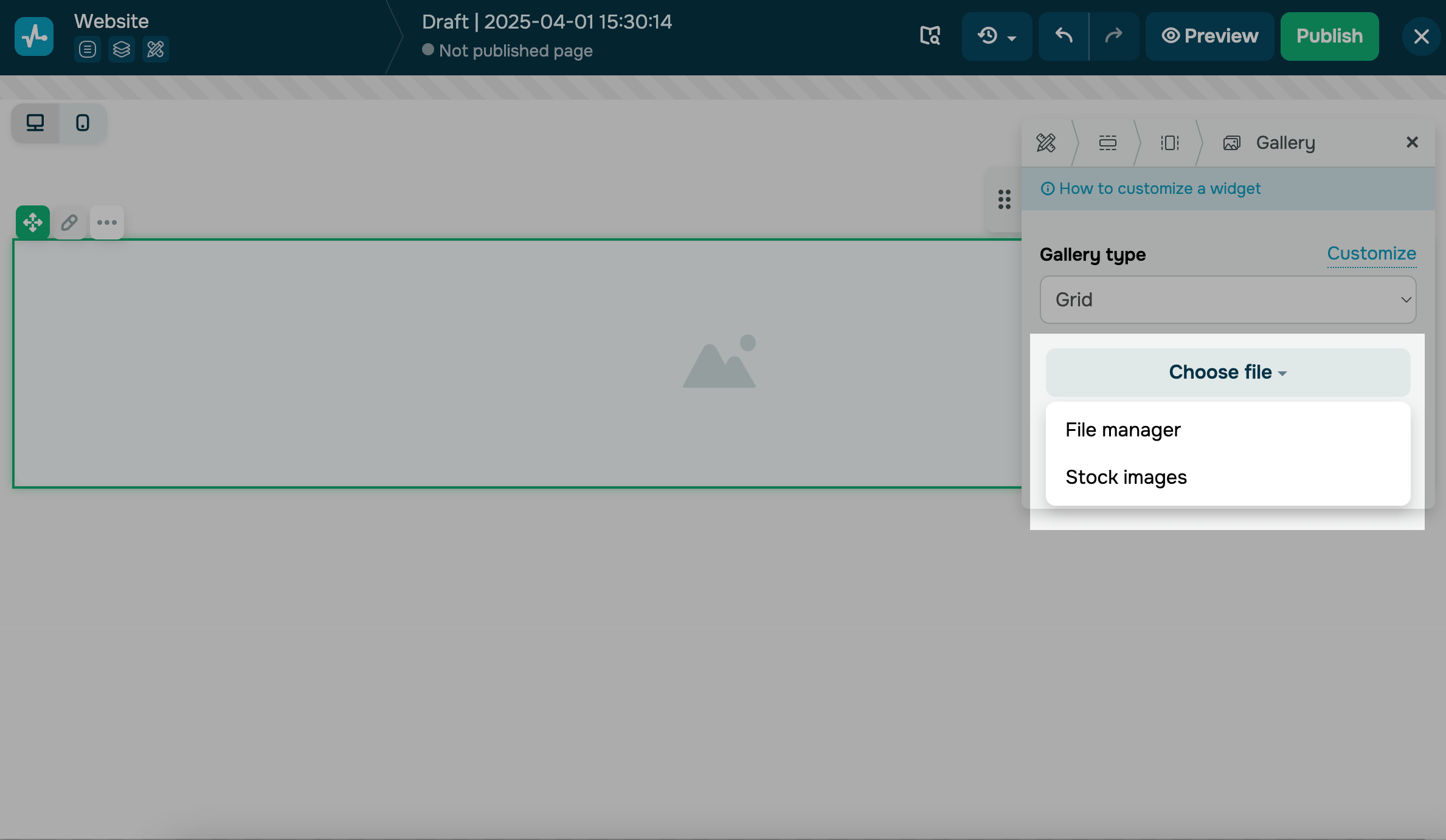
Upload images
Click Choose file and select an option to add your image:
| File manager | Opens the file manager where you can select an existing image or upload a new one. |
| Stock manager |
Opens a modal window where you can choose an image from Unsplash’s free stock photos. You can search by image name, select an image from the list, and click Select at the bottom to add it to your page. |
Website images are automatically resized to match the screen size of the visitor's device (720, 1080, or 1920 px) and converted to the webp format. If the required size is not available, the website visitor will see the original image, which is stored in the file manager.
You can only add images to the gallery one by one.
To add more images, click Add.
To replace or delete an image, hover over it, and click the corresponding icon.
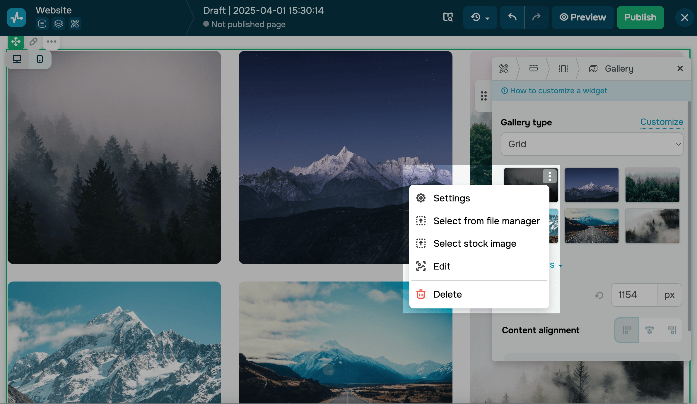
To rearrange images on the grid, drag and drop them to the necessary location.
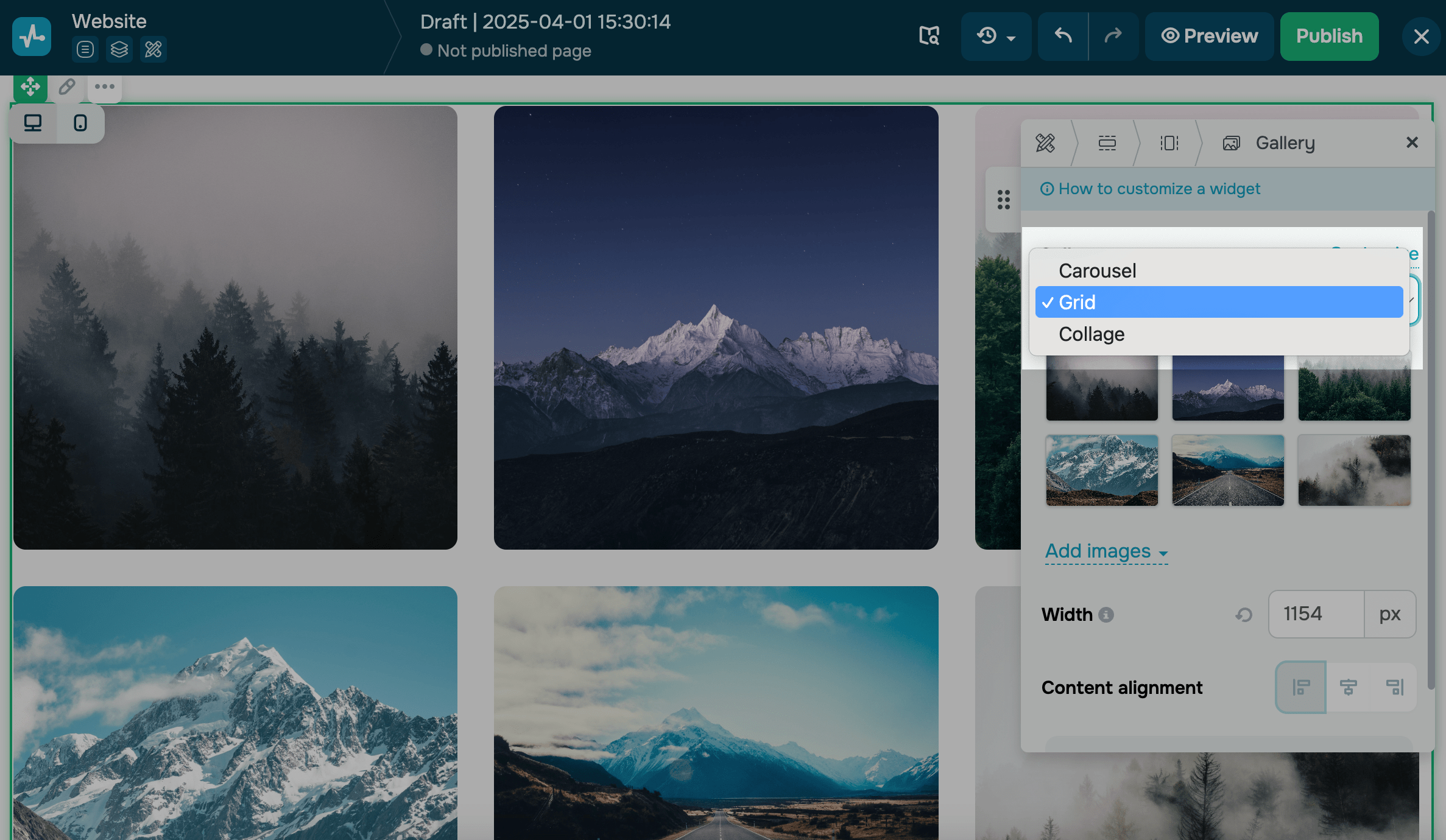
Set up your gallery
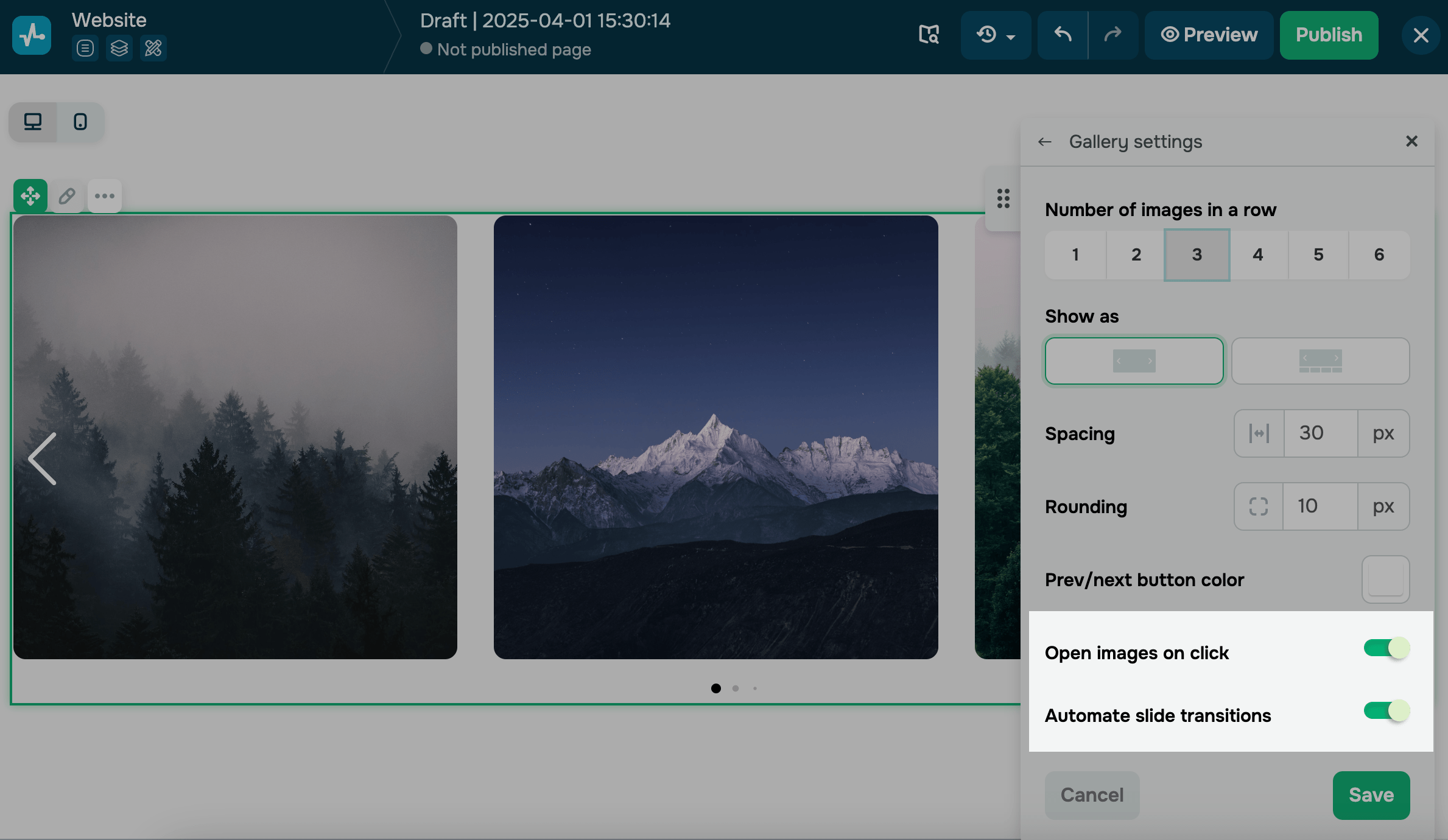
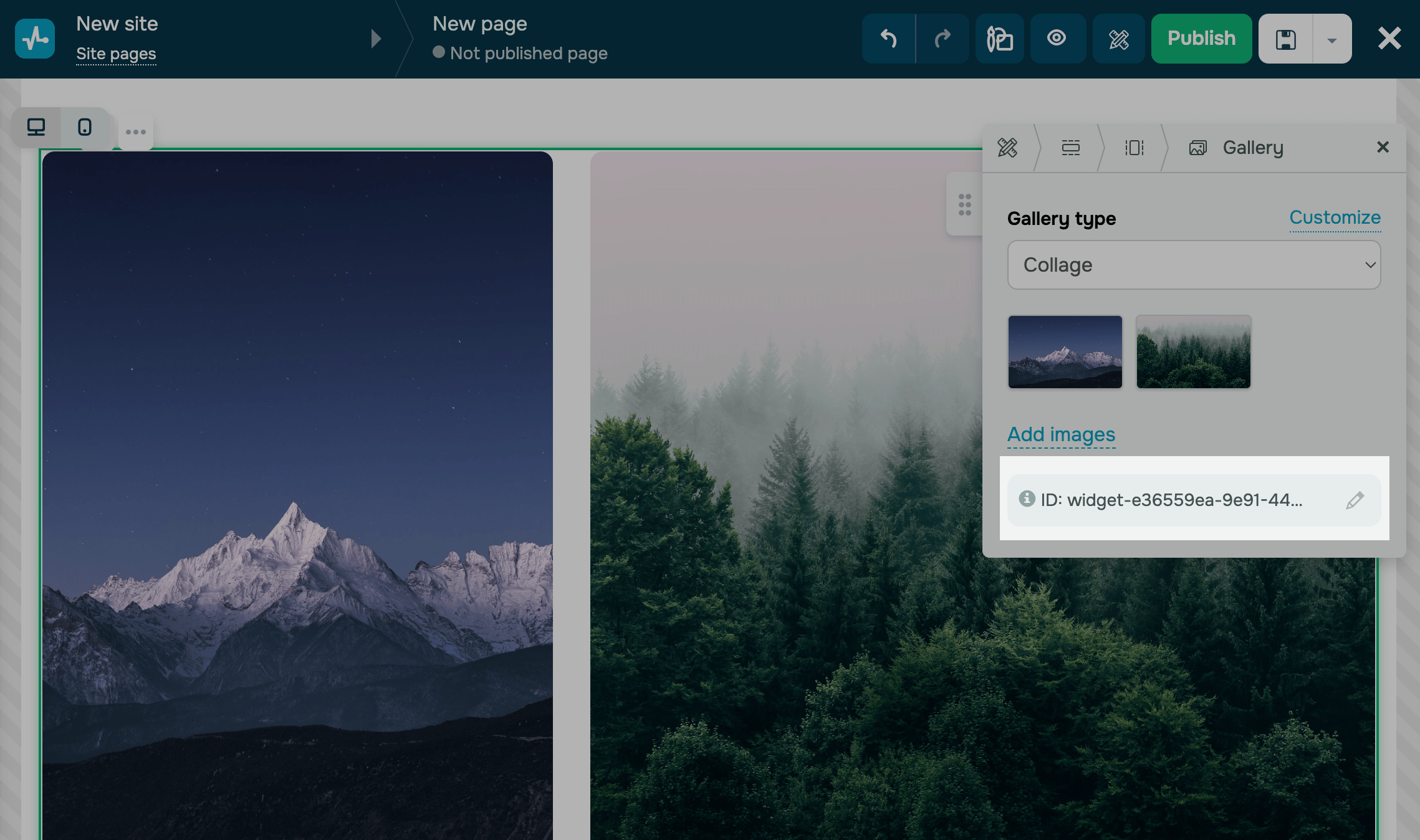
Select your gallery type (carousel, grid, or collage), and click Customize.
Carousel
Used to create a slideshow that rotates through various images.
Customize the appearance of your carousel:
| Number of images in a row | Select how many images to show in a single row. |
| Show as | Select a carousel display mode.
Options include: Row — all images appear in a single row. Thumbnails — one main image appears with a row of thumbnails below. |
| Show the edge of the last thumbnail | Select this checkbox to partially show the next thumbnail at the edge of the row, indicating that more images are available.
Applicable only to Thumbnails. |
| Image scaling | Decide how images fit within their containers.
Options include: Cover — fills the entire area; images may be cropped. Contain — shows the full image without cropping. Use Contain for images with non-standard aspect ratios, such as testimonial screenshots. |
| Preview image scaling | Select how thumbnail images fit within their containers. Choose Cover or Contain.
Applicable only to Thumbnails. |
| Background color | Select a background color for image containers.
This color appears when you use the Contain scaling mode or when the gallery has more images than fit on the screen. |
| Spacing | Set image spacing in the row using pixel values. |
| Rounding | Round image corners using pixel values. |
| Prev/next button color | Select a color for carousel navigation arrows. |
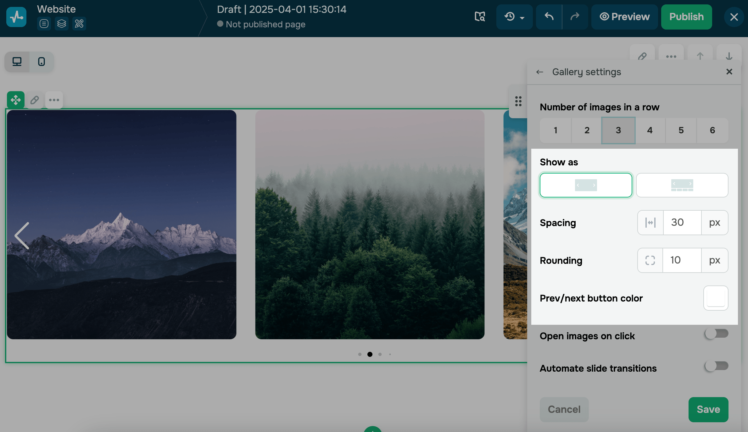
You can also set up additional options for user interaction by enabling or disabling image opening after a click* and automating slide transitions.
*When this option is enabled, the image will be opened in a modal window in its original size.
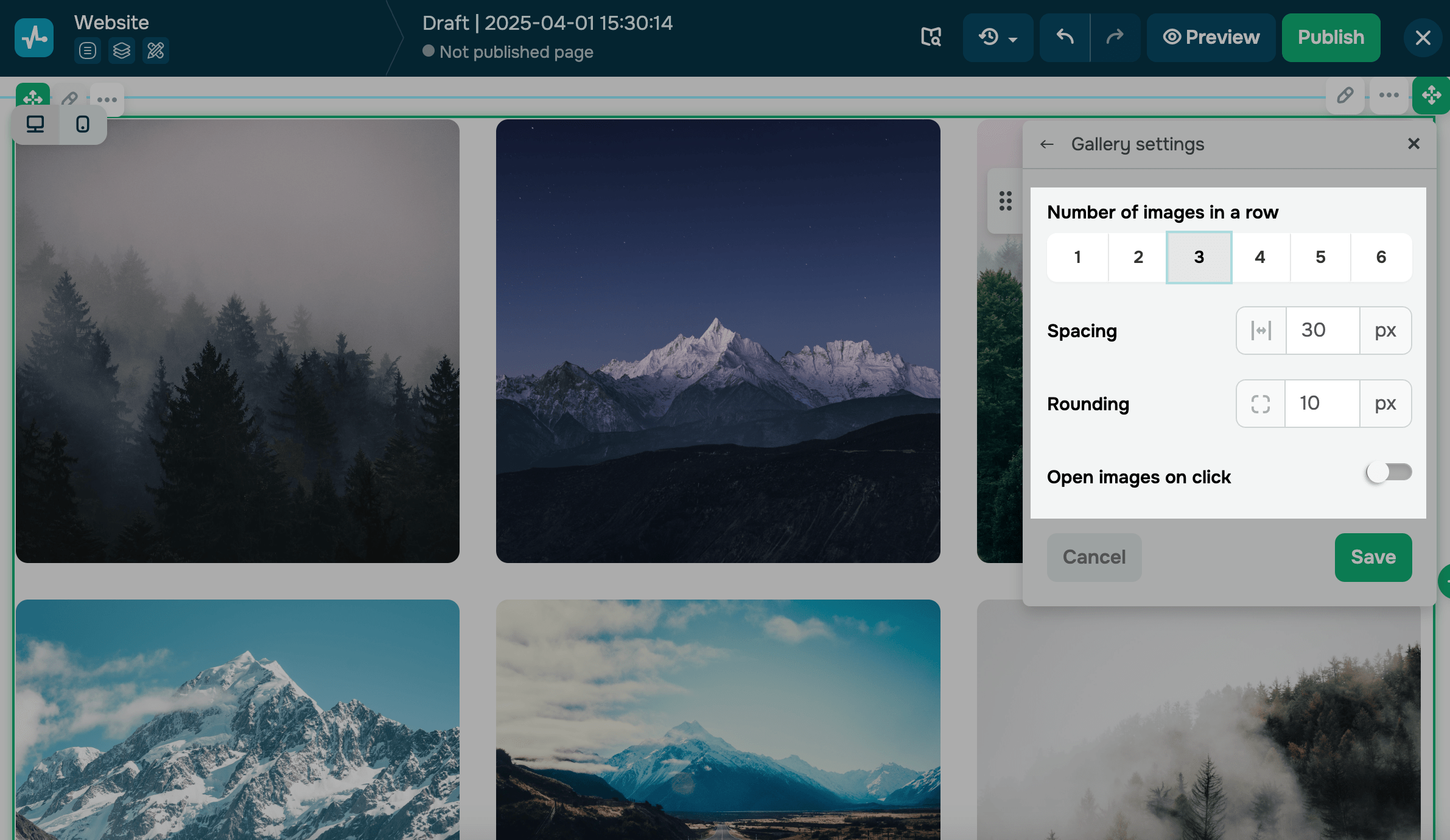
Grid
Used to present all images at once in one block and in the same size.
Customize the appearance of your grid:
| Number of images in a row | Select how many images to show in a single row. |
| Image scaling | Decide how images fit within their containers.
Options include: Cover — fills the entire area; images may be cropped. Contain — shows the full image without cropping. Use Contain for images with non-standard aspect ratios, such as testimonial screenshots. |
| Background color | Select a background color for image containers.
This color appears when you use the Contain scaling mode or when the gallery has more images than fit on the screen. |
| Spacing | Set image spacing in the row using pixel values. |
| Rounding | Round image corners using pixel values. |
You can also set up additional options for user interaction by enabling or disabling image opening after a click.
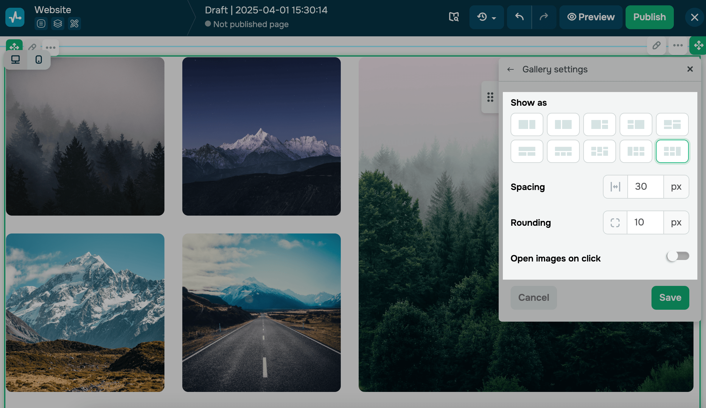
Collage
Used to present all images at once in one block using the selected collage form.
Customize the appearance of your collage:
| Show as | Select a collage layout template. |
| Image scaling | Decide how images fit within their containers.
Options include: Cover — fills the entire area; images may be cropped. Contain — shows the full image without cropping. Use Contain for images with non-standard aspect ratios, such as testimonial screenshots. |
| Background color | Select a background color for image containers.
This color appears when you use the Contain scaling mode or when the gallery has more images than fit on the screen. |
| Spacing | Set image spacing in the row using pixel values. |
| Rounding | Round image corners using pixel values. |
You can also set up additional options for user interaction by enabling or disabling image opening after a click.
Edit your images
You can customize your image size and add a focal point (an image part to which you want to draw more attention) to bring out the main object in a large photo.
Click an image in the widget, and drag the sizing handle to resize your image. Click the center of your image to set its focal point.
You can edit images right in the website builder, for example, add text or use various effects.
Read more: How to edit images using the website builder.
Copy your element ID
Every element has an ID that distinguishes it on the page. With it, you can add styles and scripts, show pop-ups, and track events for this element.
To copy an ID, click it. To edit an ID, click the pencil icon.
Read more: Block and widget ID.
Last Updated: 01.04.2025
or