A mobile landing page is a web page built for mobile browsers that opens when a user clicks on a search result or an ad via smartphone. This page should have one goal, one call to action, simple navigation, and design. It has a conventional goal and makes a user perform a desirable action.
In this video, Caleb Smith, marketer at SendPulse, explains how to create a mobile landing page with SendPulse.
Why is it important to create a mobile landing page?
Creating a mobile version of your landing page is not just a useful addition, it is a necessity.
According to Statista, there are 3.5 billion smartphone users worldwide in 2020 and this number is still rising. 51% of internet users purchase products online via smartphones. Meanwhile, the number of desktop users is steadily decreasing. However, conversions on mobile devices are still lower than on desktop.
We’ve all had bad experiences browsing the web on our mobile devices: pages that are difficult to navigate, long loading times, and too much text that makes it very difficult to understand what you are looking at. This happens because only 50% of landing pages are optimized for mobile devices.
To prevent your customers from having such an experience with your products and services it is best to design a landing page so that it has an easy-to-follow copy, a simple design, fast load time, and is easy to navigate using a smartphone.
Now let’s take a look at some things you need to know when creating a high converting landing page for smartphones.
How to Create a High Converting Mobile Landing Page
- Choose an intuitive landing page builder
- Remember Mobile-First Design
- Use a Single-Column Layout
- Be Concise in Your Copy
- Optimize Forms for Mobile Devices
- Add a CTA Button
- Consider Load Time
According to Sweor, it takes about 50 milliseconds for users to decide whether they like a website or not. That is why sites should be optimized to keep mobile users on the page. So, we’ll walk you through several steps to create a high-converting mobile landing page.
Choose an Intuitive Landing Page Builder
SendPulse provides an easy-to-use drag and drop landing page builder. It enables you to create a landing page, online store, or link page for your social media bio. All the pages created with our service are responsive by default. You can use a pre-made template or create a unique page from scratch for free. Add images and videos, a subscription widget to convert site visitors into subscribers, links to your social media accounts and blog, payment options. Track your page performance with the help of reports and optimize it for a search engine.
To create a landing page, arrange your page structure, drag the elements you need and customize their design using a toolbar.
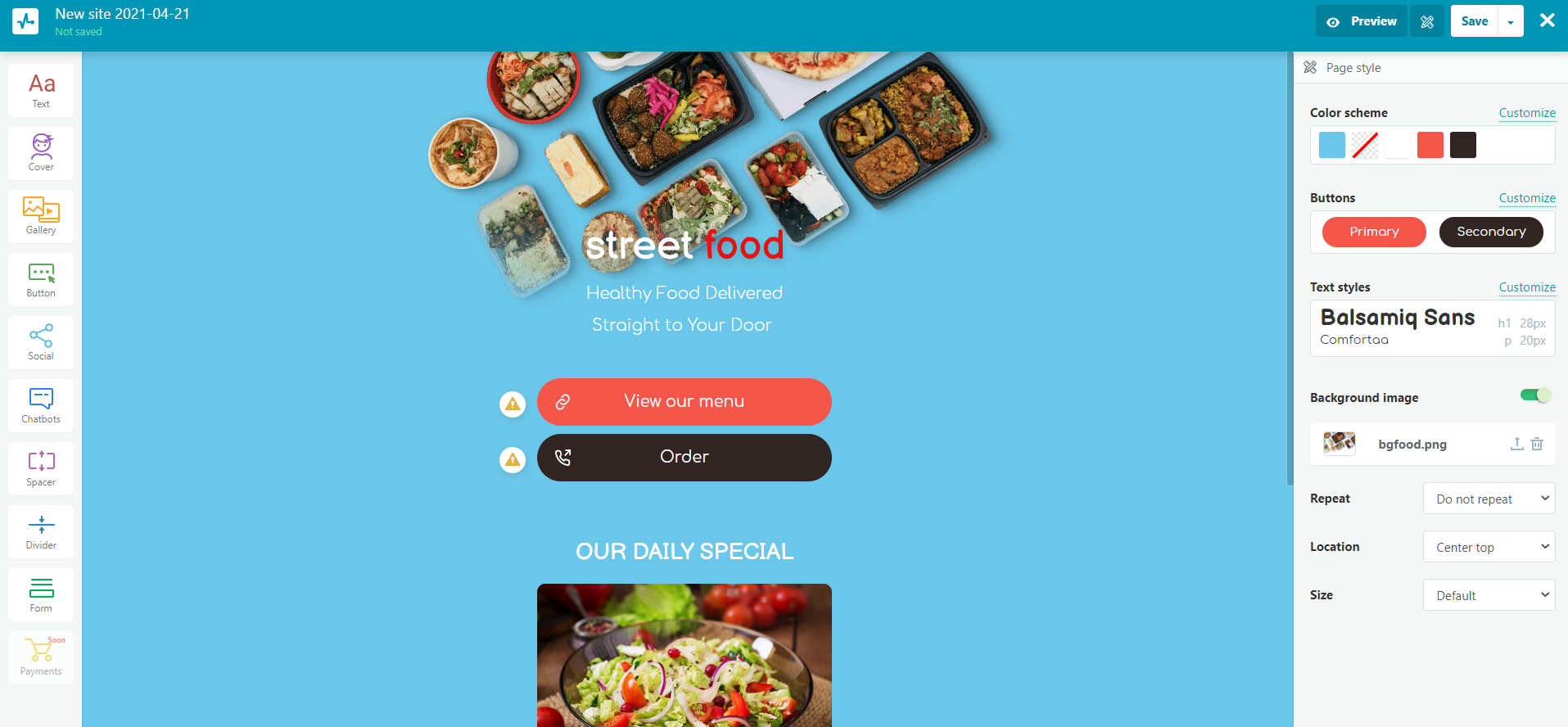
Follow this step-by-step guide.
Remember Mobile-First Design
When you design your site so that users can access it from a smartphone, you guarantee that your customer experience will be good on any device. There are several things to consider. Firstly, make sure that your site visitors can see everything clearly from a small smartphone screen. Secondly, provide your customers with all the necessary information they might look for. Thirdly, make sure that your website is easy to navigate on a smartphone. Finally, don’t burden your visitors with excessive elements such as ads or intrusive pop-ups.
Use a Single-Column Layout
Smartphones don’t have room for several columns. They can make navigation and scrolling feel cumbersome and unnatural. Multiple columns that are used for a desktop version of the site aren’t a good fit for mobile devices as users only have about 3x5 inches to navigate around your page.
A Single-column layout is easy to set up and suits mobile screens the best. It is a series of boxes stacked one on top of the other. This layout includes a header, field for content, footer, and a horizontal navigation menu.
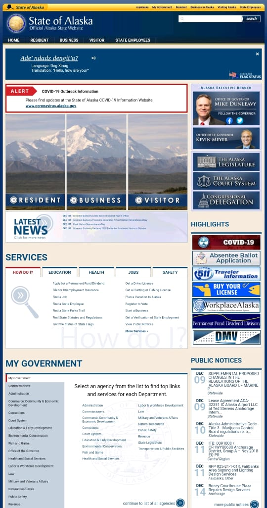
Now let’s take a look at the official Alaska state website. The desktop and mobile version of the website looks the same. So you can imagine how difficult it is to navigate from a smartphone.
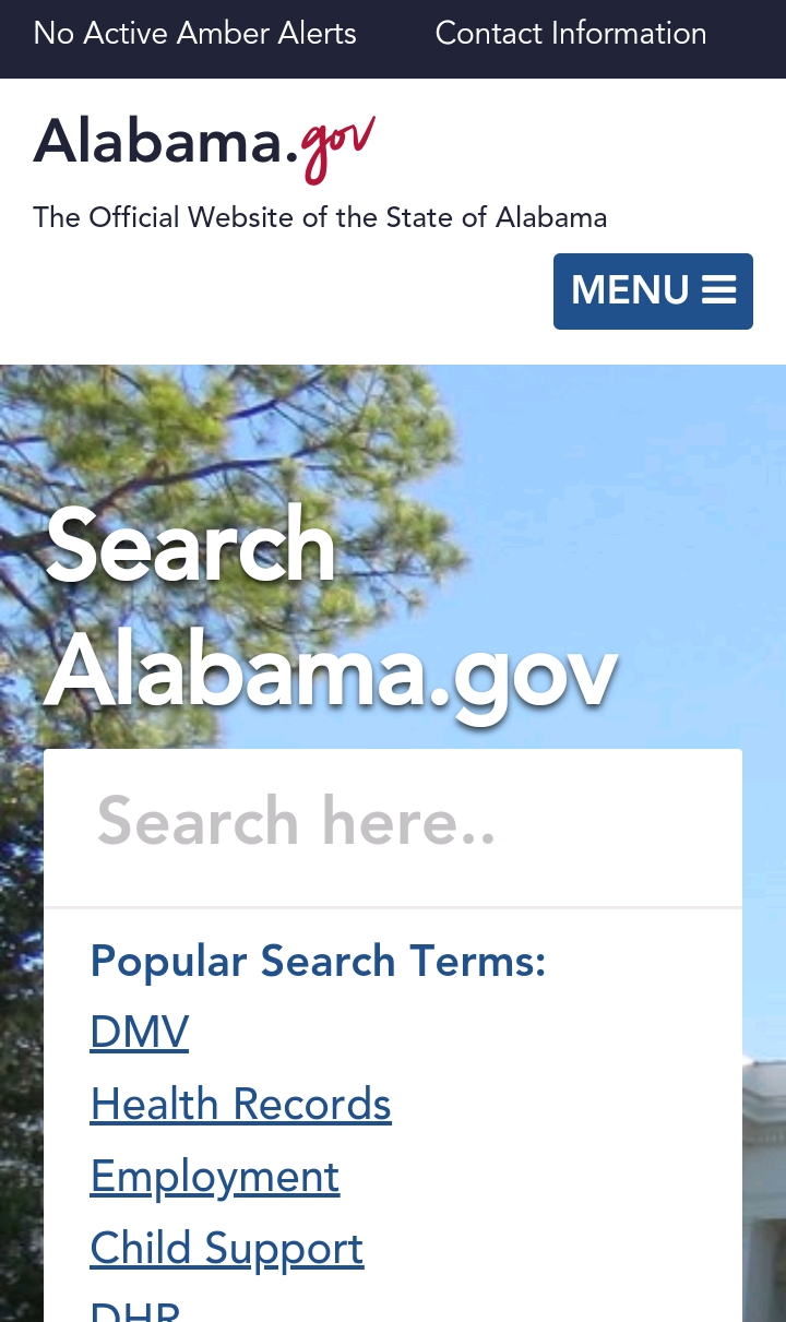
To see the difference, let’s analyze Alabama’s landing page for smartphones. The single-column layout makes it much easier to use compared to the previous site.
Be Concise in Your Copy
When creating a mobile version, think about how users will engage with your content. Here are several points to consider:
- use a headline that is specific and short;
- make sure that your headline contains a unique value proposition;
- add a subheading, if necessary;
- ensure that your written copy is clear, concise, and to the point;
- use bullet points to highlight the key points and draw customer’s attention;
- ensure that your sentences and paragraphs are short not to overwhelm a user with too much information.
Here is an excellent example of Mouseflow’s mobile landing page. This site uses a clear headline that conveys the main message of this service, short sentences to describe the benefits of Mouseflow, and an easy-to-tap CTA button that offers a freebie.

Optimize Forms for Mobile Devices
If you want to collect information about customers who use smartphones to visit your website, it is critical to optimize forms for mobile devices. You need to:
- write a headline that makes a user click;
- ensure that the form includes the minimum required fields (name, address, email, phone number) to achieve your goals;
- avoid using images as they take up a lot of space;
- make sure that the form loads fast;
- create an easy-to-tap ‘Submit’ button and keep in mind that 44x44 pixels should be the minimum size you use;
- implement drop-down menus and auto-selected answers to save customers’ time;
- specify the required fields;
- use vertical alignment for the fields of your form to fit the screen of a mobile device.
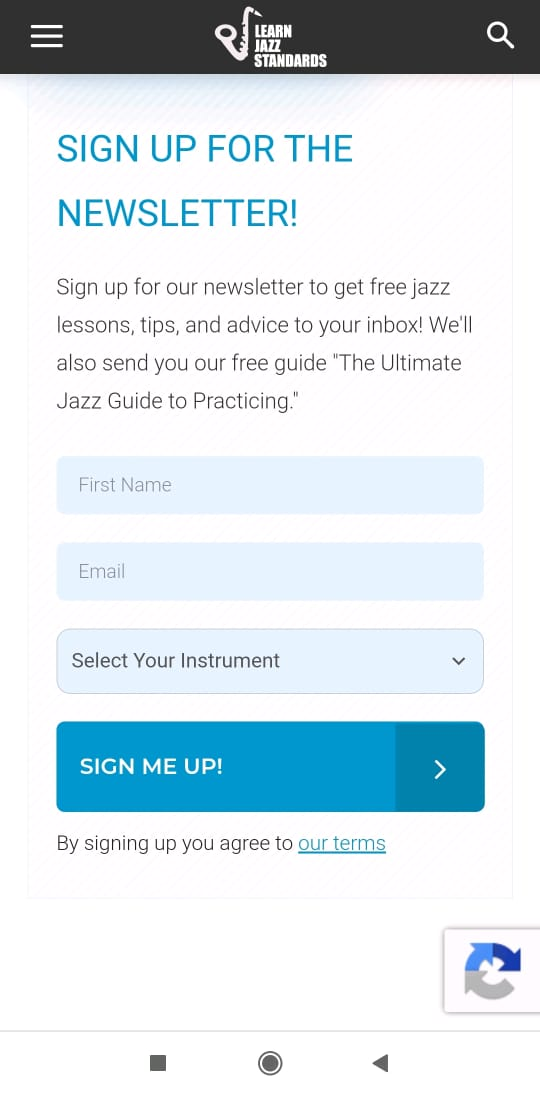
Here is a great example of an optimized form from Learn Jazz Standards.
Add a CTA Button
A call to action button is an essential element for helping users decide to take an action. The minimum size of this button for a mobile device is 44 x 44 pixels. According to the Gutenberg Principle, users start scanning the page at the top left corner and finish at the bottom right. That is why the best place to add a CTA button is at the end of the visitors’ scanning path when they get acquainted with your content. This button should contrast with the background to be visible and big enough for a user to click.
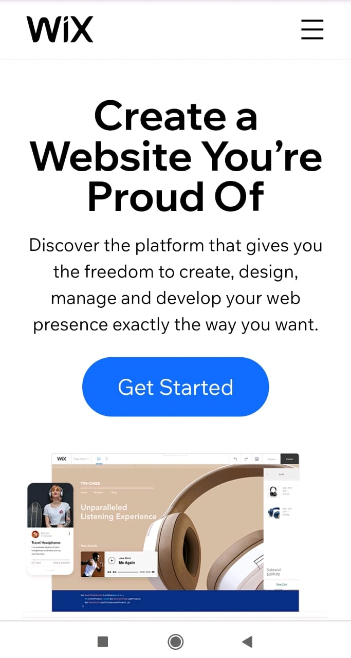
Here is an example of a Wix’s CTA button that is easy to click and is placed after the copy.
Consider Load Time
Speed is very important for smartphone users. You risk losing your audience just because your mobile landing page user interface is slow. According to Think with Google, as page load time goes from one to three seconds, the probability of bounce increases by 32%.
If you want to check the speed of your landing page, you can go through a Google Speed Test to receive a report on your page’s performance and some suggestions to optimize the site. This tool indicates things that are slowing down your site. Remove anything that you don’t need from this list. Here are the main steps you need to follow to increase your mobile landing page speed.
- Reduce your content. The fastest way to make your page load faster is to remove the unnecessary elements. Take into account that visual content weights a lot. Moreover, images take up 20% of web page weight and each creates an HTTP request. These requests go from the user’s browser to form the elements of your landing page. As a result, the speed of your site slows down.
- Optimize images. To increase the load time of your page, you should make sure that your images are at least under 800KB and consider the format of images on your page. Compress visuals using special tools. However, remember that when you use JPEG, you can get lower visual fidelity but a smaller file after compression. At the same time, PNG won’t change visually but will be larger in size after compression.
- Transfer videos to a third-party platform. If you have videos on your mobile landing page, they can slow down the speed of your page. That is why you should give a thought to moving them to platforms like YouTube, Vimeo, or Wistia to help your page load faster.
Examples of Mobile Landing Pages
Every brand should have a good landing page for mobile devices as it takes milliseconds for a user to decide whether or not to make a purchase. If customers like your mobile landing page, they will engage with your store and finally make purchases.
Here are some excellent landing pages for smartphones so that you can get an idea of how to create a good page for your brand as well.
Mahabis Slippers
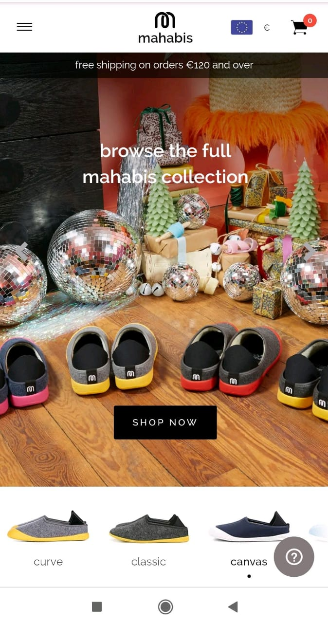
Mahabis provides a wide range of slippers ‘designed for comfort and made for adventure.’ You can see their mobile landing page below. The first thing to note is that the brand relies heavily on visuals and it is very striking. There is no doubt that Mahabis passed the shopper’s test for grabbing attention within 50 milliseconds.
Here is an example of a page where everything is clear and visible. When users open Mahabis’ site from a smartphone, they find out about free shipping without scrolling down. Also, customers can select a currency, go to their cart, or start shopping immediately by clicking the ‘Shop Now’ button.
Fronks
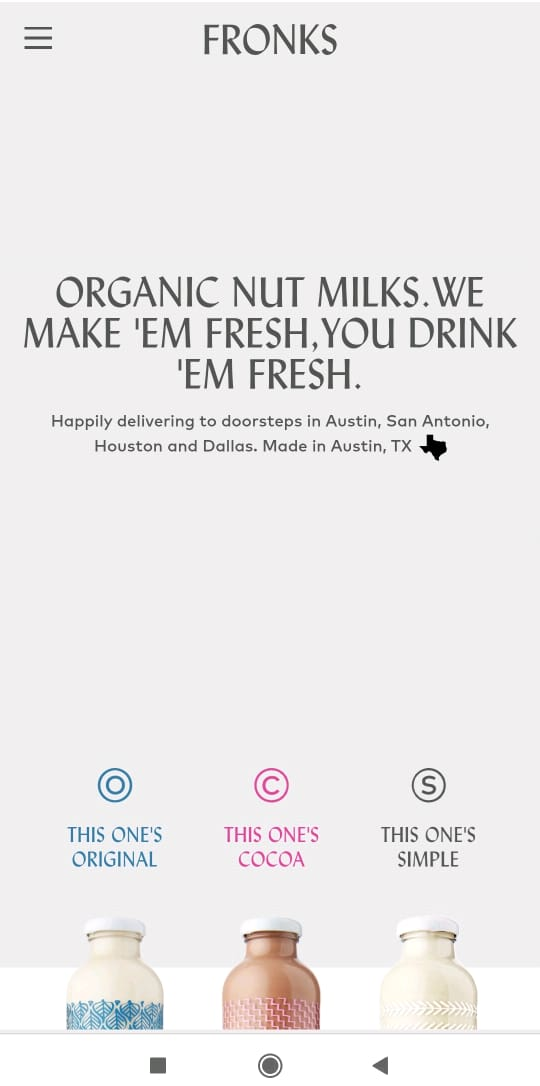
Here is an example of a brand that offers organic nut milk and provides customers with delivery. You will appreciate its landing page that contains the information necessary for buyers and is minimalistic in design. Also, Fronks’ landing page has a short and clear header explaining what they offer.
Jack Wolfskin
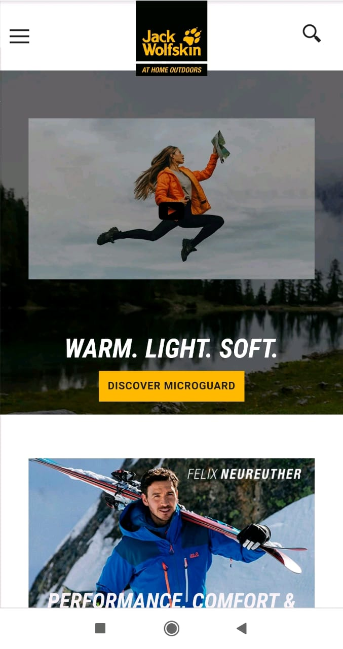
This brand of outdoor wear and equipment is known worldwide and you can learn a lot from its mobile landing page. When opening the site, the first thing you pay attention to are visuals that demonstrate products for hiking, trekking, mountain sports, winter sports, and everyday clothes.
To be concise and clear, Jack Wolfskin’s landing page includes words to convey the key value proposition, whitespace to give room for customers’ eyes, and a call-to-action button that is easy-to-tap.
Ace Hardware
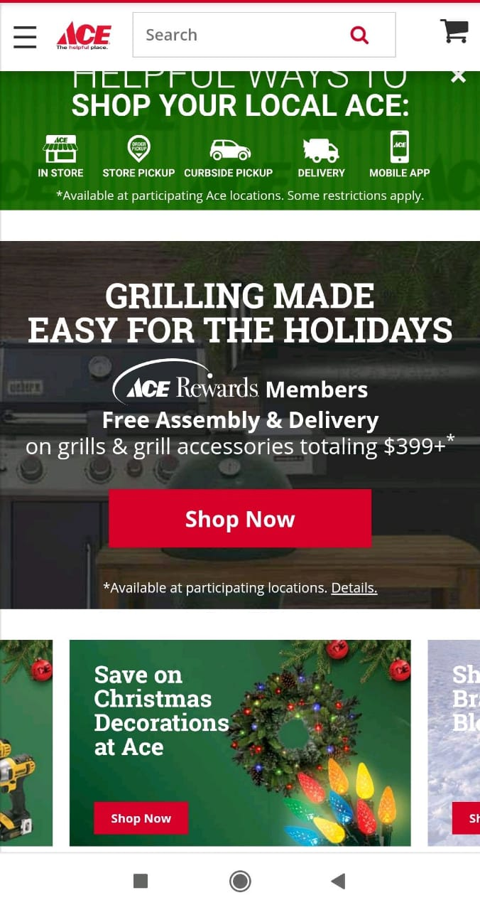
Ace is the world's largest hardware retail cooperative that has a lot of customers. That is why it is essential to provide their customers with the opportunity to buy online, especially from their smartphones.
Here you can see an example of Ace Hardware’s mobile website. If users open this page, they will find out how to shop at their local Ace, free assembly and delivery for Ace Rewards Members. A customer can also go to their cart, or shop right away by clicking the ‘Shop Now’ button.
Monki
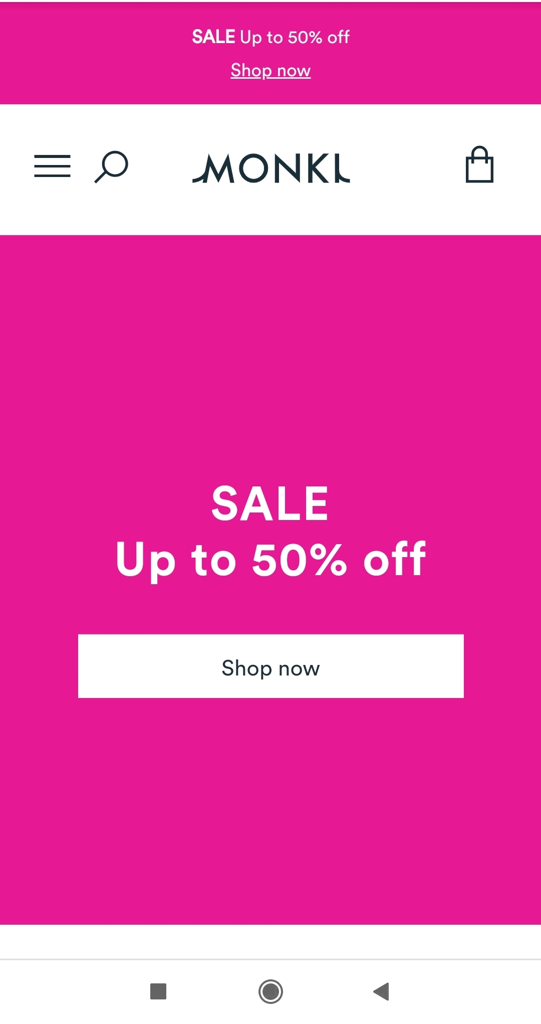
Monki is a brand that offers stylish clothes at competitive prices, aiming to be kind to the world. This company not only has great clothing but also a great mobile website.
After you open Monki’s landing page, you can directly go to your cart, or shop right away. As you can see, Monki uses white space and short phrases not to overwhelm their customers.
6 Mobile Landing Page Best Practices
- Implement Click-to-Call
- Set Sticky Navigation
- Use High Contrast Colors
- Limit the Number of Visuals
- Reduce Taps
- Consider Using White Space
Let’s get into these best practices to design a mobile landing page that attracts customers and allows you to increase conversions.
Implement Click-to-Call
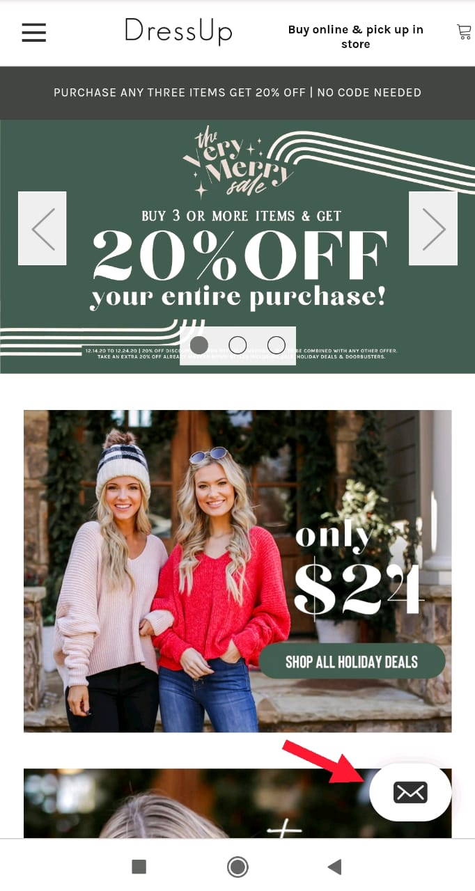
If some data about your products or services isn’t easily accessible for a user of your mobile landing page, you should provide your contact information. To this end, you can use a click-to-call button. Place it so that a button is visible for your customers.
Often, mobile users want to receive information right away. If they can’t find it on your mobile landing page, they can try to reach you by using the call-to-contact button.
Here is an example from Dress Up. A user can click this button to send a message to the brand.
Set Sticky Navigation
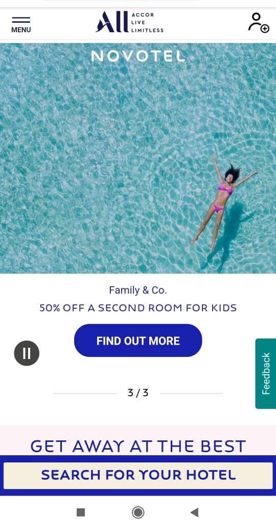
Sticky navigation is a fixed navigation menu that remains visible on a mobile landing page even when a visitor scrolls down. It helps simplify the process of browsing by providing menu access that is always visible. They don’t only ensure that customers don’t get lost but also build brand recognition by maintaining a logo always visible to visitors. Data shows that sticky menus are 22% faster to navigate which is crucial for mobile pages.
Here is an example of sticky navigation on Novotel Hotels website. The menu remains even when a user scrolls down.
Limit the number of visuals
Informative and interesting images play an important role in attracting customers. That is why it is critical to use them for a mobile landing page. However, you should be careful with them not to overload the design with too many images.
Excessive visuals can cause several problems for your visitors, they:
- weigh a lot and take a long time to load;
- make mobile users feel overwhelmed;
- make your mobile landing page feel cluttered.
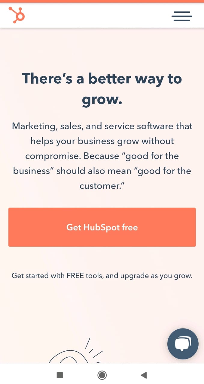
Here is an example from HubSpot, that demonstrates that a page shouldn’t always contain images to be visually appealing.
Reduce taps
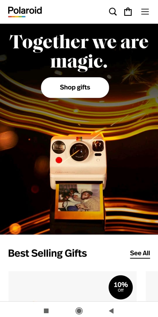
If mobile users are looking for a particular type of product, for sure they want to narrow the search to find a product as soon as possible. Your responsibility here is to facilitate the process and provide a narrow search. Create a mobile landing page so that a shopper doesn't have to make many taps.
Polaroid offers visitors to see the best selling gifts. This landing page also has sections for different types of products.
Consider Using White Space
To create a page that is suitable for smartphone screens, you should consider using white space. It makes a text easier to perceive; highlights important elements, such as a call to action button, particular phrases, or sentences — attract customer’s attention, improve readability and comprehension.
There are two types of white space:
- micro covers space between lines, paragraphs, and grid images and influences reading speed and comprehension;
- macro surrounds the design layout, covers the space between content blocks.
White space helps you highlight important elements, gives eyes room to read a copy, see images placed on a page, and allows minimizing accidental clicks.
Here is a great example from Wix which uses white space on their mobile landing page to make it not overwhelming for users.
A mobile landing page is a web page built for mobile browsers that opens when a user clicks on a search result or an ad via smartphone. This page should have one goal, one call to action, simple navigation, and design. It has a conventional goal and makes a user perform a desirable action.

As the number of mobile users is constantly growing, it is essential for every brand to provide a better user experience for those who use smartphones to shop. Designing your site for mobile devices allows you to improve the user experience with your company.
References:
- The article “15 Mobile Landing Page Best Practices Proven To Get Big Results” on the Optinmonster blog defines the term and conveys the mobile landing page best practices.
- The article “7 Mobile Landing Page Examples You’ll Want to Copy in 2024” provides 7 mobile landing page examples with visuals.
- The article “Mobile Landing Page Examples That Seriously Set the Bar” on Unbounce blog provides best practices and best mobile landing page examples.

or