Advancements in technology have paved the way for a world dominated by bright and airy designs. As a result, we encounter white backgrounds almost everywhere on the internet and in apps. However, times change, and it appears that black is making a comeback.
According to a survey by Narola Infotech, an overwhelming 95% of respondents expressed a preference for dark mode. This feature is not limited to social media apps and websites only. Marketers have taken notice of this growing trend and begun considering email dark mode for their campaigns. If you’re too contemplating trying it out, you’re in the right place to find out more.
What is email dark mode?
Dark mode transforms the color scheme of your device, typically reversing the traditional appearance of white backgrounds with black text to black backgrounds with white text. Similarly, email dark mode refers to a visual display option that allows users to view their emails with a dark or black background, often accompanied by lighter-colored text.
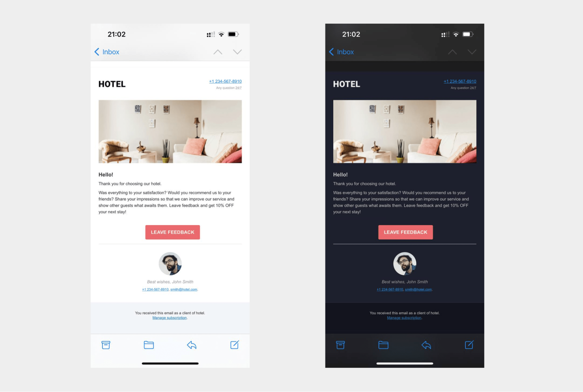 The difference between light and dark mode emails
While the term itself may be relatively new, the concept is not a recent development in computer technology. As early as the 1970s, dark mode was the default computer setting. Almost 50 years later, Android and iOS introduced their dark settings, too, allowing users to select a dark theme in email clients.
Why is dark mode so popular?
Dark mode has gained immense popularity for several reasons. Here are some of them:
- Aesthetics. Dark mode offers a sleek and stylish visual appearance that is appealing to many users. The dark color palette and light-colored text and elements create a high contrast and make the content stand out.
- Reduced eye strain. Dark mode can potentially reduce eye strain, particularly in low-light or nighttime environments. In some cases, dark mode can help alleviate eye fatigue and make it more comfortable to view the content for a longer time.
- Battery savings. Dark mode can contribute to energy efficiency, specifically on devices with OLED (Organic Light-Emitting Diode) displays. This type of screen individually illuminates each pixel, and when displaying black or dark colors, less power is needed.
- Focus and attention. Dark mode may minimize or eliminate screen flickering and potentially increase focus. The darker background allows the content to take center stage, reducing peripheral distractions and improving readability.
Other benefits may vary depending on individual preferences and device characteristics.
Which clients support dark mode emails?
The support for the dark mode feature in email clients can vary, much like any other email feature. It’s important to know the email clients currently offering support for dark mode emails. Some of these clients include:
- Apple Mail app for iOS 13 and macOS;
- Gmail app for Android and iOS 13;
- Outlook app for iOS 13;
- Outlook 365;
- Outlook macOS;
- Outlook Windows 10;
- Outlook.com.
Since each email client employs different methods of converting emails into dark mode, it’s crucial to note that dark mode emails will not appear the same in every client. Here are some common techniques used:
- Converting transparent backgrounds. When an email has areas with transparent background colors, certain clients will convert them to darker shades. In the absence of an explicitly set background color, users will see a dark background to maintain readability.
- Automatically-inverted background colors. Some dark mode-supporting clients detect light backgrounds and automatically convert them to darker colors. This ensures a consistent visual experience.
- Inverted text colors. Clients that invert email background colors will also invert the text colors to maintain contrast. This prevents the text from blending into the background and maintains readability.
- No automatic changes. Some dark mode-supporting clients do not automatically convert emails into dark color schemes by default. However, they support email creators who want to customize and optimize the appearance of their emails.
All in all, not all email clients convert emails into dark mode if chosen in settings. Some of them do provide minor or major changes. By understanding these different approaches, email creators and marketers can better adapt dark mode email designs to ensure a user-friendly experience across various email clients.
How does dark mode affect your email deliverability?
Some email clients don’t automatically optimize image-based email elements like logos and images for dark mode. It results in unappealing and hard-to-read emails and leads to a negative user experience.
Subscribers who prefer dark mode won’t bother trying to read a poorly formatted email. Instead, they’ll either ignore, delete, or mark them as spam, all of which can harm your email deliverability. However, ensuring your emails look their best even in dark mode increases the likelihood of readers engaging with them.
Things to pay attention to while designing dark mode emails
The probability that some clients on your mailing list are fans of the dark mode is pretty high. That’s why you might want to consider how your emails will appear in both light and dark themes to provide the best possible user experience.
Here are some tips that will help you create stunning dark mode email templates:
- Optimize your brand logo. While designing dark mode emails, it’s essential to remember this feature’s impact on your logo. Optimize it by adding a translucent outline to ensure it displays correctly in dark mode, and ensure that the background of your logo is transparent.
- Switch JPGs for PNGs. The background topic is also relevant to the rest of the pictures in your emails. While JPGs take up less space and help emails load faster, they retain white backgrounds in dark mode, resulting in unsightly white boxes around images. Stick with PNGs for all your images, as they support transparency and go well with dark mode emails.
- Increase padding around non-transparent images. If you must include non-transparent images in your emails, add padding around the cropped area to create a smooth transition between the image and dark mode email backgrounds. This ensures better visibility of the images and overall aesthetics.
- Update individual email elements. Also, consider reviewing design elements like icons and CTA buttons to ensure they retain their visual appeal in dark mode. Colors that appear too saturated in dark mode may need to be adjusted, and vice versa.
- Use fewer colors. Try to establish a color palette for your emails and minimize the number of colors used. This will result in a reduction in the variations when switching between light and dark modes.
- Test dark mode email appearance. Testing is crucial for designing dark mode emails. Preview and test your emails before sending them to your customers. After that, you can fix any issues if needed and ensure everything works as intended.
As you can see, there are a few details to pay attention to. It is important to think these details through while designing an email. After that, you can adopt it for both dark and light modes without much effort.
Examples of dark mode email design
From elegant and minimalist layouts to bold and vibrant templates, there are many opportunities to design a dark mode email. These five examples showcase how dark mode can create a visually appealing journey for recipients.
Student Beans
The first example is from Student Beans, featuring a dark mode email with a minimalistic design. The email showcases a sleek aesthetic, featuring a black background that sets the stage for a striking contrast with the contrasting colors. Note how the email incorporates visible elements such as emoji and crisp graphics, helping enhance readability and guiding the recipient’s attention to important information and a CTA.
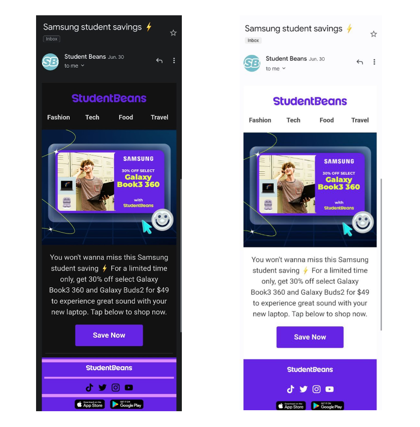 An example of a dark mode email from Student Beans
Yves Saint Laurent
One more example is a newsletter from Yves Saint Laurent. At its core, the email features a dark background that serves as the perfect canvas for a logo adorned with a subtle white outline. This clever use of contrast not only ensures the logo stands out prominently and is readable but also adds a touch of elegance. To further amplify its impact, this dark mode email incorporates an image that effortlessly transitions between light and dark modes.
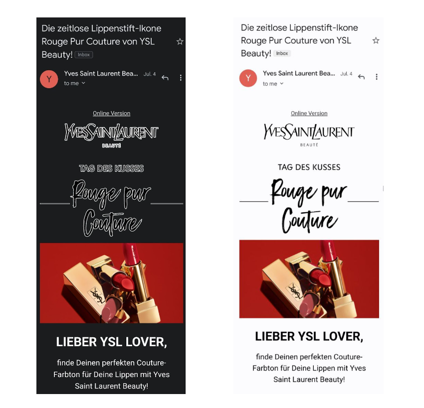 Dark mode email design with a white logo outline
La Biennale
Some emails strip away visual distractions and rely solely on text to deliver their messages. This dark mode email captivates with its minimalistic approach. To ensure key points resonate, bold and italics are employed, highlighting essential keywords that demand attention. This intentional use of different formatting styles guides the reader’s focus and emphasizes the core message that stands out in both light and dark modes.
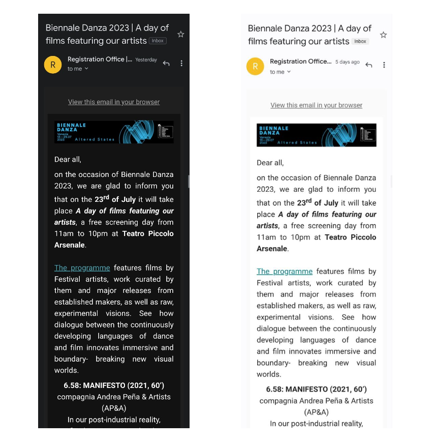 A text-based dark mode email
Uber
Here is another example from Uber that seamlessly adapts to your visual preferences. This email incorporates an image whose background color adjusts based on the selected light or dark mode, ensuring a harmonious look. Whether it’s a light mode or dark mode email, the image effortlessly blends in. With barely visible padding, the CTA button also stands out, inviting recipients to take action. The code field boasts different background colors in different modes, ensuring a cohesive design.
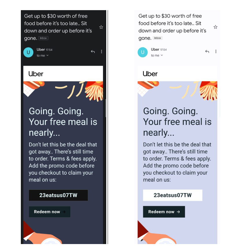 A dark mode email template from Uber
Miro
The email newsletter from Miro features a thoughtfully crafted design that seamlessly adapts to different modes. It incorporates white padding around stickers, creating a striking contrast against the dark background while ensuring a harmonious visual appeal in both modes. Basically, all design elements have been well thought through to suit both light and dark email modes. The logo is positioned on a white background; however, its round edges make it look neater.
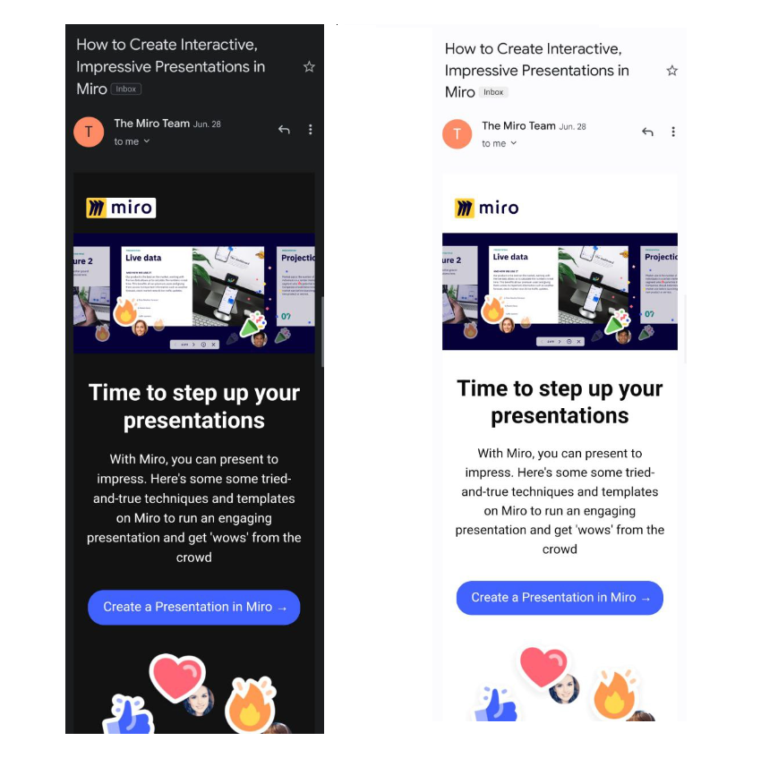 Miro’s dark mode email template
Don’t let dark mode emails intimidate you when it comes to their development and design. By putting in the effort to carefully create your emails, you can ensure they look fantastic and remain visually appealing, whether in dark or light mode.
How to create a dark mode email template in SendPulse
Making your emails and templates dark mode-friendly doesn’t have to be difficult. If you wish to create emails that can be converted to dark mode, you can seamlessly do it in SendPulse.
Follow these steps to set up a dark mode for your email template:
- Open your dashboard in SendPulse and navigate to the “Email” section. Select “Email templates.”
- Choose the “HTML editor” and create a custom email template.
- Look for the “Source code” icon to open the source code editing window.
- Add dark mode meta tags. They will signal to email clients that your email dark mode is available.
- Customize the style of your dark mode email. In SendPulse, you can specify, for example, text color or any other settings you want to modify. Save your changes in the HTML editor.
And just like that, you can add a dark mode option to your email template. For more detailed instructions, feel free to visit our knowledge base.
The bottom line
Email dark mode has gained widespread popularity since its inception. To ensure that your emails are well-received by your subscribers, it’s essential to optimize them accordingly.
While it may initially present some challenges and require adjustments, a good user experience is worth it. With SendPulse, you can easily create an email newsletter from scratch suitable for both dark and light modes or adjust existing ones accordingly.