As long as your product is of the highest standard, it doesn’t matter how you carry your business — your target audience will choose you over the competition regardless. Substance over form, right? Actually, no — this approach is becoming less and less applicable to the modern business realm. As markets are getting more competitive, every little thing that can differentiate your business from the crowd matters.
Nowadays, you need to pay close attention to strengthening your branding, and the very first thing a potential customer learns about your brand, the logo, is a good place to start.
In this post, we’ll share the top seven signs of a good logo and uncover how to make a logo that will set your brand apart from the competition.
Tell-tale signs of a great business logo
A good logo is essential to any business: it grabs attention, makes a strong first impression, lays out the foundation of your brand identity, differentiates you from other businesses, raises brand awareness and brand recognition, and… is expected by customers.
Essentially, it’s the thing that can either make or break your business in the increasingly competitive environment of the Great Resignation era accompanied by the rise of entrepreneurship.
A bad logo, on the other hand, doesn’t only fail to help you achieve the aforementioned goals but can actually hinder the growth of your business and ruin your brand image. A poorly made logo is almost guaranteed to drag down other aspects of your business design.
Let’s talk about how to distinguish between the two and how to make sure your brand is on the right track.
Great business logo sign #1: It tells the story of your brand
If you aren’t sure where to start the logo design process, start from the beginning. Create a mind map and lay out everything you know about your brand and everything you want your target audience to learn about your business just by looking at your logo, including your:
- brand voice;
- core values;
- brand mission;
- unique selling point, etc.
To better communicate your brand’s identity, answer the following questions before designing your brand logo:
- Who do you want to engage with your brand?
- What differentiates your brand from the competition?
- What is the emotion you want to trigger?
- If your brand were a person, who would they be?
- What’s the backstory of your brand?
- What is your brand’s aesthetic?
Ideally, you want all of these to both guide the final logo and reflect it. For example, if you’re a funky, edgy brand, you might want to go for visuals that share that with your audience via appropriate colors, imagery, fonts, etc.
Pro tip: Before drafting your logo, sit down and think about three adjectives that describe your brand best to get a better sense of direction. Then, create a mood board guided by those adjectives.
Here’s an example of a logo that definitely tells a brand’s story from a bread brand Sourdough Against the System.
 An example of a logo that tells a story from Sourdough Against the System
Just by looking at it, you immediately know what’s up: the image of two sourdough baguettes and five wheats (along with the text, of course) screams that the logo represents a bakery, while the positioning of the bread in a cross, the font choice, the grunge style, and the black and white color pattern give away that it’s a rebellious, not-like-the-rest business.
It communicates the brand story incredibly well! Which, unfortunately, can’t be said about the London 2012 Olympics logo. Back in the day, the public was polarized by it: some found it very quirky and interesting, while others couldn’t understand what it meant to represent and even found it ugly.
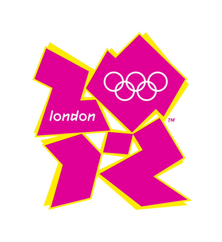 The London 2012 Olympics logo; source: Dezeen
Great business logo sign #2: It’s unique
There are way too many logo copycats and doppelgangers out there, even among famous brands. As a small business, you can’t afford your logo to be one of them, not when the competition is so high and so much is at stake:
- A logo that’s not unique is likely to get you a hefty lawsuit from the brand that patented it first.
- A non-unique logo will not differentiate you from the competition and, therefore, won’t let you enjoy the benefits of greater brand awareness and brand recognition.
- You will automatically inherit the brand image of the brand whose logo looks like yours (if it’s a brand with a bad reputation, the negative implications are obvious; if it’s a well-established brand with a great reputation, see p.1).
And even if you’re in the clear legislatively, using a logo similar to an already existing one can still affect your marketing. Just imagine how weird Mini Cooper’s ads must look for someone that confuses their logo with Bentley.
 A Mini Cooper logo on the left and a Bentley logo on the right
So, you need to create a unique logo that would make your brand more prominent in a cluttered marketplace and distinguish it from the competitors. To do that, you need to cover several bases:
- Do a thorough competitor analysis. Since you’re operating in the same market and even in the same niche, your direct competitors will be the brands telling a story as similar to yours as it gets. Study their logos to make sure you aren’t using the same “words” to tell your story. In fact, try to do the opposite of what your competitors are doing. For example, if all of them use rectangles in their logo design, go for circles.
- Conduct research to see if there are already logos similar to the one you’re looking to design. While it’s impossible to know about every logo to ever exist, modern AI technology is advanced enough to show you all the matches it can find.
- Step away from the obvious solution and explore alternatives. For example, if you’re a coffee shop brand looking to craft a logo, don’t even look in the direction of coffee beans and cups — these are a cliche. See if you can play around with more abstract concepts and use your logo to convey your brand’s mission or core values.
- Use a typeface that is less likely to be used by other brands. The easiest way to do this is to make your own font.
Great business logo sign #3: It’s instantly recognizable and memorable
One of the main purposes of creating a logo is to increase your brand awareness and brand recognition. For that to become possible, you need to make sure your logo evokes a clear association with your brand or the products or services you sell.
The easiest way to do this is to opt for a text-based logo that features your brand name. Now, there are different types of logos that allow for that: a wordmark logo like Google or Prada that includes your brand’s full name, a monogram logo like Louis Vuitton or CNN that shows the brand’s initials, or a letterform like Beats or McDonald’s that comprises of a single letter.
 Examples of text-based logos — CNN, Beats, and Prada
Alternatively, you can go for a pictorial logo that features an image closely associated with your brand name or your area of expertise, or a combination mark that includes both a pictorial and text. Apple’s logo is just… an image of an apple — you won’t be second-guessing the brand’s name when you see it, will you?
But it’s wrong to assume that only Apple-level brands can enjoy brand recognition thanks to their logo. Startups can leverage the benefits of a recognizable logo, too.
Here’s an example of a VistaCreate logo template with all the chances of getting recognized.
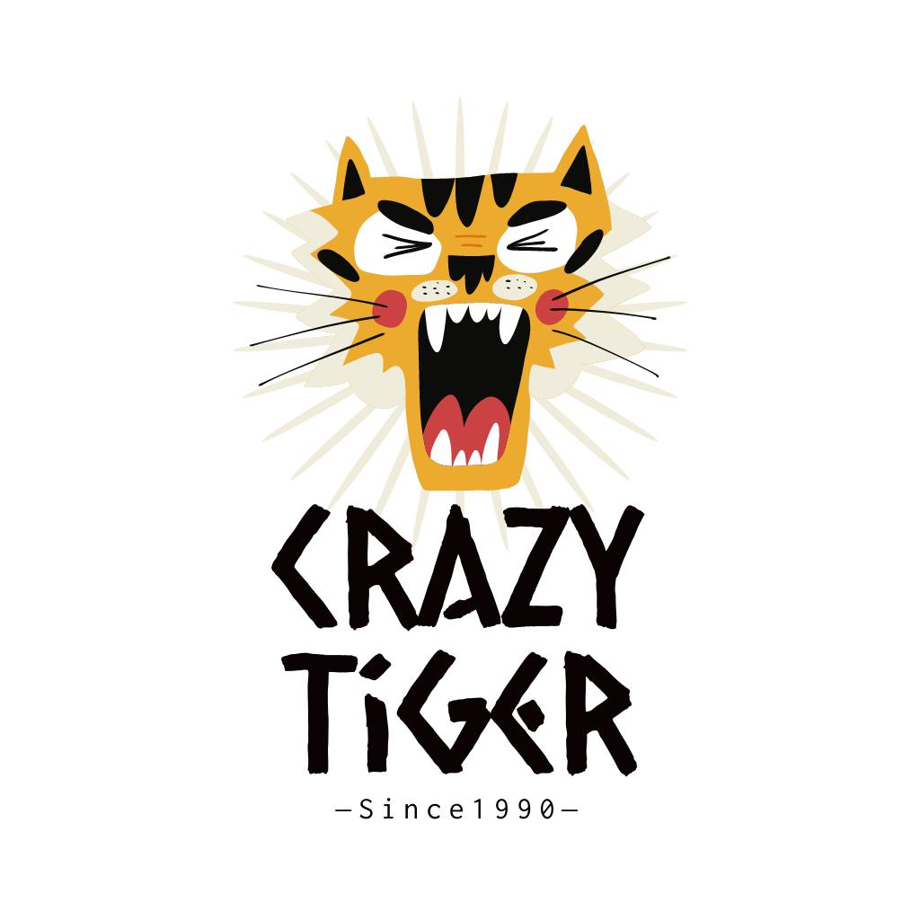 An example of a recognizable logo, where all the elements work towards achieving the same goal; source: VistaCreate
Every element of this logo is working towards achieving the same goal — to make people recognize the brand name of the business: a funny illustration of a crazy tiger, the font choice, and the brand name itself.
But creating a recognizable logo is only a battle half-won; you also want it to stick once it gets discovered. Take a look at the following logos:
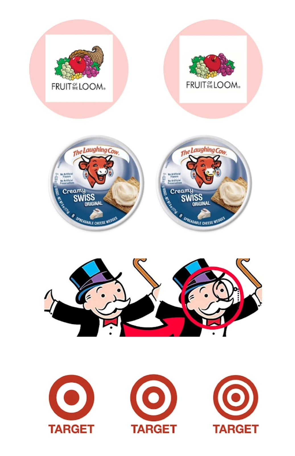 Examples of the Mandela effect in logos
Despite being very different visually and representing very different brands, these logos do have something in common: they’re all examples of the Mandela effect in action. A lot of people can’t recall the exact design of these logos correctly, so they’ve been doing rounds online, arguing whether or not the Fruit of the Loom logo features a horn, if The Laughing Cow has a ring or not, if the Monopoly man wears a monocle, and how many rings are there on the Target’s signature bullseye.
While there isn’t a clear answer as to why the Mandela effect occurs, based on these examples, we can assume that it’s more widespread among more complex logos that feature brand mascots or use detailed illustrations. Perhaps, people simply can’t remember the exact look of the logo well, and their brains come up with false memories.
On the other hand, Target uses a somewhat unconventional image of a bullseye; people are more used to it being depicted with several circles instead of just one. So, another factor that can contribute to the creation of the Mandela effect is portraying ordinary objects in an unordinary way.
And while you can try to follow in the footsteps of brands that capitalized on the Mandela effect, it’s definitely not a foolproof strategy. All the stars must align just right for your brand logo to (a) get remembered, (b) get remembered slightly incorrectly, and (c) for people to care about your brand enough to both spot the inconsistency between your actual brand logo and their memory of it and discuss it with others. Yeah, you’ll definitely be testing your luck with this approach — something small startups with limited budgets simply can’t afford.
But this approach still teaches us a valuable lesson on making a logo memorable. Just do the opposite of the aforementioned:
- Go for a K.I.S.S. (don’t roll your eyes — it’s an acronym!), aka Keeping It Simple and Straightforward. As a rule of thumb, the less complex and detailed your logo is, the easier it is to remember it.
- Use no more than four words or 30 characters.
- Stick to three or fewer colors.
- If you use images of real-life objects in your logo design, make sure you go for the traditional depiction thereof to avoid confusion.
- Achieve balance through clever use of color or placement of the logo features. Balanced, visually appealing logos are easier to remember and recall.
Great business logo sign #4: It’s relevant and resonates with your audience
Remember that one of the reasons you even create a logo for your business is to attract the attention of your target audience. Therefore, you need to look at the logo from the audience’s perspective; come up with something that would catch their eye and make them want to buy from you.
For that to become possible, you need to have a good understanding of your target audience:
- Who do you want to attract with your logo? What are they like?
- What do they like and dislike?
- How old is your target audience?
- Where do they live?
- What are the interests of your target audience?
- Do they keep up with trends?
On top of that, you should also have a good understanding of the industry logo standards. Otherwise, you risk creating something completely inappropriate for your target audience. An irrelevant-looking logo will most likely give audiences the wrong impression about your company and discourage them from buying from you. For example, if you’re designing a logo for a bank, don’t make it childish and overly bright.
Finally, you should ensure you are aware of your logo’s implications. Conduct thorough research to ensure you know the meanings behind every element you’re using in your logo. Remember that different age groups may perceive things differently, and certain symbols might have different meanings in different cultures.
For example, in 2022, many businesses that used the letter “Z” in their logo, including Zurich Insurance Group, have gone through an emergency rebranding. Because of Russia, the letter has become the 21st-century Swastika, and no one wants their business to be associated with such atrocities.
Great business logo sign #5: It’s versatile
When crafting your logo, you need to remember that it’s one of the most important parts of your branding that will be used on all your marketing materials, including your social media, website, print materials, merch, etc.
You need to account for all of those uses of the logo and come up with a logo design that’s scalable and flexible. To do that, imagine your logo in situ when designing it, and ask yourself the following questions:
- Can you use it over an image?
- Can you add a tagline to it?
- Is it going to work in black and white?
- Will it still be recognizable in print?
- Does it work really large or really small?
- Do you have an icon version for mobile devices or websites?
- If you make a product, does the logo work on labels?
Ideally, you should design several variations of your logo for different purposes. Here’s how Coca-Cola’s and Chanel’s logos transform depending on where they are being used.
 Responsive logos by Coca-Cola and Chanel
Another characteristic that falls into this category is timelessness.
Of course, it might be tempting to tap into current design trends when designing a logo and get an instant boost for your brand. At the end of the day, cutting-edge logo designs do attract a lot of attention, both from an audience that keeps up with what’s popular and online media that covers design trends on a year-to-year basis and needs real-life examples from brands to illustrate their points.
For example, this logo design by Bruno Fernandez has collected quite a few of this year’s hottest design trends: the chrome metallic effect, a nod to Y2K aesthetics, neo-tribals, and a strong, bold typeface.
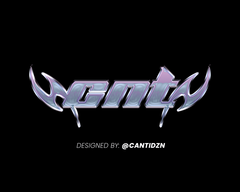 An example of a logo that’s trendy in 2022
In our books, it’s a masterpiece that perfectly reflects graphic design in 2022. The question is: will it stay relevant in a year? What about five years from now? Ten? Twenty?
When designing a logo, you should remember that trends come and go; and they do so fast. In fact, it’s been proven that the rate at which trends change is as fast as ever before, and it’s only going to accelerate in the future. Just a couple of decades ago, a micro-fashion trend’s cycle would typically last 3-5 years, and macro-trends would often last 5-10 years. However, today, things can go in and out of fashion in under a year. We live in a society of fast consumers that get easily distracted and equally as easily oversatiated.
And if you think the cycle will become so short it essentially vanishes, leaving the world with a fixed set of trends that stay trendy… Don’t fool yourself — even when old trends come back into fashion, they never replicate the original concept. Instead, borrow some of its qualities and build on it.
So, unless you want to rebrand every other season (which is extremely detrimental to your brand recognition, disruptive to your production line, and monstrously expensive), try to avoid abusing current design trends when choosing a style for your brand logo.
Here are some other tips that will help you create a truly timeless and versatile logo:
- Don’t use an image of a celebrity or a real person in your logo — many brand image risks are associated with the person’s reputation throughout the years.
- Opt for one of the classic typefaces.
- Go for a logo that can exist both in the real world and digital realm (especially since we’re going through the rise of NFTs and the Metaverse).
Great business logo sign #6: It utilizes color psychology
In the previous section, we discussed the importance of ensuring your logo isn’t too dependent on its color scheme. Nonetheless, you shouldn’t overlook the impact color can have on the perception of your logo and its success among your target audience.
Colors and combinations thereof can convey different messages and evoke various emotions, so it’s important to learn the meaning behind different colors.
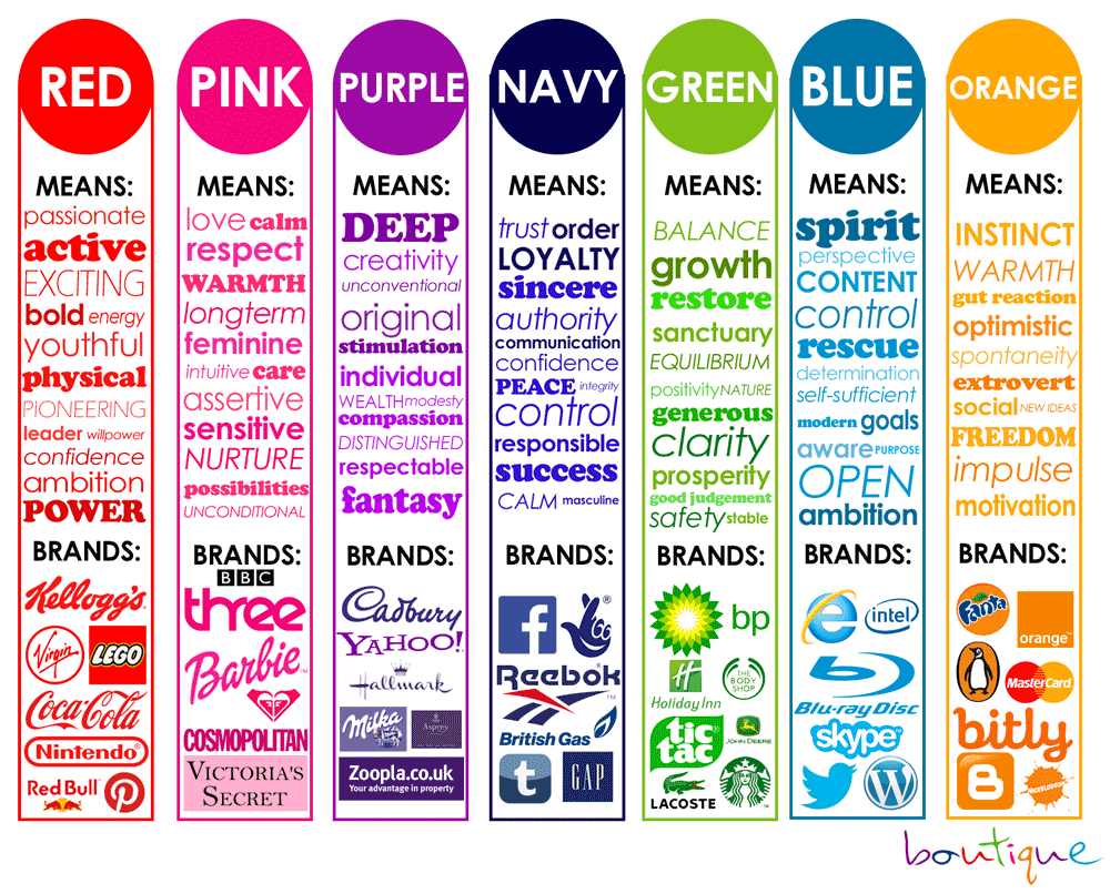 Meaning behind different colors and examples of brands that use them in their branding; source: Pinterest
Great business logo sign #7: It utilizes shape psychology
Color isn’t the only thing that can impact the perception of your brand on a subconscious level. Another thing you need to pay close attention to when designing a logo for your brand is the shapes you’re going for. The right choice of shapes for your logo can help communicate your brand’s story better, differentiate you from competitors, and even drive sales as different shapes can often forge a clearer emotional and psychological connection between your brand and the public.
To leverage the benefits of shape psychology, you need to know what each of the most popular shapes symbolizes and apply this knowledge to your logo.
Circles, ovals, and ellipses
Circles, ovals, and ellipses symbolize stability, continuity, and collaboration that is often perceived as welcoming, positive, and focused on a message of unity. It’s not rare for circular logos to convey a sense of femininity and harmony.
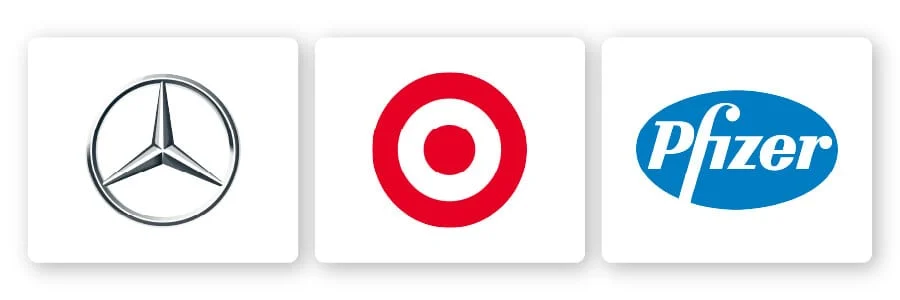 Logos that use circular shapes
Squares and rectangles
Squares and rectangles are often seen as a sign of reliability, robustness, boldness, balance, and timelessness. More than any other shapes, square logos are used to create a sense of order and confidence in a brand.
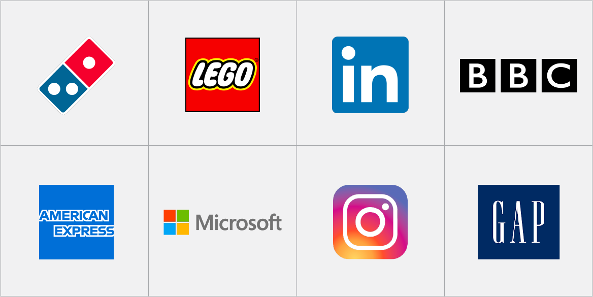 Logos that consist of squares and rectangles
Triangles
Similar to square and rectangular logos, triangles get used in logos to impart a sense of power, strength, energy, and more. However, they’re considered to be slightly edgier and more modern.
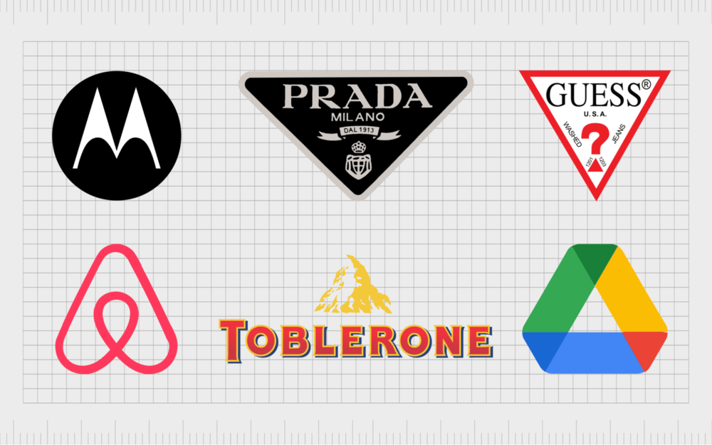 Triangle-based logos
Horizontal lines
Horizontal lines often showcase that the brand expands horizons and makes impossible things feasible. They are often used to convey a sense of motion and speed.
 DHL logo that uses horizontal lines
Vertical lines
These logos often get associated with calmness and tranquility; logos that use vertical lines are particularly popular among brands related to music and sound. Alternatively, vertical lines in logos (especially bolder ones) can be used to display a sense of strength and durability.
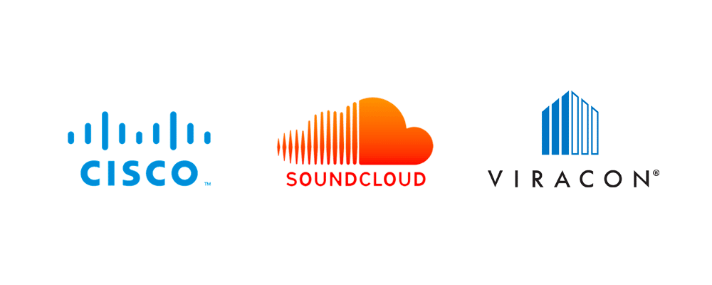 Examples of logos that use vertical lines
Curves
Curves are traditionally used in logos to present brands that focus on femininity in their branding and are strongly associated with movement, happiness, and positive emotion.
 Vaio is an example of a brand that has a curve-based logo
Spirals
The least common shape, spirals can underline your brand’s creativity, uniqueness, and ever-changing, progressing nature.
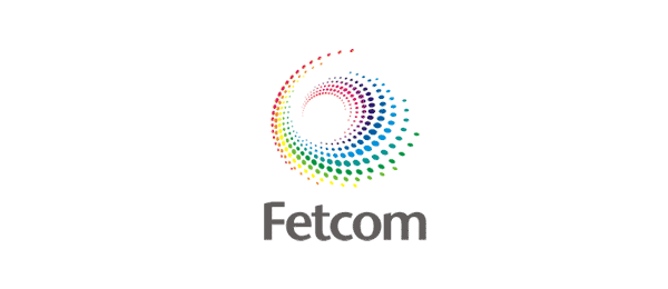 An example of a logo that uses spirals
A quick recap
Seven tell-tale signs of great logos later, you should have a much better idea of where you’re headed with your logo:
- Study your target audience to make sure you know what will resonate with them.
- Have a thorough understanding of what your brand is all about, including its story, mission, and core values.
- Analyze your competitors to make sure you’re not stealing anyone’s logo ideas.
- Create a logo that’s easy to recognize and remember.
- Consider different uses of the logo.
- Make sure you know the basics of shape and color psychology and actively utilize them in your logo design.
And remember, if you’re on a budget, you don’t necessarily have to splurge on an expensive designer to create a logo for your business. Today, there are numerous DIY solutions and online graphic editing apps that allow you to create professional-looking logos without much prior experience. All you need is an idea and a solid understanding of what makes a good logo!