Create your custom template
Using the email template builder, you can design emails by combining various ready-made elements. These elements help you effectively communicate key messages to your customers and enhance information delivery. Headings, buttons, images, videos, social media icons, and more enable you to create well-designed email campaign templates.
Key benefits of the email template builder:
- You can add any element to your email template by dragging and dropping it.
- Every element is editable — you can customize the color, style, size, and other settings.
- You don’t need any specialized skills or knowledge of HTML to create an effective email template.
In this article, we will talk about how to add and customize every element in the email template builder.
Select a layout
Email templates include text elements (such as plain text, headings, and links), media elements (such as images and videos), and section separators.
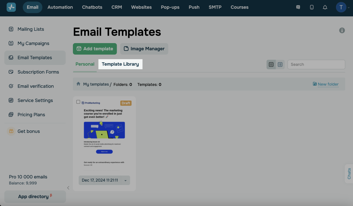
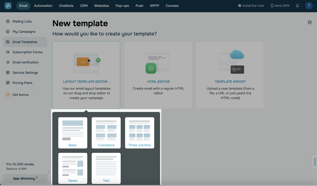
To start creating a template, go to the menu on the right and select Email Templates. Click Add Template and select Layout Template Editor.
You can also select a pre-designed template from the Template Library tab and edit it.
Select an initial template layout based on the number of columns and the default set of elements it includes.
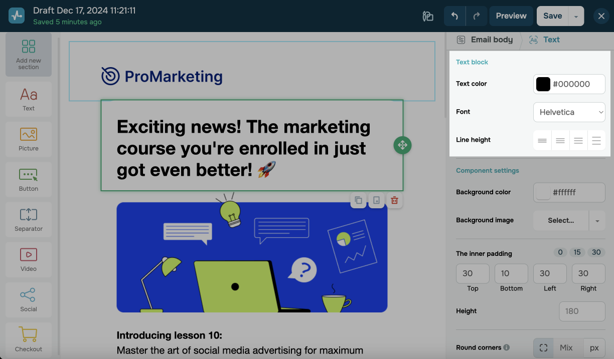
In the template builder, the sidebar on the left lists elements you can add to your email.

The panel on the right lists editing options for your selected element.
We recommend creating a dedicated layout block for every template element (e.g., Image, Text, Video).
The Text element
The Text element highlights key information or calls to action, includes text messages, descriptions, or instructions, and personalizes your content.
To add text to your template, drag the Text element from the sidebar on the left to the workspace. By default, it includes both larger and smaller text.
Editing text
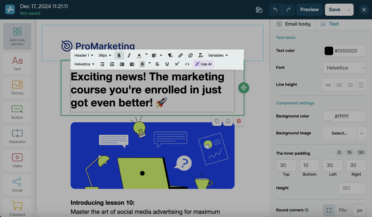
To edit text, click the text field. Highlight a piece of text, then use the toolbar to customize it.
You can customize your text using the following options:
| Text format | Select a text formatting option.
Paragraph applies to regular text. Headings 1, 2, 3, and 4 help break text into subsections and highlight key points. Typically used for email section titles. |
| Font size | Select a font size. |
| Text style | Select a text style option: bold, italic, underlined, strikethrough, subscript, or superscript. |
| Text color | Select a text color. |
| Background color | Select a text background color. |
| Insert/Edit link |
Add a link to the selected text or enter a link text. You can add and configure links to websites, email addresses, or phone numbers. If you collect statistics, tracking tags will be added to your links. Tracking links are valid for 1 year. Afterward, tracking stops and links become inaccessible. |
| List | Create a numbered or bulleted list with multiple lines of text. |
| Alignment | Select a text alignment: center, left, right, or justified. |
| Source code | Expand the source code of a text block to edit it.
See also: List of supported CSS and HTML attributes. |
In the editing panel on the left, you can configure the overall text style using the following options:
| Text format | Select a text formatting option.
Paragraph applies to regular text. Headings 1, 2, 3, and 4 help break text into subsections and highlight key points. Typically used for email section titles. |
| Text color | Select a text color. |
| Font | Select a font. |
| Line height | Select a line height. |
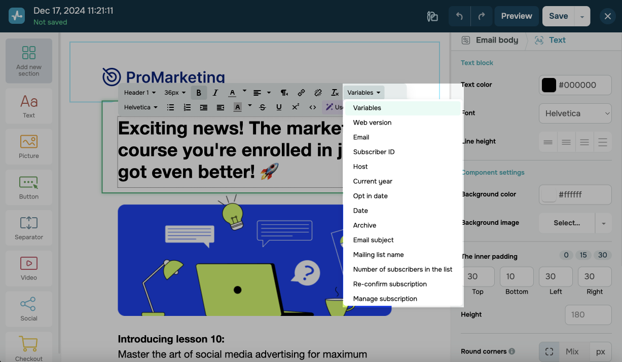
Adding variables
You can personalize your email for every subscriber using variables. In the editing toolbar, select Variables and choose a variable. You can select system or custom variables.
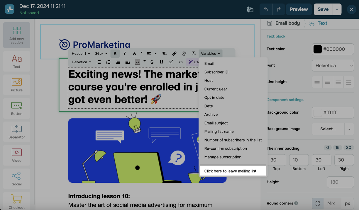
Adding an unsubscribe link
By default, every email has an unsubscribe link, but you can add it to your template to customize its style so that it matches your design.
Click your text element and go to Variables. Select Click here to leave mailing list from the list.
Read more: How to add an unsubscribe link.
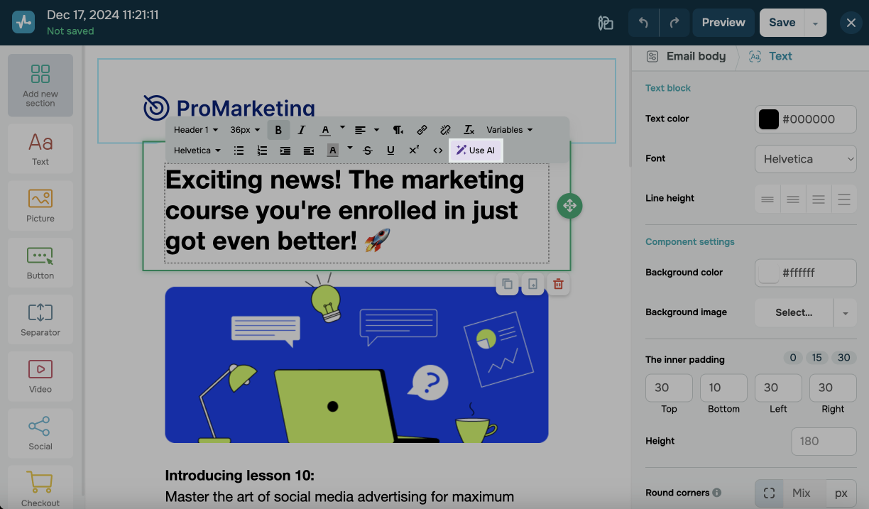
Enhancing text with AI
You can also improve your text using AI. Click Use AI, and select an option to enhance your text, change its tone of voice, or translate it into another language. To generate new text using AI, click Create New Prompt.
Learn more: How to improve or generate your email copy with OpenAI.
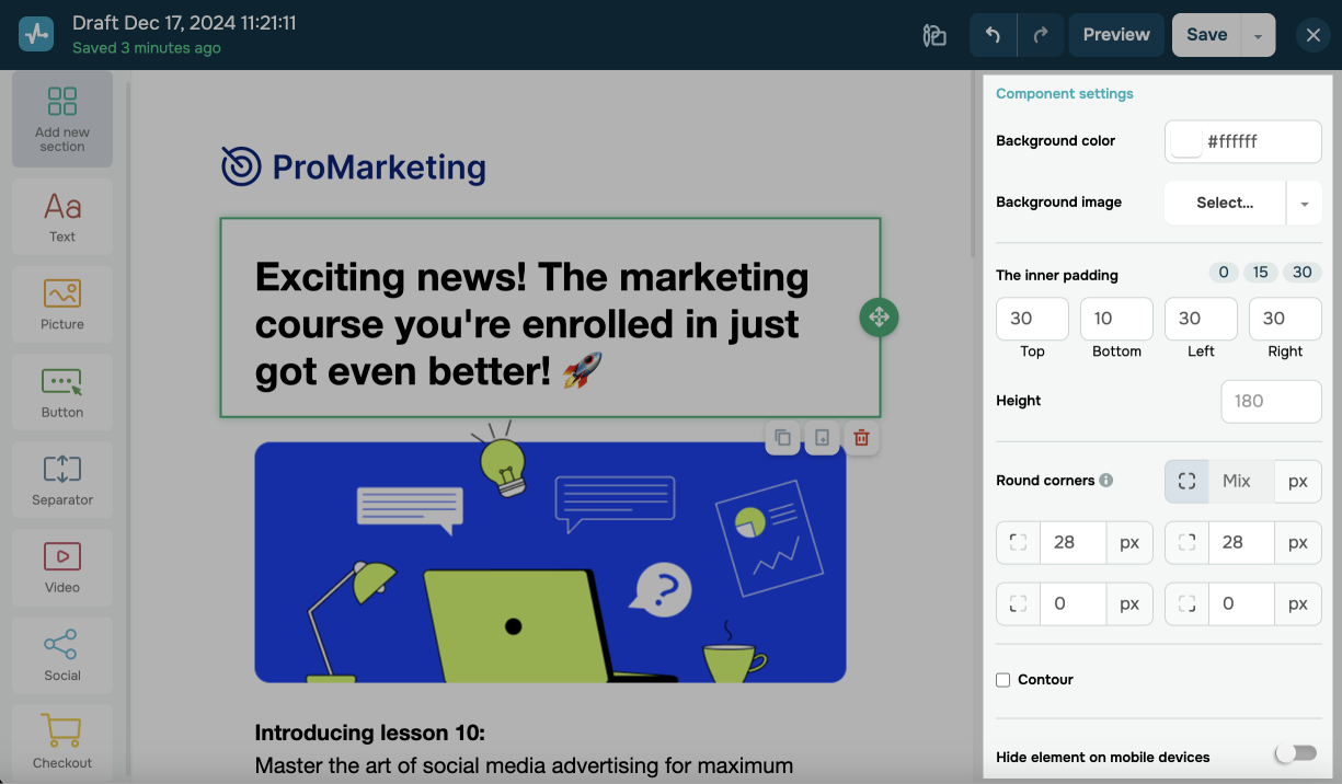
Customizing settings
You can customize the Text element in the Component settings section:
| Background color | Select a background color from the color palette, or type in a hex color code. |
| Background image | Select an available background image, or upload an image from the file manager. |
| The inner padding | Adjust the top, bottom, left, and right padding. |
| Height | Set a height value. |
| Round corners | Set a rounding value.
To make this effect noticeable, use different colors for the element background and email body. |
| Contour | Add an outline and adjust its thickness, style, and color. |
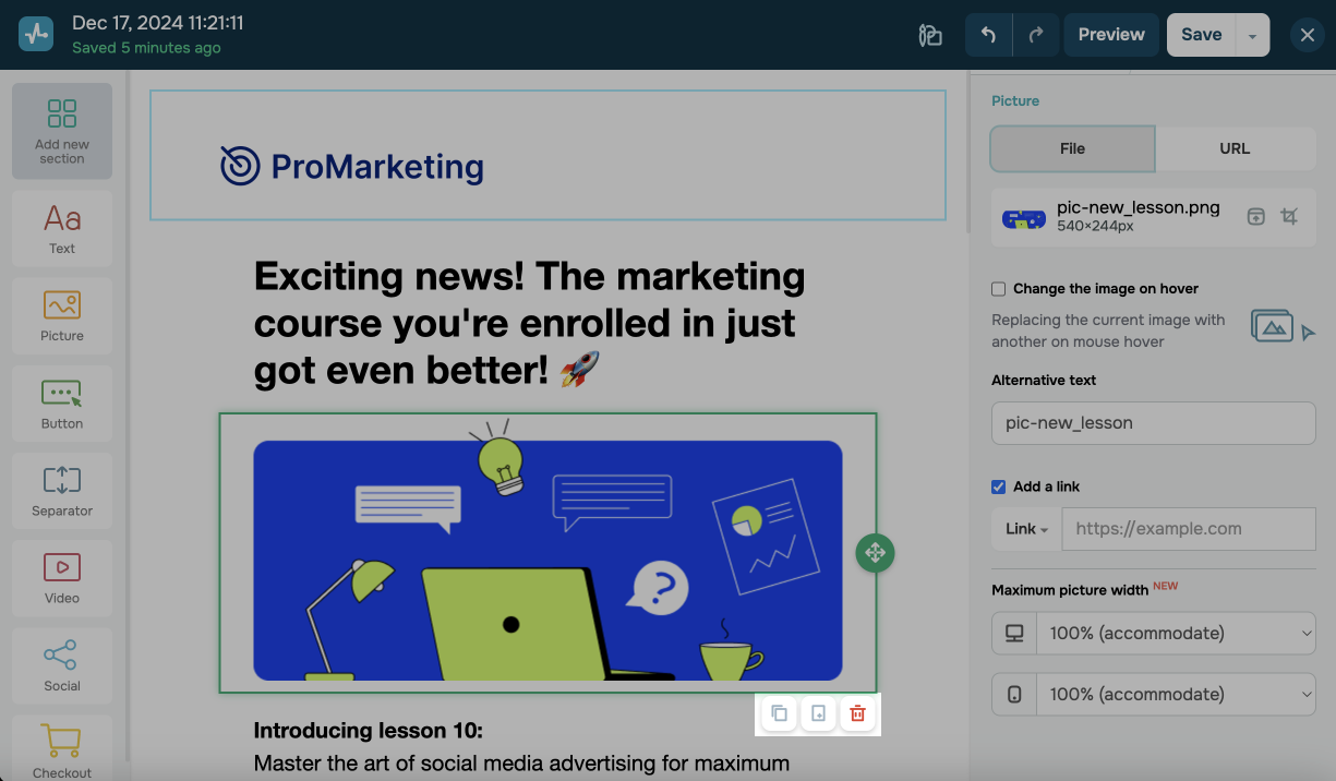
The Button element
The Button element enables users to follow links and contact you via phone number or email address.
To add a button to your template, drag the Button element from the left sidebar to the workspace.
Next, customize the button's text and link. Type in a button text, select a type (link, phone, or email), and add the required information.
| Link |
Used to insert a full link as If you collect statistics, tracking tags will be added to your links. Tracking links are valid for 1 year. Afterward, tracking stops and links become inaccessible. |
| Phone | Used to insert a phone number as +11111111111. By clicking such a link, users can call the specified phone number from their browser or device using built-in applications. We recommend using the international format when adding phone numbers so that applications can correctly determine call destinations. |
Used to insert an email address as user@example.com. We recommend checking your email address for typos so that website visitors can easily contact you. |

You can customize the button itself using the following options:
| Button style | Select a button style: flat, concave, or convex. |
| Button color | Select a button color from the color palette, or type in a hex color code. |
| Round corners | Set a rounding value. |
| Button height | Set a height value. |
| Button width | Select your button's width style: automatic, full-width, or fixed size, which can be customized or set manually. |
| Alignment | Select an alignment: left, center, or right. |
| Font | Set a font, font size, and text style: bold or italic. |
| Text color | Select a text color from the color palette, or type in a hex color code. |
| Alignment | Select a button text alignment: top, center, or bottom. |
You can customize the Button element in the Component settings section:
| Background color | Select a background color from the color palette, or type in a hex color code. |
| The inner padding | Adjust the top, bottom, left, and right padding. |
| Height | Set a height value. |
| Round corners | Set a rounding value.
To make this effect noticeable, use different colors for the element background and email body. |
| Contour | Add an outline and adjust its thickness, style, and color. |
If necessary, turn on the Hide element on mobile devices toggle to ensure your button is not visible on mobile devices.
The Separator element
The Separator element helps space out layout blocks within your template.
You can space out your content using the following options:
| Spacer | Set a spacer height. |
| Divider | Select a divider thickness, style, and color. |
You can customize the Separator element using the following options:
| Background color | Select a background color from the color palette, or type in a hex color code. |
| The inner padding | Adjust the top, bottom, left, and right padding. |
| Round corners | Set a rounding value.
To make this effect noticeable, use different colors for the element background and email body. |
| Contour | Add an outline and adjust its thickness, style, and color. |

If necessary, turn on the Hide element on mobile devices toggle to ensure the separator is not visible on mobile devices.
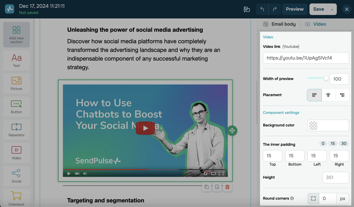
The Video element
The Video element adds YouTube videos to your email.
You can add and customize this element’s content using the following options:
| Video link | Add a YouTube video link. |
| Width of preview | Set the width of the preview, which users can click to access the video page. |
| Placement | Choose a preview alignment: left, center, or right. |
You can customize the Video element using the following options:
| Background color | Select a background color from the color palette, or type in a hex color code. |
| The inner padding | Adjust the top, bottom, left, and right padding. |
| Height | Set a height value. |
| Round corners | Set a rounding value.
To make this effect noticeable, use different colors for the element background and email body. |
| Contour | Add an outline and adjust its thickness, style, and color. |
If necessary, turn on the Hide element on mobile devices toggle to ensure the video is not visible on mobile devices.
The Socials element
The Socials element adds clickable social media icons linking to your profiles. You can add Facebook, X (Twitter), Instagram, and YouTube links.
The Checkout element
The Checkout element adds a checkout page link. You can also customize your product’s name, payment method, and other details that will be visible to users.
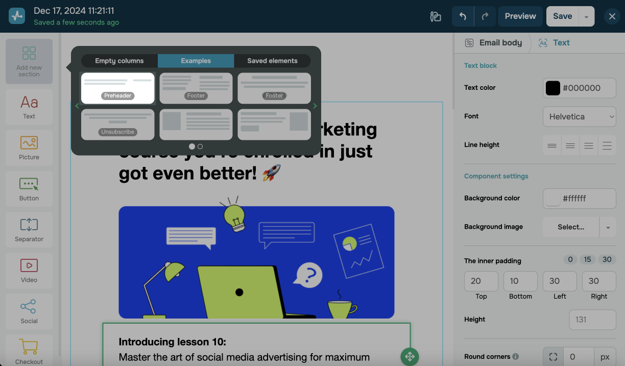
Pre-made sections
You can also create templates using ready-made sections. Every section is customizable, which helps build email templates quickly and easily.
You can edit text, add company details, and set the background color of any element in ready-made templates.
The Preheader section
The Preheader section adds an email preview text under the subject line. It helps capture recipients’ attention and encourages them to open your email, so make sure to keep it clear, concise, and engaging.
To use this section, click Add new section > Examples > Preheader, then drag and drop the element at the top of your template.
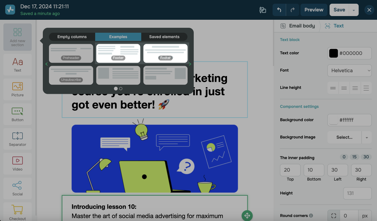
The Footer section
The Footer section adds text at the bottom of your email, typically including company contact information (email address, phone number, or website link), an unsubscribe link, legal information, and other relevant details.
To use this section, go to Add new section > Examples > Footer, then drag and drop the element at the bottom of your template. Edit its text and customize the settings.
Select a footer layout: a solid block or a two-column design.
Add your sender name to the {{ec_es_email_sender_company}} footer variable. To do this, go to Account settings > Company information and add it to the Company field.
The Unsubscribe section
The Unsubscribe section adds an unsubscribe link, which every email includes by default. If necessary, you can create more unsubscribe sections.
Adjust the mobile version
All templates you create using SendPulse's email template builder are responsive. You can also adjust your mobile template version separately by hiding certain elements.
To do this, select an element, go to its settings on the right, and turn on the Hide element on mobile devices toggle.
This option is supported by Gmail, but it may not be compatible with other email clients.
Read more: How to create responsive emails in the SendPulse template builder.
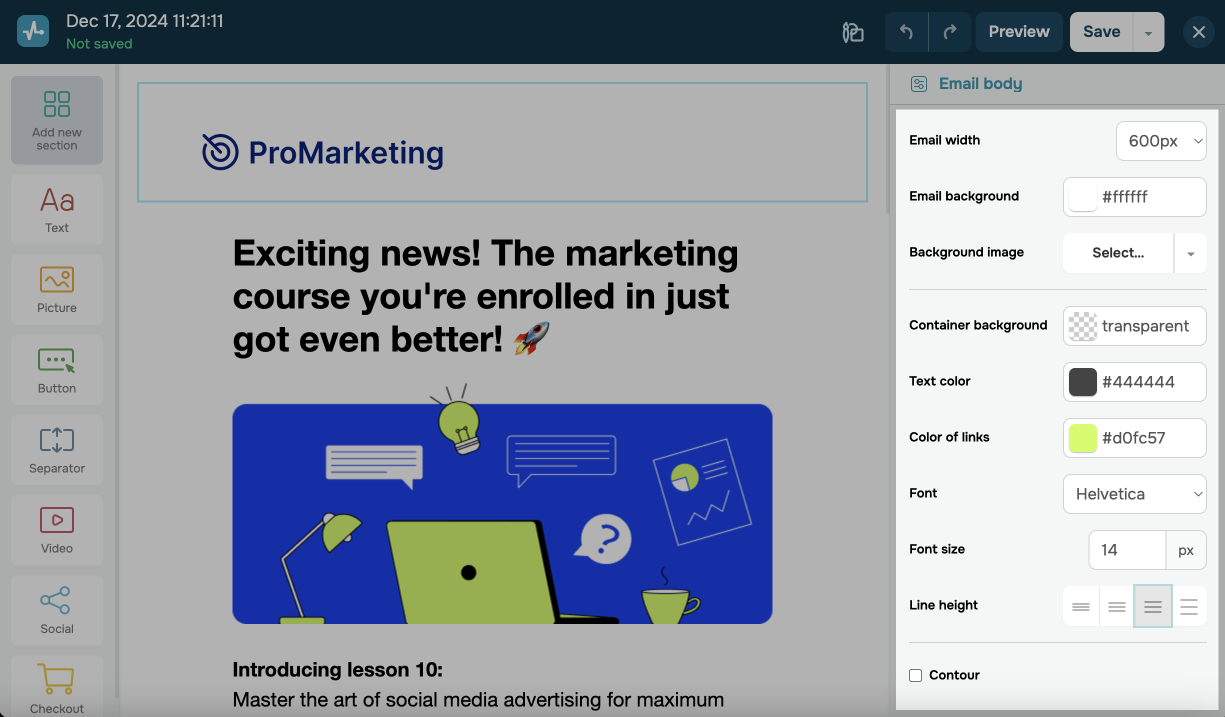
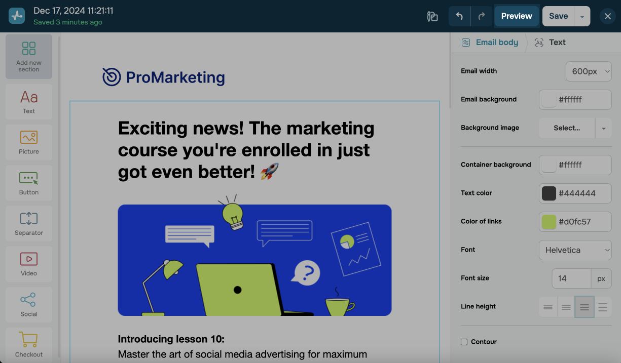
Customize the template
You can customize your template design in the Email body section using the following options:
| Email width | Select a template width. All email content will be adjusted accordingly. |
| Email background | Select a color from the palette or enter a hex color code. |
| Background image | Select an available image, or upload an image from the file manager. |
| Container background | Select a color from the palette or enter a hex color code. |
| Text color | Select a text color from the palette or enter a hex color code. |
| Color of links | Select a link color from the palette or enter a hex color code. |
| Font | Select a text element font. |
| Font size | Select a font size for regular text in your email. |
| Line height | Set a text spacing. |
| Contour | Add an email body outline, then adjust its thickness, style, and color. |
Manage layout blocks
You can perform the following actions on every layout block:
| Move | Moves the block around the template. Click the move button on the right of your block, then drag it up or down. |
| Copy | Adds a copy of the block and all its content below it. |
| Save this block | Saves the block to Saved elements. To use your saved block in another template, go to Add new section > Saved elements, then drag it to the workspace. |
| Delete | Removes the block from the template. |
View the template
To preview your template, click Preview in the upper right corner of the builder. You can view both the desktop and mobile versions of your template.
You can also send a test email to view it in your email client. To do this, in preview mode, click Test email, then select the email addresses to which the email should be sent.
To go back to template editing, click To the editor.
Once you finish reviewing the template, click Save to save it. Afterward, you will be able to use the template to create email campaigns, automated flows, and transactional emails.
Last Updated: 03.07.2024
or