The popular expression “looks can be deceiving” is applicable to product landing pages. They may appear pretty straightforward, but there’s a lot of thought that goes into a powerful one-pager, and the smallest details can make or break the positive first impression for the user. If you want to master this format, keep on reading — we’ll give you practical tips and show you some of the best product landing page examples to keep your creative juices flowing.
What is a product landing page?
A product landing page is a focused, standalone web page designed specifically to showcase a single product or product line. It drives visitors toward taking one specific action, like making a purchase, signing up, or learning more. Think of it as a product’s own interactive display where it can shine without the distractions of other goods.
These pages are equally suitable for physical, intellectual, and digital products. For instance, they are commonly used for:
- tech gadgets;
- clothing;
- skincare products;
- software;
- online courses;
- gourmet products;
- flagship items;
- limited-time promotions.
Product pages aren’t intended to slowly immerse visitors into your brand’s lore — they are very action-oriented and get straight to the point. This format is ideal when you have a clear goal in mind and want to guide visitors straight to that purpose — whether it’s buying, installing, or signing up. By removing unnecessary noise and clutter, these pages make it easy for customers to recognize the value and make a buying decision on the spot.
The benefits of having a product landing page
In a typical online store, customers browse through a variety of products and can easily get distracted and overwhelmed. A product landing page is the opposite of that — it eliminates alternatives and comparisons, putting a single concept front and center. This approach makes sense if your brand prioritizes quality over quantity.
The focused setup allows you to emphasize exactly why that product is special, showcase its best features, and guide visitors toward the desired action without them wandering off to other virtual aisles.
Product landing pages often come with the following benefits:
- Improved conversion rates. When users are efficiently guided through the product characteristics and toward the checkout, they are less likely to get carried away or misunderstand the advantages of the offer in front of them, resulting in increased conversions.
- Clear, value-based messaging. These pages allow for tailored content that speaks directly to the product’s unique benefits and features, without any abstract descriptions, unrelated links, or extraneous details.
- More targeted SEO. One-pagers tend to include product-specific keywords, which can improve search rankings, making it easier for people to find the product directly from the search results.
- Refined user experience. Stand-alone pages streamline navigation and keep users focused on learning about the different aspects of the product without having to make extra clicks or browse through multiple pages.
- Laser-precision advertising. Product landing pages can be closely aligned with ad content, which results in better ad relevance, quality scores, lower ad costs, and higher conversions.
- Easier A/B testing. Landing pages are perfectly suited for testing various elements like headlines, images, and CTAs, helping craft the most engaging layout and copy.
- Speedy, sleek pages. Without the bulk of an entire website, stand-alone pages typically load faster, which can reduce bounce rates and make users stick around for longer.
- Better understanding of user behavior. Single-product pages are great for tracking of and analyzing specific user behaviors, as there are fewer variables and points of attraction.
- Shaping a strong brand image. Product pages reflect the brand’s aesthetic and values in an undiluted way by focusing visuals and messaging specifically on the flagship product. This enhances brand recall and connection with the overall brand promise.
In today’s shrinking attention span era, it’s unrealistic to expect customers to spend hours researching products — they want solutions quickly and with minimal effort. Product landing pages address that need by delivering essential information in a straightforward way. They eliminate the chaos of countless tabs and products, allowing customers to see exactly how this one product meets their needs, which builds confidence and accelerates the path to purchase.
What elements should your product landing page contain?
The structure of your product page defines how users navigate it. If there are too many barriers, they will quickly get discouraged from scrolling further. On the other hand, if something essential is missing, the page will feel neither trustworthy nor informative enough. Striking that perfect balance should be your main goal as your content deserves the right delivery form.
No matter what design approach you take, your product landing page will benefit from including the following elements:
- Strong, unapologetic headlines. With product pages, you don’t get a lot of space for convoluted storytelling. Go straight ahead and hook users’ attention with benefit-focused, daring, or even provocative copy.
- Stunning imagery. Above the fold is the perfect place to include visuals that showcase the product in detail, including images of the product in use, lifestyle shots, or a short demo video.
- Unique selling point. Briefly explain what the product does, highlighting its outstanding features, benefits, and how it solves a problem for the target customer. The description should clearly state why your offer is better than the competition.
- Call to action. Prominent, inviting buttons or links are required to guide visitors toward making a purchase or completing the desired action. Your CTAs should be optimized and strategically placed throughout your page to reinforce the message.
- Social proof. When introducing a new, potentially disruptive product, the chances of facing customer doubts and hesitation are quite high. Testimonials, star ratings, or influencer endorsements are essential for building credibility and trust.
- List of benefits. Consumers rarely have enough time and motivation to draw conclusions from lengthy product introductions. Do that work for them by providing them with a brief list of the top benefits and features that set your product apart.
- Trust badges or guarantees. A stand-alone page is by default more suspicious than a busy multi-page online store. Adding security seals, payment assurances, or satisfaction guarantees will help ease any purchase anxieties.
- Delivery information. Let your customers know how little is standing between them and the product of their dreams. Use transparent pricing and quickly summarize the delivery conditions, fees, and timeframes. If it’s a digital product, describe how users can obtain it, what software is required to use it, and for how long it will remain available.
- Scarcity cues. Some consumers need an extra push to put their caution aside and act on their purchasing desire. By highlighting the scarcity of your offer, you may achieve just that. If relevant, consider including countdown timers or limited-stock alerts to create urgency.
- FAQ section. Regardless of how good your product is, there will inevitably be some objections and concerns, like “Is it compatible with my existing gear?” or “How does it compare to X?” Addressing them in a dedicated section or an FAQ chatbot will help visitors make informed decisions quickly.
Depending on the nature of your product, you may want to omit some of these elements or add new ones. For instance, a smoothie brand doesn’t need social proof as much as a high-end sound system producer, as taste is subjective and the amount of nutrients in one smoothie is already a strong enough argument.
Product landing page design recommendations
With today’s website builders, potential design choices are truly limitless, which may lead to decision fatigue. Here’s how to stay focused and make sure nothing outshines or distracts from your product.
Craft a killer hero section
Once the visitor opens your product landing page, you only get a very narrow window of time to impress them before they make a split-second decision whether to scroll down or to leave. So, having a perfectly formulated hero section at the top of your site can save the day.
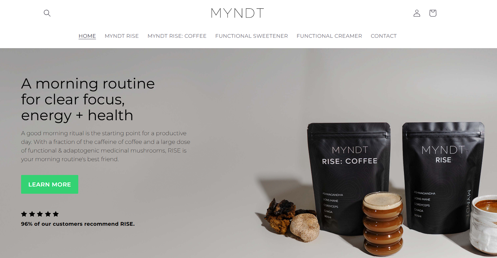 An example of an appetizing product image in the hero section
For better effect, pair a high-quality image or video of the product with a punchy headline highlighting the main benefit and accompany them with a subheadline that gives a bit more context. To make plain product packaging more appealing, give your customers a hint at what’s inside and show some serving suggestions, just like in this product landing page example.
Maximize white space to let users digest each section
When it comes to product pages, just like in a physical store, it’s better to provide quality guidance and keep a respectful distance from the customers than to chase them around the shop until they leave. By incorporating ample white space around elements and keeping the design clutter-free, you achieve exactly that.
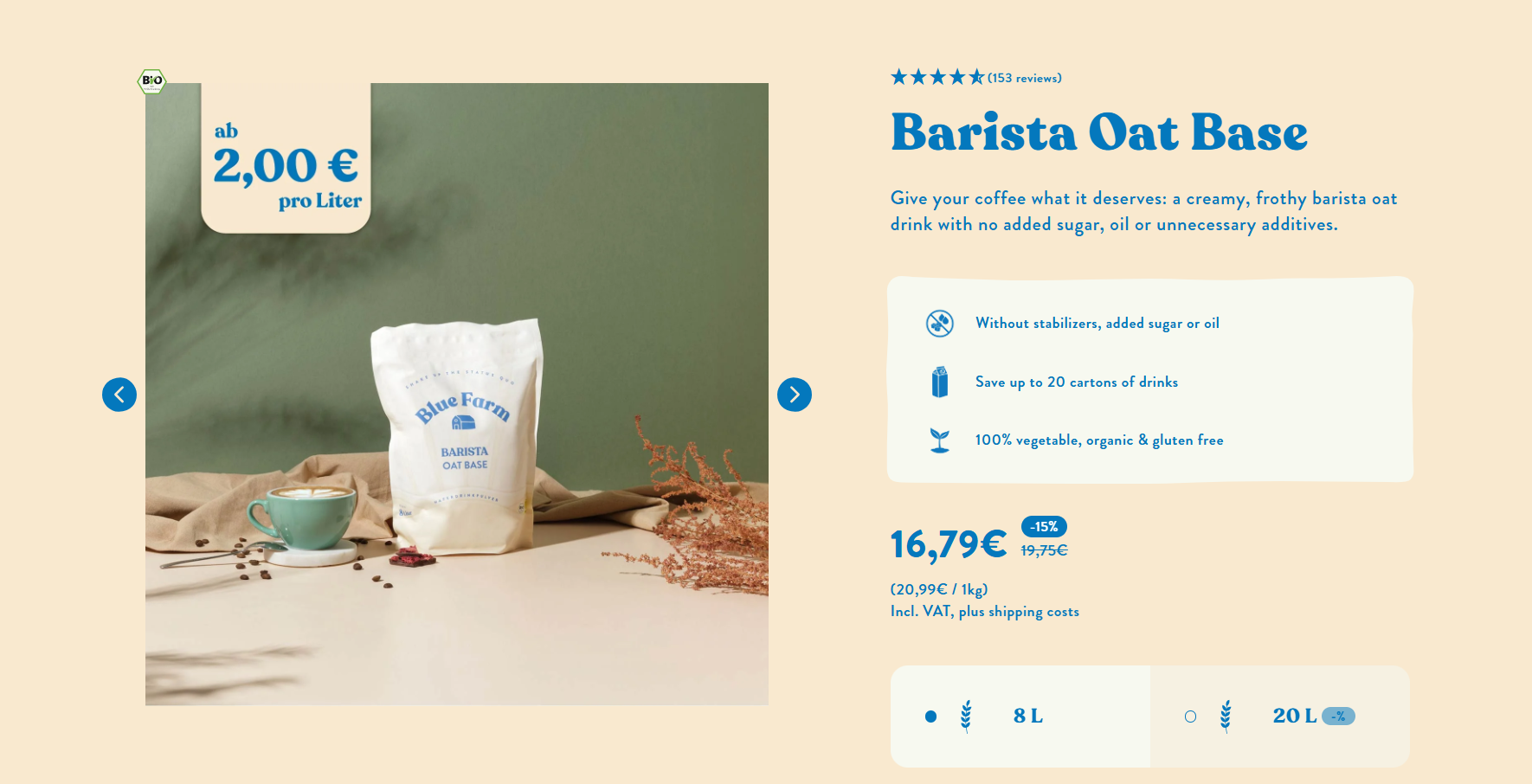 A visually balanced product description example
This example proves that having plenty of white space doesn’t mean that your product descriptions have to be dull and lifeless. The clever use of white space establishes a clear visual hierarchy where each element contributes to the overall harmonious look.
Turn your design into a brand poem
Whether you create a product landing page from scratch or use one of the template-based builders, it makes sense to put a strong emphasis on your brand early on, showcasing your product in its context. Every page element should reflect and organically compliment your brand’s aesthetic.
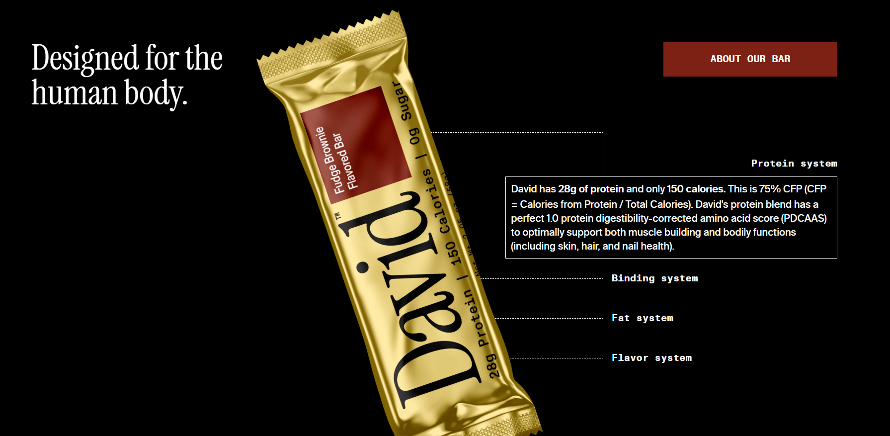 A product landing page with strong branding
This is an excellent example of how a landing page can become a natural extension of the product. When the visual style, the fonts, and the accent colors fully match, it ensures a cohesive experience for the user, increasing the likelihood of brand retention.
Use interactivity to captivate your audience
Static product descriptions often need a spark of life to capture and preserve customers’ attention. With the help of lifestyle videos, animations, and other interactive elements, you can let your visitors envision using the product and immerse themselves in its context.
 The use of interactive elements in product landing page design
In this example, a premium stroller brand repurposes engaging user-generated Instagram videos for its social proof section to convey the sense of easiness and freedom that the product brings into busy parents’ lives.
Introduce sticky elements for smoother conversions
For products with a short sales cycle, there’s no need for excessive storytelling and in-depth nurturing content. Therefore, by using a sticky element with a Buy button, you can provide your product page visitors with an uncomplicated way to convert at any point of their browsing journey.
Using conversion-oriented sticky elements in product page design
Such sticky elements simplify the way to the checkout while also highlighting the key selling points of the product. To make them feel more risk-free, you can mention what awaits users once they click that CTA button, be it a secure payment page, a 30-day money-back guarantee, etc.
Prioritize mobile devices
Adopting a mobile-first approach when designing product landing pages is recommended for two reasons. Firstly, more people browse and shop on mobile devices than desktops. Secondly, Google prioritizes the mobile versions of sites in search rankings.
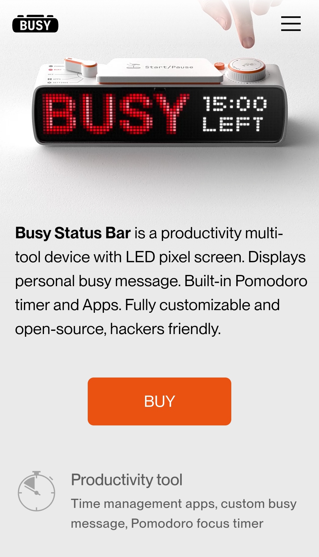 An example of a mobile-friendly product landing page
Many website builders on the market do offer responsive templates, which look good on smartphones and tablets by default. Still, it’s important to test the layout, image scaling, and text readability on smaller screens — the content should remain appealing, fluid, and easy on the eyes. It’s also important to optimize images and minimize animations to keep the pages lightweight.
Product landing page copywriting tips
When writing for product landing pages, the question “What to remove?” is just as important as “What to add?” because you get a very limited space for introducing your offer. Below are several tips that can help you navigate these waters:
- Open with customer-centric, benefit-oriented copy. Demonstrate the product’s value by describing how it can measurably change the customer’s life for the better. Address your audience’s pain points in your headings to make them resonate.
- Prioritize facts over descriptors. Highlight the tangible advantages of the product and let the customers draw the right conclusions themselves. The excess use of superlative adjectives without any proof will only make your site visitors question whether your product is actually “the most wear-resistant” or “best on the market.”
- Gently but firmly lead toward the desired action. Keep your copy action-oriented, avoiding drifting off into abstract comparisons or speculations. Write as though you’re speaking to a specific person, using “you” and “your” to make the copy feel personal.
- Let your target audience know how others feel about your product. Incorporate realistic, conversational testimonials from your previous customers to nail down your message. Ask them to describe exactly how your product has brought a positive change for them.
- Enrich your product descriptions with storytelling. Paint a vivid picture of how the customer’s life or experience will improve with the product, using scenarios they can relate to, while also staying concise and on point. Use sensory or emotive language to let their imagination run wild.
- Use typography to visually guide, prioritize, and accentuate. Explore different formatting options to break up monotonous text and add depth. Pay attention to your font legibility, line height, contrasts, and paragraph length to ensure a buttery-smooth reading experience.
- Finish off strong. End with a strong closing statement reinforcing the primary benefit right before the final CTA to motivate users to make a buying decision and start experiencing the said benefits as soon as possible.
Facts feel reliable and enrich narratives by grounding them in reality, so the safest approach to copywriting for product pages is by carefully mixing bits of raw data with intriguing stories.
5 steal-worthy product landing page examples
Learning from others is a shortcut to creating a more polished, user-friendly, and high-performing landing page from the start. That’s why we’ve gathered these five multi-product and single-product landing page examples that illustrate all of the points made above.
Science-backed supplements
Seed is a probiotic brand with a strong emphasis on the evidence-based approach. The product landing page fully reflects that commitment to science, highlighting proprietary bacteria strains, 50+ quality control checkpoints, and the superb delivery formula instead of making vague health claims.
A product landing page example from Seed
This product landing page’s design combines clinical minimalism with dreamy visuals, helping the user appreciate the significance of the tiny bacterial ecosystems that surround and exist within us. When it comes to copy, the tone of voice stays factual and concise — it uses very little medical jargon and makes complex concepts approachable for everyone. The mesmerizing scroll-activated animations bring the page to life and create an entertaining transition between the sections.
Luxury eyewear brand
The Other Glasses is state-of-the-art eyewear combining timeless aesthetics with next-generation constructions. The high-quality product close-ups and videos capture the powerful lines, sophisticated designs, and premium materials of the frames. The product gallery lets the striking imagery speak for itself, only featuring minimalistic and carefully chosen descriptions.
A product landing page example from The Other Glasses
The company’s emphasis on quality and manual assembly is reflected in the page design. The skillfully chosen color palette sets a dark mood with warm undertones. Although, technically, this landing page features multiple products, it’s anything but cluttered and salesy — the suspenseful build-up leads to a single CTA button for a more high-end feel.
Ready-to-drink meals
Huel is an iconic meal-in-a-bottle, both deliciously quick and nutritionally complete. While the brand has been around for a while, the idea of getting all of one’s nutrients from a liquid is still pretty novel and requires convincing argumentation, hence the informative product page.
A product landing page example from Huel
This multi-product landing page doesn’t hold anything back, addressing every possible concern a cautious consumer may have. At the same time, the visual hierarchy is on point, making it a smooth, enjoyable read. Trust badges, catchy slogans, influencer endorsements, advice from dietitians, and macro counts — the website checks all the boxes when it comes to guiding the customer toward the purchase.
Creator course
This online content creation course is a perfect example of how to elegantly present an intellectual product and justify its price tag. The page starts off with an eye-grabbing headline and action-oriented supporting copy. The price is announced right away to establish transparency and hint at the high value of the product. This is followed by an image gallery depicting the results one can achieve with the course.
A product landing page example from iPhone Creator Course
Moving forward, the benefit lists and descriptions get extremely condensed — the gorgeous before-after examples speak louder than words. Finally, the curriculum along with the FAQ section gives more clarity as to who this course is for and what gear is needed to participate.
Avocado oil brand
Avoca is an all-natural avocado oil with an exquisite landing page, which pairs mouth-watering descriptions with practical tips for home cooks and health geeks alike. Here, every design element contributes toward celebrating the beauty of this simple ingredient with a rich history and flavor. The color palette matches the packaging, mimicking the natural hues of the avocado trees, fruit, and seeds.
A product landing page example from Avoca
From the succinct descriptions, the customer can learn where the product originates and how it’s processed, which is crucial for high-quality cooking oil. The bottle is shown in various settings, demonstrating its outstanding design. Lastly, the extensive FAQ section is aimed at educating customers and further rationalizing the price.
How to create a pixel-perfect product landing page with SendPulse
Having studied some of the best landing page examples for products, it’s time for practice. Our intuitive website builder has everything you need to create high-converting landing pages for physical as well as digital products. With it, you can accept payments, generate leads, and even offer support through your website.
Begin by creating a new landing page or selecting one of our pre-designed templates. Choose a layout that fits your product — you can always customize it later using our drag-and-drop editor.
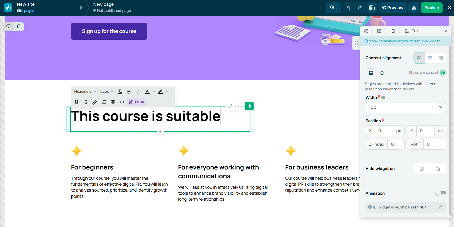 Creating an educational product page in SendPulse
Once your page is set up, feel free to add, move around, or delete individual blocks, sections, and columns. You can change the appearance of any element to make it fully match your vision. Whether you need widgets, navigation menus, buttons, image galleries, or subscription forms, you can add them in one click from the pop-up menu.
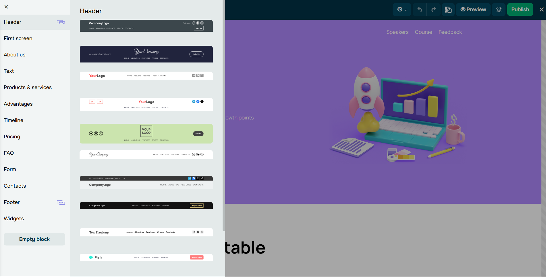 Editing an educational product page in SendPulse
The built-in AI-powered copywriting tool allows you to generate, translate, and refresh content in seconds. If you need deeper customization, there’s an option to enhance your landing page with custom code.
Once ready, publish your product landing page and start monitoring its SEO performance directly from your SendPulse account. All of our templates are responsive and seamlessly adjust to any screen size.
You can explore most of these features even on the free plan — it includes one website, 100 MB of image storage, access to 24/7 support, and more. Our paid plans start at $21 billed yearly.
Ready to supercharge your product landing page?
The landing page builder is just scratching the surface of sales and marketing automation. With SendPulse, you can enjoy the benefits of our built-in CRM, email builder with automation features, chatbot builder, pop-ups, SMS service, push notifications, and online course builder — all of these tools are available from a single tab.
Create your free account and start working on your omnichannel strategy today!