When crafting an email, most brands put all their energy into writing the perfect subject line and compelling body content. But what about the email footer? This small section at the bottom of your email often gets overlooked, but it shouldn’t be.
A well-designed email footer does more than just display legal disclaimers. It builds trust, reinforces your brand, and can even be a subtle marketing tool. In this post, we’ll walk through email footer best practices, creative email footer examples, and smart email footer ideas to help you make the most of this often-ignored space.
An email footer is the section at the very bottom of an email, typically located after the main content. It usually includes legal information, disclaimers, contact details, and links. While it might seem like an afterthought, your email footer design plays a significant role in making your emails look professional, informative, and compliant with legal requirements.
Even though email footers take up little space, they serve several essential functions. A well-crafted email footer design blends compliance, professionalism, and branding, making your emails more effective. Here’s why they matter:
- Legal compliance. Regulations like GDPR, CAN-SPAM, and CASL require specific details in email footers. These typically include the sender’s identity, an unsubscribe link, and any necessary disclaimers or legal notices.
- Professionalism. A thoughtful email footer design makes your email look polished and credible. It reassures recipients that the message is authentic and comes from a trustworthy source.
- Brand reinforcement. Footers often include elements such as the company logo, tagline, and links to social media profiles. This creates consistency across communication channels and strengthens brand identity.
- Access to contact information. Including your business address, phone number, or alternative email in the footer makes it easy for recipients to get in touch with you if needed.
- Marketing opportunity. Footers can serve as a subtle space for secondary CTAs, such as promoting a blog, sharing upcoming events, or showcasing a product or service.
- Enhanced user experience. Another email footer best practice is to keep it clear and organized, ensuring users can easily navigate your email and find essential links, such as privacy policy or social media profiles.
Overall, a footer is a small but mighty component of any email. It plays a key role in compliance, trust-building, and maximizing the impact of your communication strategy.
In this section, we’ll take a closer look at the key elements that make up a strong footer. We’ll also share some email footer examples and explain why these elements are important to include.
Contact information
The first thing you should think of adding to your email footer is legal and contact information. This can include company name, physical address, and phone number. Not only is this required by global anti-spam laws, but it also makes your email look more professional and reliable.
Here is an email footer example from Flamingo State. This section includes all essential details, such as the company address and contact options. You can also add extra information if needed, like your map location or business hours.
 An email footer example containing contact information
Unsubscribe link
One of the most critical email footer best practices is providing a clear and visible unsubscribe link or button. There’s nothing more frustrating for recipients than struggling to opt out of unwanted emails. A simple, accessible way to unsubscribe ensures compliance with CAN-SPAM, GDPR, and other email regulations.
A creative email footer idea comes from Wimp Decaf Coffee. Instead of simply offering an opt-out option, the company provides three choices: continue receiving all emails, receive only essential updates, or unsubscribe entirely. By giving recipients control over their communication preferences, businesses can potentially reduce unsubscribe rates while maintaining engagement.
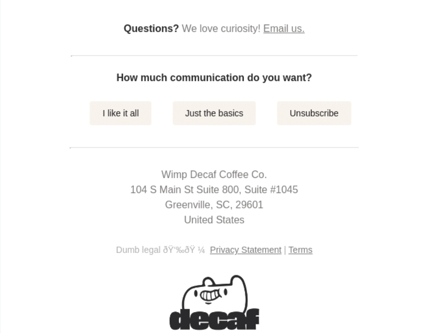 Communication preference options in the email footer
Legal disclaimers
Including legal disclaimers in your footer is essential for protecting both your business and your customers. Always make sure to add copyright notices to clarify ownership of content and images, confidentiality statements if your email contains sensitive information, and a link to your privacy policy to reassure recipients that their personal data is handled securely.
A great email footer example is from Joseph Brandley, which not only features the company’s address and business hours but also a clear copyright notice for all images. By explicitly stating whether or not visual content can be reused, businesses can protect their materials and avoid legal issues.
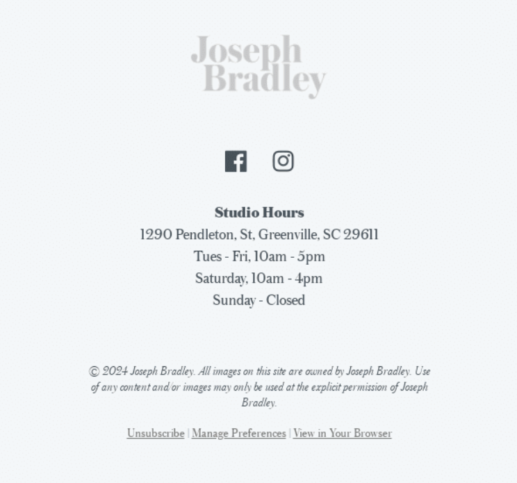 An email footer example with a copyright disclaimer
Social media links
Incorporating icons that link to your company’s social media profiles in the email footer design can encourage engagement and promote further interaction. This can also help your social media channels grow organically, attracting followers who are already familiar with your brand and interested in staying connected.
Take a look at the email footer example below. Gymshark is present across multiple social media platforms and effectively incorporates icons into their emails. This approach allows recipients to stay updated on their social media content and follow them on the channels they use most.
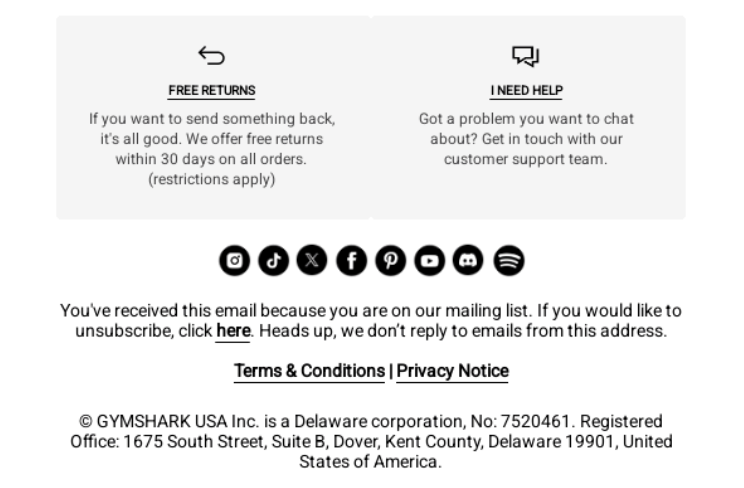 Social media icons in the email footer
Additional CTA
While your primary CTA should be prominently featured in the email body, you can place additional CTAs and information in the footer. These links could direct recipients to a blog post, special offers, or upcoming events. You can also include buttons for actions like contacting you, leaving a review, and so on.
Filson provides an email footer idea that incorporates an additional CTA. The company clearly highlights the offer and its benefits, along with a hyperlink directing recipients to view limited-edition releases, sales, and new arrivals.
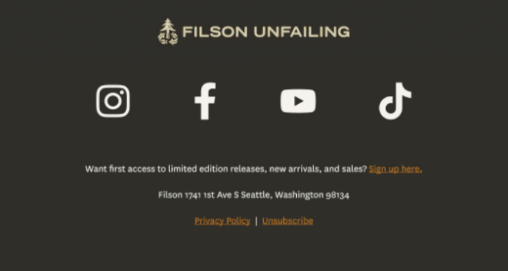 A CTA encouraging sign-ups
Social proof
Another email footer idea is to use this space to share your ratings on platforms like Google, TripAdvisor, Trustpilot, or others. If you have specific customer testimonials you’d like to share, this area would also be perfect for showcasing them. This approach will help you build trust and credibility from new customers.
Here’s an email footer example from Kensington Tours. The travel provider showcases their high ratings across various platforms, along with several awards. This approach helps reassure potential customers of the company’s trustworthiness and quality of service. Additionally, including clickable links to review portals can encourage existing customers to leave feedback and share their experiences.
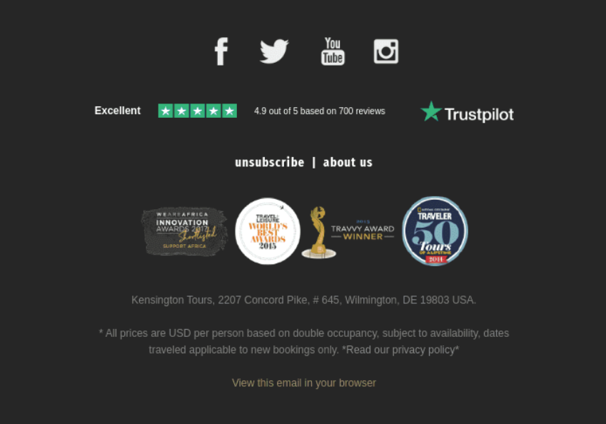 Company’s ratings displayed in the email footer
App download option
If you have your own app, another email footer idea is to include download buttons for the App Store and Google Play. This can help increase the visibility of your app and promote it to users who are already familiar with your company or use your services.
eBay features app download links in its footer. This will help customers discover the app and encourage them to use it for an improved shopping experience.
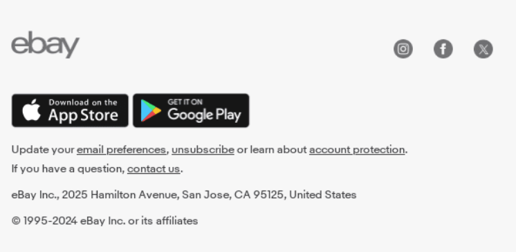 App download links in the email footer
Green initiatives
Since 2023, EU law requires large companies and publicly listed firms to report on their social and environmental impact. Some non-EU companies are also required to share this information if they generate over EUR 150 million in revenue within the EU market.
In your email footer, you can briefly mention your green initiatives or include a link to a dedicated webpage for more details. Even if you’re not legally obligated to provide this information, showcasing your green practices can still have a positive impact on customers, influencing their choice of brand and support for businesses.
Simpler’s email footer idea features icons that highlight key aspects. These are local production, a cruelty-free and eco-friendly approach, and free shipping and returns.
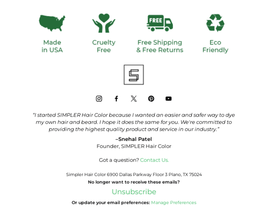 Eco-friendly initiatives displayed in the email footer
Thank-you message
Including a thank-you note in your email footer can work wonders for building customer loyalty, as it makes recipients feel appreciated and valued. To make the message even more impactful, consider adding a personal touch, such as a handwritten-style signature or a heartfelt statement from the founders. This will help you create a stronger emotional connection and leave a lasting impression on your audience.
In the email footer example below, Adegen includes a statement from their founder and CEO. This statement effectively highlights the brand’s mission while expressing gratitude to their community members at the same time.
 A thank-you message in the email footer
To ensure all elements display correctly and serve their purpose, it’s crucial to focus on thoughtful email footer design. Here are some best practices to keep in mind:
- Limit vertical space. Make sure your footer doesn’t take up too much room. Use compact elements to avoid overwhelming the recipient and keep it proportional to the rest of the email content. Exceptions are if you’re legally obliged to share a certain amount of information.
- Use clear hierarchy. Organize your email footer design in a way that prioritizes the most important information visually. An example could be: contact details first, then social media icons, etc.
- Set consistent alignment. Choose a left, center, or right alignment for text, links, and icons throughout the footer. Typically, center-aligned footers work well for a balanced, symmetrical look, while left-aligned footers look more structured.
- Add enough spacing. An email footer best practice is to ensure proper padding between lines, icons, and text to avoid a cramped or cluttered look. It’s important for readability.
- Use dividers. It’s possible to add subtle lines to separate the footer from the main body of the email. If the footer has multiple sections, dividers can help visually organize the content.
- Choose the proper font size. For the footer text, use a smaller font size, such as 10-12 px, but still large enough to read comfortably. Avoid using fonts smaller than 9px, as they can be hard to read on mobile devices.
- Highlight important information. Make essential details like company name or contact info slightly bolder to give emphasis and ensure easy scanning.
- Play with color contrast. Different colors or shades can help to set apart the footer from the email body. Also, ensure your email footer design provides enough contrast between the text and background.
- Optimize for mobile. Make sure that your footer adapts well to mobile screens. Elements should stack vertically on smaller screens, and clickable items like social media icons should be large enough for easy tapping.
- Use iconography. Small and simple icons for social media links keep the footer looking modern and clean. It’s important that these icons are consistent in style and size.
- Maintain consistent branding. Also, in the email footer design, you should stick to your brand’s color palette and font styles. This helps maintain consistency across all your email communications.
By following these email footer best practices, you can create a visually appealing footer. However, depending on your industry and the required information, some of these guidelines may not apply in every case.
In this section, we’ll explore a variety of email footer ideas from different industries. We’ll have a look at different design solutions and discuss why they work well for specific niches.
Travel
Travel companies typically strive to offer the most convenient and time-efficient services. In Delta’s email footer example, there is a prominent section encouraging users to download the company’s app. This allows customers to access their boarding passes, track luggage, and more. Additionally, the company encourages customers to leave feedback by asking them to rate the email and share whether they found it helpful.
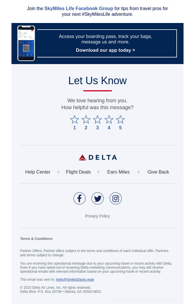 Delta’s email footer example
KLM Airlines makes effective use of their email footer to share important information and policies. It features hyperlinked phrases that guide recipients to specific pages for additional details if needed.
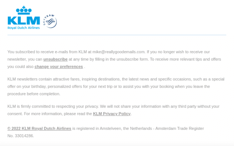 The use of an email footer for important information
Frontier takes a different approach by using its email footers to include extra action buttons. These allow recipients to book a flight, browse online deals, or manage their trip. Additionally, the footer features social media buttons and app download icons, offering even more convenience.
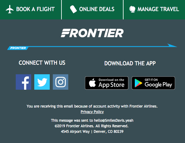 An email footer example from Frontier
Skyscanner, for instance, uses their footer space in a similar way. It provides buttons to book flights and hotels or rent a car. In addition, it displays its company contact information and allows email recipients to take actions regarding the email newsletters or contact the company directly.
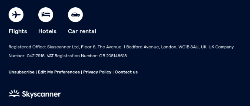 An email footer idea from Skyscanner
Food and beverage
When it comes to cafés and restaurants, email footers can be designed in various ways depending on the email’s primary objective. For example, Adun includes the phrase “From our kitchen to your table” in its footer. It serves as both a brand motto and a way to emphasize their direct, customer-focused approach. Additionally, this company’s footer features buttons linking to key sections such as their shop, recipe page, About Us section, and customer account page.
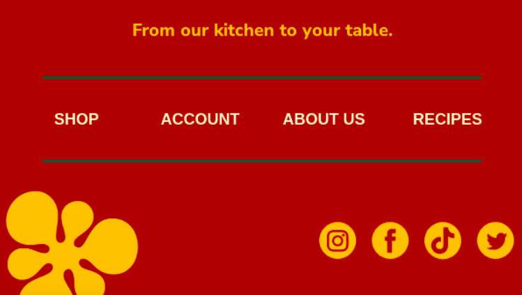 Adun’s email footer example
Miller’s Ale House takes a different approach by using its email footer to inform customers about the terms of its gift card offer. The footer clearly outlines the offer’s timeframe and any applicable exclusions. Additionally, it includes standard elements like social media icons and clickable links for visiting their website, managing subscriptions, and more.
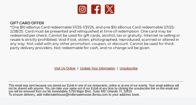 An email footer idea from Miller’s Ale House
Press follows an essential email footer best practice by highlighting key features of their meals, such as being plant-based and plastic-neutral. This approach makes essential details stand out while reinforcing the restaurant’s strengths. Below, users can also find social media icons to connect with the company on other platforms.
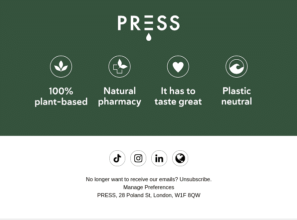 An example of an email footer from Press
Take a look at the example from Chick-fil-A below. Their email footer design stands out with a 3D-like image that looks up at the email content. It includes key information about terms and conditions, while also noting that the offer is time-sensitive and only valid while supplies last.
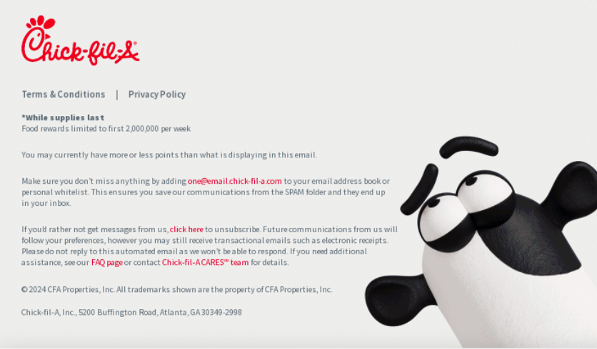 An email footer example from Chick-fil-A
eCommerce
The email footer idea from Vallon is a great example of how eCommerce brands can combine functionality and branding. It highlights key information for customers, such as free shipping, free returns, and a lifetime warranty, while also showcasing Vallon’s commitment to green initiatives. Below these details, the footer provides links to return to the shop, browse sunglasses or goggles, access the FAQ section, or contact the brand directly.
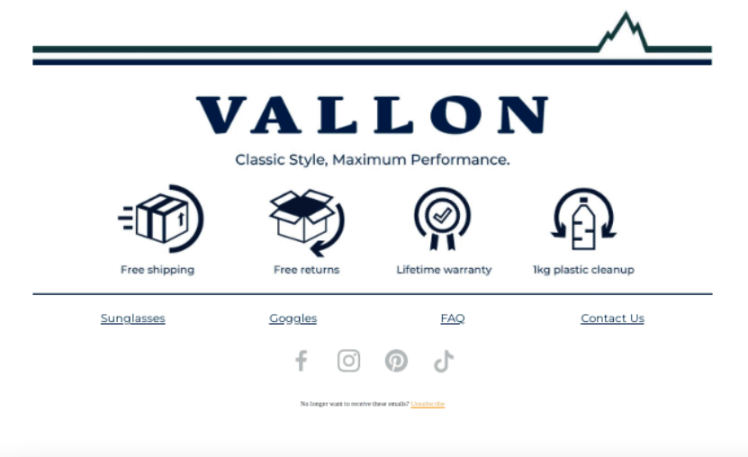 An email footer from Vallon
Similar to the previous example, Fiorucci uses its email footer effectively to inform customers about free express delivery on orders above a certain amount. Additionally, the brand highlights its flexible payment options with a simple icon. The footer also includes links to the website and social media pages, making it easy for email recipients to stay connected with the brand.
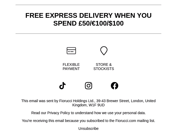 An email footer example from Fiorucci
Plus-Plus USA incorporates an email footer best practice by expressing gratitude for their customers that support their brand. In addition, they also highlight their mission and what they stand for. From a design perspective, the footer stands out with a bright logo set against a dark background and clear, concise text, creating a polished and professional look.
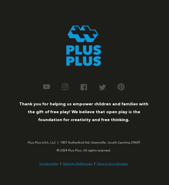 Expressing gratitude in the email footer
Finance
Email footers in the finance sector should prioritize compliance and security by including disclaimers, confidentiality notices, and risk warnings. SoFi demonstrates this approach by featuring key rules for borrowers in their email footer, supported by relevant links. This email footer example also includes a referral offer, links to the app, and an option to contact their team. Additionally, SoFi emphasizes their commitment to fostering an inclusive environment and supporting the solidarity of all communities.
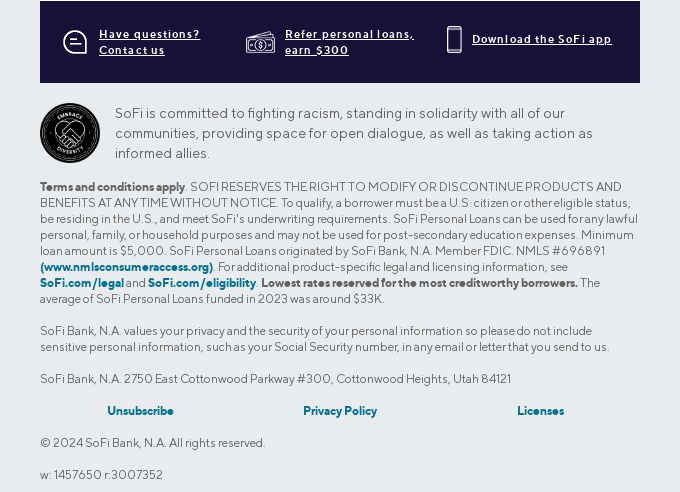 An example of an email footer in the finance niche
Here is another email footer example from SoFi. It features a framed notice warning that investments are not insured and carry a risk of losing value. It’s recommended to tailor the information in the footer to align with the main content of the email.
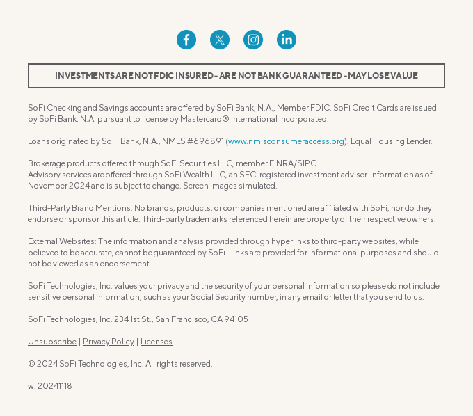 SoFi’s email footer idea
Take a look at this email footer example from ClearScore. The company lists its services individually, making it easy for recipients to find and access what they need instantly. The company also includes its rating on Trustpilot, which helps strengthen their image as an experienced and trusted company. Additionally, ClearScore clarifies that it is a credit broker, acting as an intermediary between borrowers and lenders rather than a lender itself.
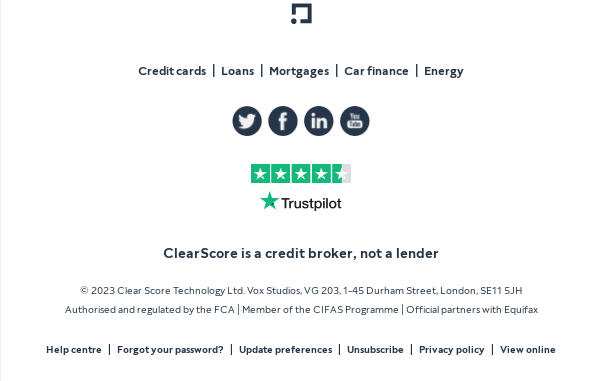 An email footer example from ClearScore
Education
Email footers in the educational industry often feature institutional branding, contact details, links to portals or resources, and compliance disclaimers. Babbel’s email footer idea begins with a statement that over ten million subscriptions have been sold, offering strong social proof. Additionally, it highlights the expiration date for the flash sale mentioned in the email. Beyond these elements, Babbel’s footer includes standard components such as social media icons and other helpful links.
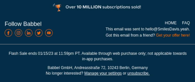 An email footer example from Babbel
Moment opted for a minimalist email footer design that features a company slogan to reinforce their brand identity. Similar to their website menu, the footer includes links to various sections such as lessons, trips, reviews, and more. This approach ensures recipients can easily access essential website tabs with a single click, making their user experience more convenient.
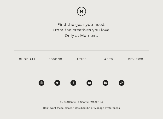 A simple email footer design from Moment
Pathwright takes a creative approach to email footer design by offering a unique incentive — readers who spot a typo in the email receive a free t-shirt. This playful strategy not only engages recipients but also encourages them to read the content more carefully.
This email footer example also reinforces the brand’s commitment to innovation and fresh ideas. Additionally, it includes a copyright statement and essential links for signing up, logging in, requesting a demo, and more, making it both interactive and functional.
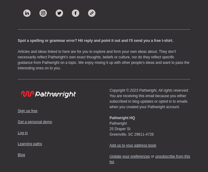 An email footer idea from Pathwright
SaaS
Email footers in the SaaS industry often focus on brand identity and usability, featuring quick access to support, personalized links to dashboards, and legal disclaimers. They frequently highlight social proof, product promotions, and community links to build trust and foster engagement. For example, BeeFree’s email footer example includes essential legal information, links to the blog and academy and prominently displays the company’s awards on the right. They serve as strong social proof for recipients.
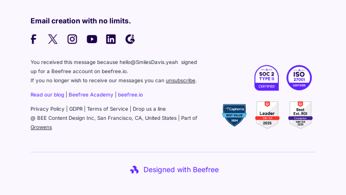 An email footer in SaaS niche
Here is another email footer idea from Semrush. The company prominently features buttons encouraging clients to become a Semrush affiliate, explore their newsroom, or hire an agency. Additionally, it includes links to unsubscribe, update preferences, and more. Overall, the footer maintains a minimalistic design while offering various options for further engagement with the company.
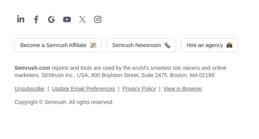 An example of an email footer design from Semrush
Shopify uses their email footer to place a footnote that provides additional context on the email topic. It highlights current payment conditions based on the type of bank transfer. Additionally, this email footer example provides a link to read more on the subject, manage preferences, and unsubscribe from the newsletters.
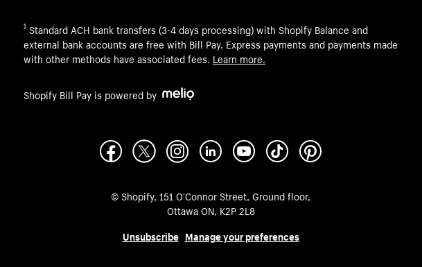 An email footer idea from Shopify
Real estate
Real estate emails typically include essential contact information, such as the agent’s or company’s name, license number, and any legal disclaimers related to property transactions, along with links to their website and social media. A notable email footer best practice is to emphasize compliance with advertising regulations, including fair housing notices and privacy policies.
Zillow, for example, keeps its footer rather concise. It features a milestone progress indicator for the customer, fostering a sense of loyalty. Additionally, the footer includes an unsubscribe link and the company’s contact information.
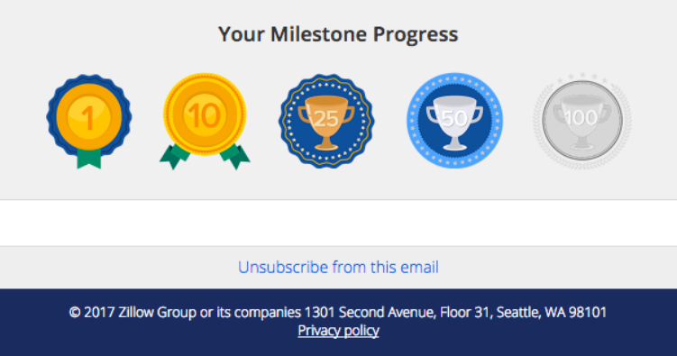 An example of an email footer in real estate
Another email footer example in this niche is from OpenAgent. The company prominently displays its Trustpilot rating to build trust while keeping the rest of the footer simple. It also includes links to the company’s social media pages to encourage further interaction.
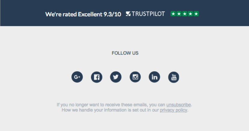 A simple email footer design from OpenAgent
Arrived, on the other hand, used their email footer space to provide all essential information regarding policies and regulations of their real estate company. They offer an option to add their email address to the list of trusted contacts in their email account. This simple step helps prevent emails from being marked as spam, ensuring better deliverability in the future.
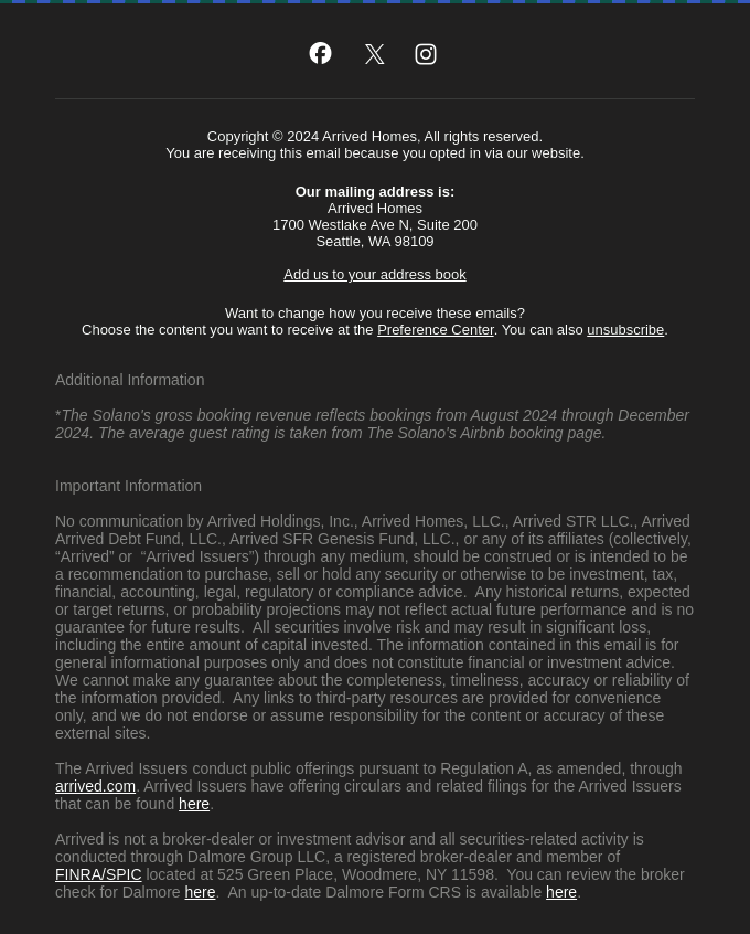 An email footer example from Arrived
The bottom line
Overall, an email footer is an important element of any email, as it can enhance the content or provide useful links and resources to encourage further engagement. By applying the right email footer ideas and design strategies, you can create a footer that adds value and aligns with your goals.
To design a user-friendly, modern footer, using reliable email software is essential. SendPulse provides powerful tools for building emails from scratch or customizing templates, all while managing and launching campaigns from a single platform.
Sign up for a free account and give it a try today!