Email accessibility makes your emails user-friendly for everyone including people with disabilities as it allows them to perceive your emails and interact with them easily.
There are a few design and copy adjustments you can do to make your emails more accessible. In this article, we’ll explain how employing accessibility will impact your email campaigns, why it matters, and how to put it into practice.
What is email accessibility?
Email accessibility refers to the practice of designing and coding emails so they can be easily read, understood, and interacted with by people with disabilities. This includes users who rely on screen readers, keyboard navigation, or other assistive technologies.
Accessible emails follow specific guidelines such as using clear headings, readable fonts, sufficient color contrast, descriptive alt text for images, and logical content structure. By following email accessibility best practices, businesses ensure their messages reach a wider audience, comply with accessibility standards, and deliver a better user experience for all subscribers.
Why accessibility matters
So why should you be concerned about accessibility, and what benefits can it bring to you and your business? Let’s take a look at some facts:
- In general, 15% of the world’s population, or 1 billion people, have some sort of disability. According to the World Health Organization, approximately 1.3 billion people worldwide live with some form of visual impairment: 36 million people cannot see at all, and 217 million have moderate to severe vision impairment. As you can tell, a very large number of people might have troubles with different day-to-day things, including interaction with devices and reading emails.
- Apart from that, the disability market represents $1.2 trillion in annual disposable income.
- According to a recent research by Cone Communications, 78% of Americans want companies to address social issues, and 87% would buy a product from a company which supported the issue they personally cared about.
So, employing email accessibility, you not only broaden your audience and open up new opportunities for more profit but also show your respect and care for each and everyone, which increases your credibility in the eyes of socially responsible users and people with disabilities.
How to create an accessible email
In this section, we’ll take a look at seven elements that can help you make your emails more accessible to everyone:
- structure;
- code;
- alternative text;
- links and buttons;
- fonts;
- colors;
- zooming in and out.
In addition to these elements, we recommend going through the criteria list accessibility guidelines by The World Wide Web Consortium, which will help you ensure your web content is accessible to people with disabilities.
Structure
First, make sure that you place your email content in a logical order as screen readers comprehend it from left to right and from top to bottom. Read your emails out aloud to see if it’s easy to understand the copy itself without looking at the images.
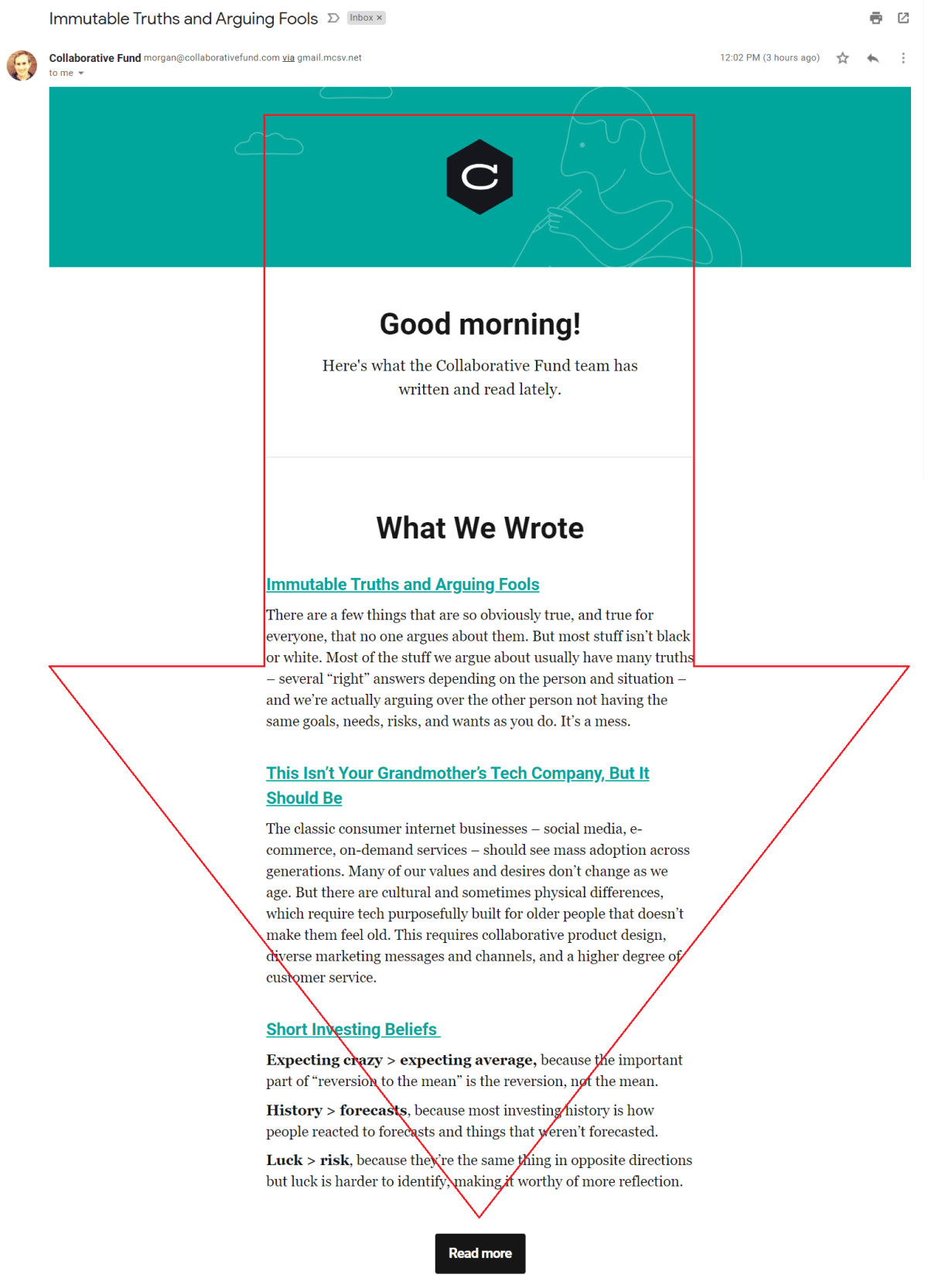
For example, Collaborative Fund keep a good logical structure in their emails, so it’s very easy to follow them with your eyes and with a screen reader.
 An email from Collaborative Fund with a logical content order
For people with dyslexia and cognitive disabilities, it can be difficult to comprehend large complex pieces of text. That’s why we recommend that you get straight to the point in your copy, making your sentences shorter and avoiding long or jargon words. Arrange one thought within a single sentence and one topic within a single paragraph.
To test the readability of your text, use services like Readable. You can paste your text there, and the tool will automatically highlight long sentences or complex words and suggest easier alternatives and synonyms. Take a look at Readable in action:
Checking a piece of text for readability with Readable
Code
Then, take a look at your code. There should be heading elements like h1, h2 and paragraph tag p, and so on. This will allow screen readers navigate through your email. A language HTML tag lang=”” will let any assistive technology understand which language profile to use for the content. Go to a list of all HTML language tags to find the code of the language you need.
To clean your code and make sure you don’t have any unclosed tags and other issues, you can use different email testing tools.
For example, to avoid any troubles with displaying your content correctly in the visual or audio format, you can try out Dirty Markup. Just paste your code and click “Clean.”
How to clean up your email code with Dirty Markup
Alternative text
Always include a detailed alternative text, or alt text, for images — you should convey the purpose or the meaning of the image so that subscribers who use assistive technology or have images turned off will understand the overall context.
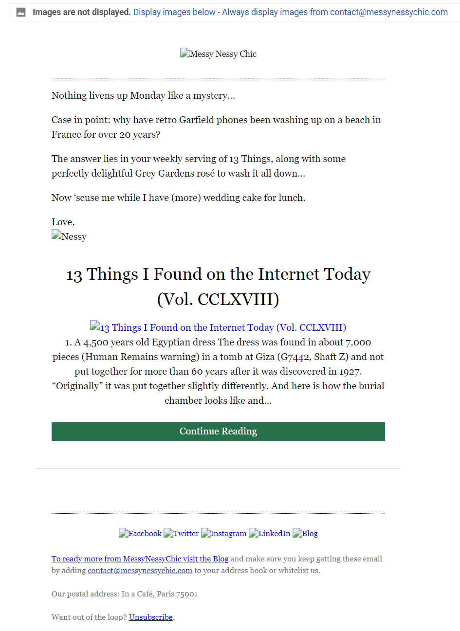
On the example from Messy Nessy Chic, you can see that every image has an alt text, including social media buttons at the email footer.
 Alt text for images in an email from Messy Nessy Chic
If your email contains decorative images — those used for visual design and not assigning a specific meaning — you should add an empty attribute alt=”” to it. This will make screen readers skip the image.
When it comes to the copy, avoid text like “Click here” and place a hyperlink in the context of a sentence. This will make it easier for users to understand where the link is going to redirect them. And remember, your links should be distinguishable from the surrounding text.
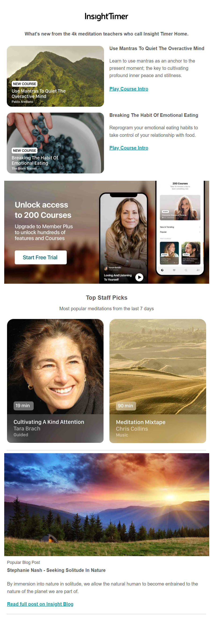
Take a look at the example from InsightTimer; they use a clean hyperlink text, which would be easy to understand even to those who can’t read the email themselves.
 Hyperlinks in an email from InsightTimer
As for call to action buttons, keep them large enough to be tapped by any thumb on any device. Surround your buttons with sufficient white space so that there will be no accidental taps.
Fonts
The font size in an accessible email shouldn’t go lower than 14px. Moreover, you should use web safe fonts, which will display correctly on most devices and operating systems. These fonts are Arial, Comic Sans, Courier New, Georgia, Impact, Palatino, Tahoma, Trebuchet MS, Times New Roman, and Verdana. Learn more about picking a perfect font for your emails on our blog.
What is more, we advise that you apply left alignment for the text. While reading, the start of each new line serves as an anchor for our eyes. When the alignment is centered, every line begins at a different point, making a user jump from one line to another. With a justified alignment, in its turn, the spacing between words is different every time. That’s why keeping that visual anchor in the same place, or using a left-side alignment, is your best choice for readability purposes.
It’s also recommended to divide your text by headings, quotes, and other types of formatting.
Brain Pickings offer very long and content-heavy emails which consist mostly of text, but it’s easy to “digest” them because of their formatting choices.
 Text formatting in the email from BrainPickings
Colors
First of all, you should check if the colors in your email are contrasting enough for it to be accessible to people who have vision issues. For example, it’s recommended that the ratio for the normal text should be at least 4.5:1 and 3:1 for enlarged text, which is often used in headings.
To check good contrast in terms of email accessibility, you can use tools like Tanaguru or WebAIM. They allow you to see the contrast ratio of your foreground and background. The Are My Colors Accessible is another great option to check whether it’s easy to comprehend your email.
For example, if we check the standard black text and white background combination, we can see that the contrast ratio is very high: 21:1. However, when we change the background color to orange, the ratio drops to 10.63:1.
Checking the contrast ratio in Are My Colors Accessible tool
Zooming in and out
For low-vision users, zoom settings are often used to increase the size of text and other visual elements on a screen. So check whether it’s possible to zoom your email to at least 200% without losing the quality of the content.
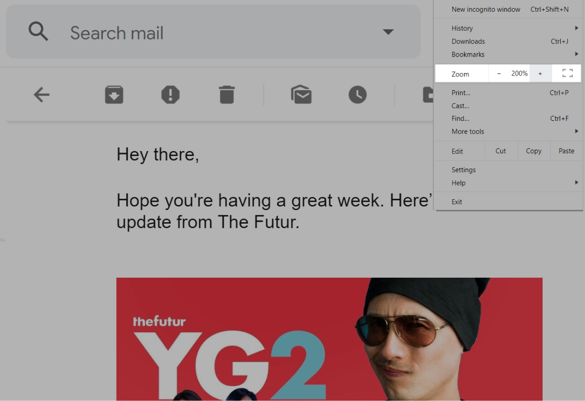
Below you can see a fragment of The Futur email we’ve zoomed to 200% — all email content remained visible and can be read clearly.
 Zooming in an email from The Futur
All in all
When creating an accessible email, try to keep these points in mind:
- Maintain a logical reading structure of your email.
- Use clean code with appropriate tags required by assistive devices.
- Include informative alt text for each image in your email, including social media buttons and your logo.
- Ensure that all your links and buttons are usable, or easy to interact with.
- Keep your fonts at a minimum of 14px, use appropriate formatting, and align your text to the left.
- Stick to good contrast between the background and foreground colors.
- Make sure that your content can be zoomed to at least 200% without loss of content.
Implementing email accessibility without prior experience can be daunting. However, when you analyze its potential impact, it’s clear that this work is worth doing. Try out SendPulse to build clean and accessible email templates and send them out to all your subscribers.