Getting opt-ins is just the tip of the iceberg. The real struggle begins when you start trying to figure out ways to keep your audience loyal and engaged in the long run. Thankfully, there are a multitude of potential touchpoints you can create, from saying “hi” to new subscribers to re-engaging passive users.
We’re going to show you how you can nudge your potential and existing customers in the right direction using eCommerce email design and a winning email copy. We’ll also discuss what to include in your emails and what to drop — and cement it with some of the best eCommerce email examples.
Types of eCommerce emails you need to use
The exact types of emails you use depend on your niche. But you always need to reach beyond the bare minimum. If you only contact your subscribers when they order something from you, your brand won’t be on top of their minds.
You can fix that by introducing more diverse types of eCommerce emails into your strategy:
- welcome — greet newcomers and establish contact;
- discovery — help users learn more about your products;
- abandoned cart — incentivize customers to finish their purchases;
- curated — send personalized recommendations and collections;
- announcement — share news;
- special offer — notify users about sales;
- holiday — celebrate holidays and announce seasonal promotions;
- transactional — keep subscribers in the loop and let them know the status of their orders;
- customer service — provide personalized responses to inquiries;
- loyalty — reward loyal customers and share discounts or promo codes;
- customer feedback — collect reviews and keep improving the shopping experience;
- reactivation — bring “sleepy” subscribers back to life.
Of course, you shouldn’t bombard your users with emails 24/7. But skillfully made, timely emails can go a long way in helping you attract and retain your audience’s attention.
On our blog, we also talk about
email marketing frequency. Make sure to check it out and apply our best practices to your email campaign!
Valuable content should also be beautifully wrapped — and our design recommendations will help you with that.
eCommerce email design tips
In eCommerce email design, visuals and copy go hand in hand; thus, we need to consider them in combination. The right images will amplify your messaging, while faulty graphics will only bring it down. The opposite is also true: weak text will harm even the most elegant eCommerce email template.
Here are some golden rules you need to follow to make your eCommerce emails stand out:
- Write concise, to-the-point subject lines.
- Pay attention to the quality of your images and avoid pixelation.
- Use unique photos and graphics instead of stock images.
- Include videos in your emails to promote products or explain specific features.
- Stick to the rule “one email, one CTA.”
- Make your CTA buttons stand out.
- Avoid long paragraphs and keep your emails mobile-friendly.
- Maintain brand consistency by keeping your email design recognizable.
- Use active, user-centric language and emphasize it with your typography.
- Remove any distracting elements that don’t help you drive the message home.
Now, let’s see some real-world examples that illustrate these rules.
10+ eCommerce email design examples
These eCommerce email examples prove that you don’t need to stuff your template with tons of videos and infographics to make it work. In fact, the simpler the email, the easier it is to get the point across.
Another thing to remember is that your users may go through their inboxes while commuting. Heavy images and animation aren’t compatible with poor network connections, so you may want to avoid using them, at least in transactional emails.
Fear not, we’ll show you some great emails with sophisticated and tasteful, yet light-weight designs — and explain what exactly makes them so great.
Ellesse
It all starts with a welcome email. Your first touchpoint defines the atmosphere and the tone of your communication. So, the best thing you can do is give subscribers a heads up on what you’ll be emailing them about and offer a little bonus for signing up.
Ellesse is a sports apparel company, so the brand sets the mood by using photos of young and active people wearing Ellesse and having a good time.
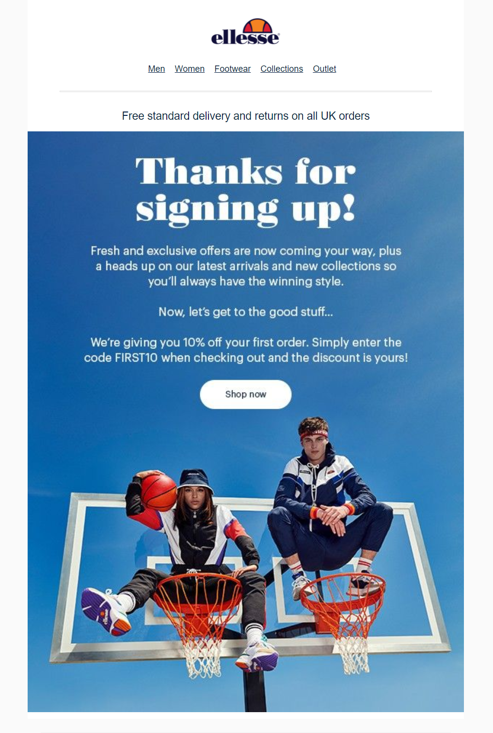 Use a discount code or coupon as a reward for signing up
Your welcome emails don’t need to be overloaded — just include an incentive for your audience to stick around and make their first purchase even more desirable. A single hard-to-miss CTA button is also required here because some of your users may be ready to convert right away.
Google Store
Here is the cleanest special offer email of all time. Nothing distracting, just high-quality photos and bright, contrasting CTA buttons that are impossible to miss. The price difference is shown right there, and it eliminates any possible doubts regarding the value of the offer.
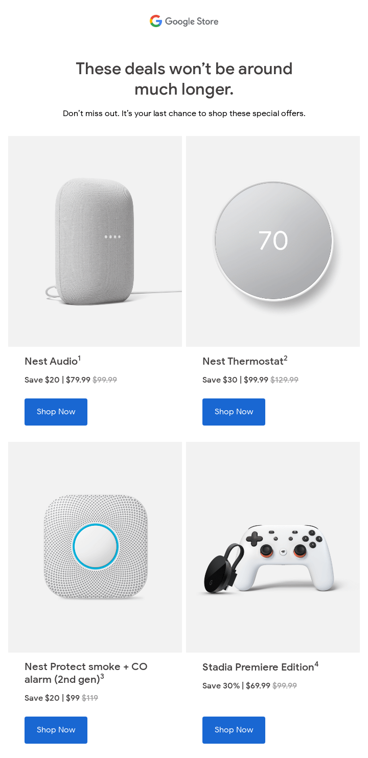 Google Stores uses clean, spacious design for its email communication; source: Really Good Emails
You can “steal” a few ideas from this example. For starters, think about adopting the same block structure to present products that may be equally interesting to your users. And, secondly, only use product photos made in the same style — it’ll immediately give your email a professional and cohesive look.
Rover
Here, we see a rather playful, but by no means silly, holiday-related email by Rover, a dog-walking app. Its visual style appeals to its audience — dog lovers — and conveys the Halloween mood that makes people wear crazy costumes and play all sorts of pranks. In this email, the company encourages dog owners to treat their pets on “the spookiest night of the year” with themed plush toys.
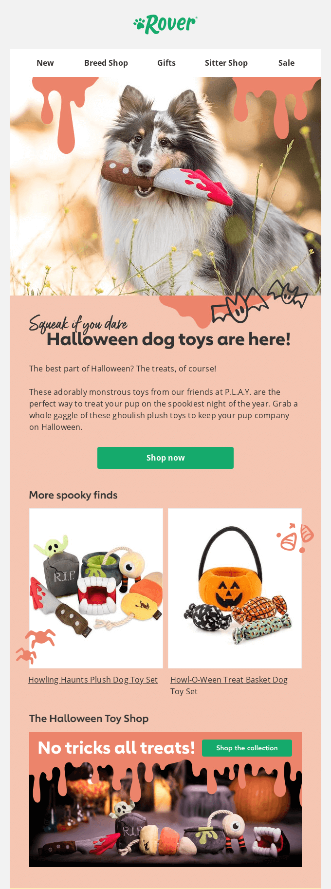 Combine a holiday design with your brand style; source: Really Good Emails
This holiday email is well-designed — even the typography choices aren’t random at all. The designers used atmospheric, cozy typefaces for headings and paired them with a clean sans-serif font for email copy to increase its readability. Graphic elements support the main theme of the email without making it too grim or gothic.
Allergy Buyers Club
Sometimes, you need to send a little guide to your users, and that’s where easily digestible infographics come in handy.
Take a look at this example — it’s an illustrated thank you email from Allergy Buyers Club. It includes useful tips on how to set up and use a recently purchased product, but it also motivates the recipient to participate in a referral program and try related products.
Include infographics in your eCommerce email templates; source: Really Good Emails
Here, the company strengthens customer trust and creates a perfect upselling opportunity by recommending items that enhance the overall positive experience of using the air purifier. You can try the same strategy and send helpful thank you emails accompanied by personalized recommendations.
Chipotle
Chipotle incentivizes parents to help their kids get used to going to school again by buying them healthy and mouth-watering meals to-go. They also offer bonus points to increase customer loyalty. It’s a short email, but it contains just enough information to attract the user’s attention and send them to the company’s website.
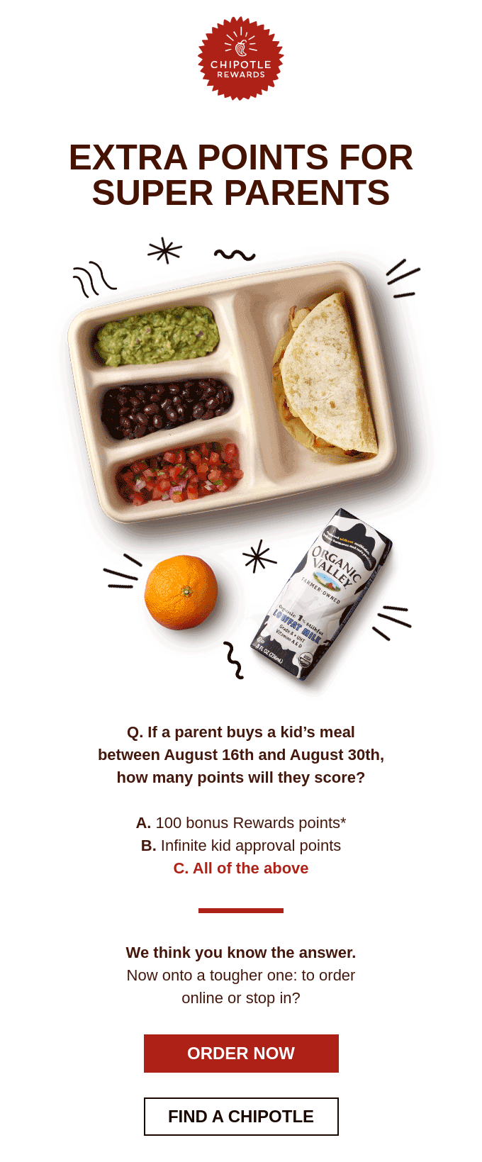 Chipotle offers bonus points for buying kid’s meals
This email has a great attention-grabbing headline and a subtle color scheme reflecting the Chipotle brand colors. An email designed like this one will be displayed correctly on any device. Notice that even two CTA buttons here don’t interrupt the flow — they just make it more convenient for users to place an order and get fresh food in no time.
Specialized
There aren’t that many ways to gently remind customers that they left something behind, namely their shopping carts. But Specialized seems to have found a perfect trick. The brand compliments their shoppers with the subject line “You Have Good Taste” and suggests taking another look and completing their purchase.
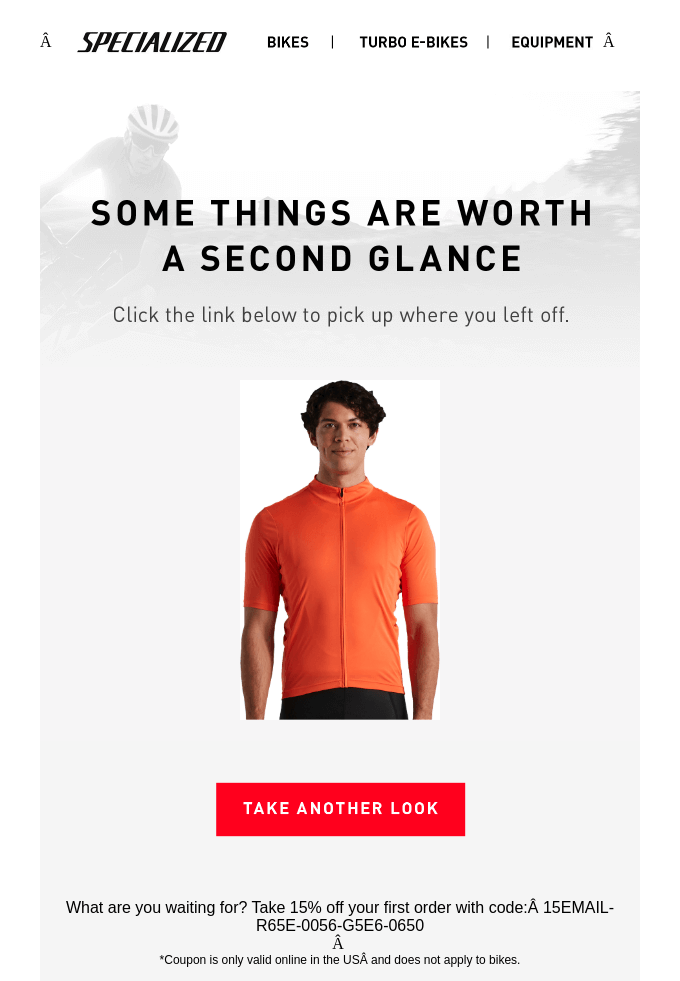 Specialized reminding their users of what they left behind; source: Really Good Emails
This re-engagement email is aimed at getting users back on track, to the checkout page, and it does so by offering a nice discount. This strategy is a must since at least 5% of all abandoned carts are easily recoverable — you just need to send enough reminders topped with discounts or other perks.
Dollar Shave Club
This announcement email has an elaborate rustic design, which is a perfect fit for this type of product. Dollar Shave Club delivers razor blades and grooming products on a monthly basis. The company is focused on producing premium products — and strives to upgrade not only its customers’ bathrooms but also their quality of life.
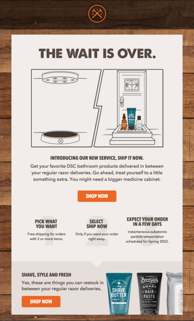 Dollar Shave Club emails have a very recognizable design; source: Really Good Emails
This particular eCommerce email template is remarkable for two reasons. Firstly, it captures the essence of the brand. Secondly, it has all of the essential elements, from CTA buttons to high-quality product images, working together. Also, the brand uses active, friendly, and informal language. We always recommend adopting a casual and friendly tone.
Meadows
Some play by the rules, and some easily break them. Meadows, a London-based brand of romantic clothes, sends minimalistic scrollable emails featuring its new arrivals and seasonal offers. But, instead of popping CTA buttons, the company only uses big clickable photos and elegant descriptions.
Use full-size, high-quality photos to demonstrate the beauty of individual items
What are the advantages of this email design? When you have just a couple of new arrivals, there is no need to hide them from view — instead, you can showcase them and let your users learn more about the story behind them and the materials used. This approach works for hand-crafted, exclusive pieces but not for mass-market producers.
London Store
This might look like another seasonal eCommerce email, but there is one detail well worth copying. London Store uses the urgency factor — a promo code valid only for a certain period of time. You can try the same trick during your seasonal sales to accelerate the purchase decision process.
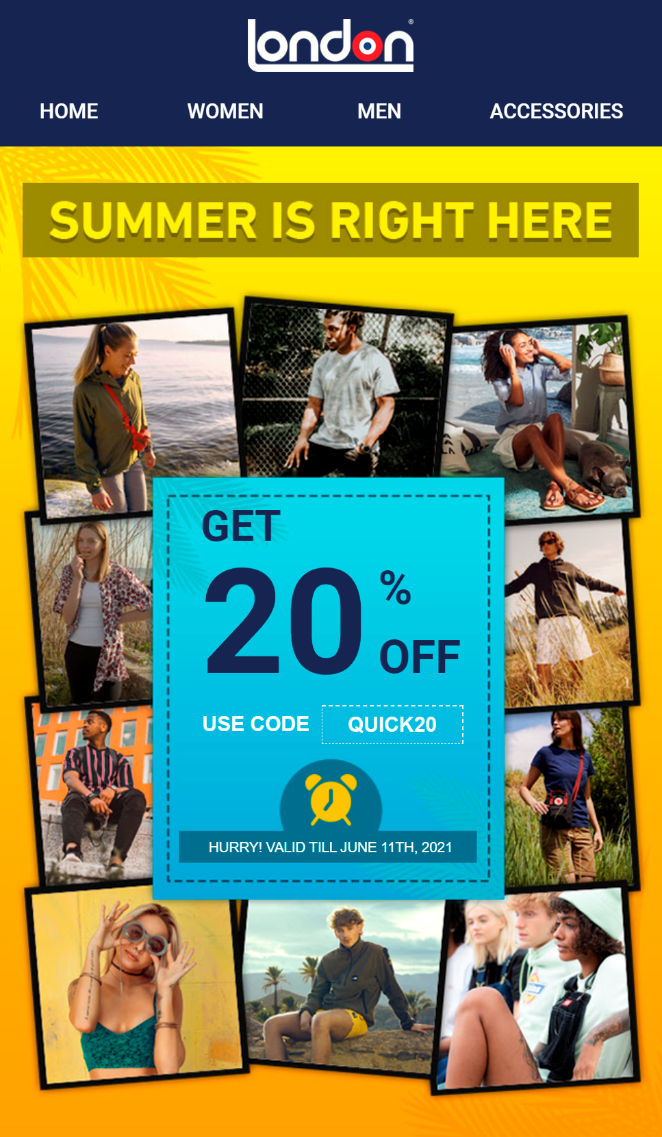 Use collages to brighten up your seasonal emails
This email also includes a strong headline and bright photos, perfectly conveying the summer mood. The collage looks a lot like an album full of memories and captured dreamy moments — that’s exactly what people hope to experience when wearing their new summer clothes. So, in your seasonal emails, try to recreate that dreamy mood with the help of visuals.
MasterClass
The platform features well-produced online courses taught by celebrities. High quality means a higher price, and MasterClass addresses its audience’s fears and doubts by proving that its top classes bring immense value. The platform sends neat email series to help its subscribers discover the right classes for them.
 Leverage user testimonials to convince customers of our expertise and credibility
As you see, the company uses an emotional tone and social proof to convince its subscribers to give it a chance. This eCommerce email design also includes photos of the world’s best experts and practitioners so that users can see who exactly is going to teach them. All of these elements come together to create an effective email that softly pushes recipients to convert.
American Giant
How do you help your users learn more about your products without overwhelming them with page-long descriptions? American Giant nails it by sending well-honed emails that contain just enough information and images to spark the user’s interest and make them click “Shop Now.”
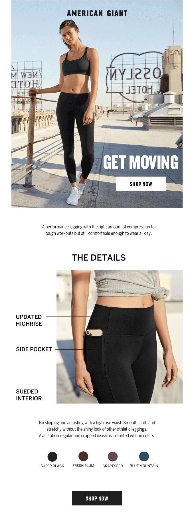 American Giant sends one of the best eCommerce emails; source: Really Good Emails
It’s a promotional email for new subscribers who haven’t gotten a chance to learn more about the brand yet. Everything in this eCommerce email example is great — encouraging headlines, a nice color palette, a well-placed CTA button, concise descriptions, and an emphasis on thought-out details.
Try our eCommerce email templates
Now, it’s time to move from words to deeds. We offer pre-designed email templates you can easily customize to fit your business’s needs.
With SendPulse, you can create your best eCommerce emails in a few minutes and set up automation flows to send personalized messages triggered by specific events. Forget the guesswork — our downloadable reports with visual graphs make it easy to analyze and optimize your strategy as you go. And, you can manage your email campaigns on the go from any device with our intuitive app!